TASTWERK Tijdschrift 001: Editorial Design by Wessam Hussien
Explore the TASTWERK Tijdschrift 001 editorial design by Wessam Hussien, pairing a six-column InDesign grid with primary-color studio studies.
Most studio monographs only show the polished final object. They don't show the messy workbench. With Tijdschrift 001, designer Wessam Hussien takes the opposite route, building an intimate editorial design portrait of TASTWERK, an atelier where craft, primary color, and raw material research collide. Through founder conversations, workshop observations, and object studies, the publication follows how pieces actually come into being from the earliest paper and wood tests to finished sculptural collections. Even the accompanying motion flip-through keeps that tactile pacing front and center.
Primary Color and Grid Tension in Editorial Design
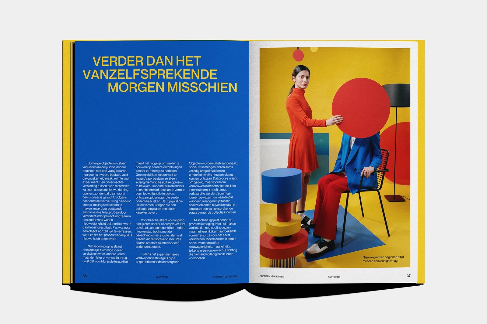
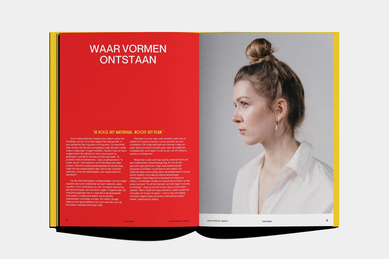
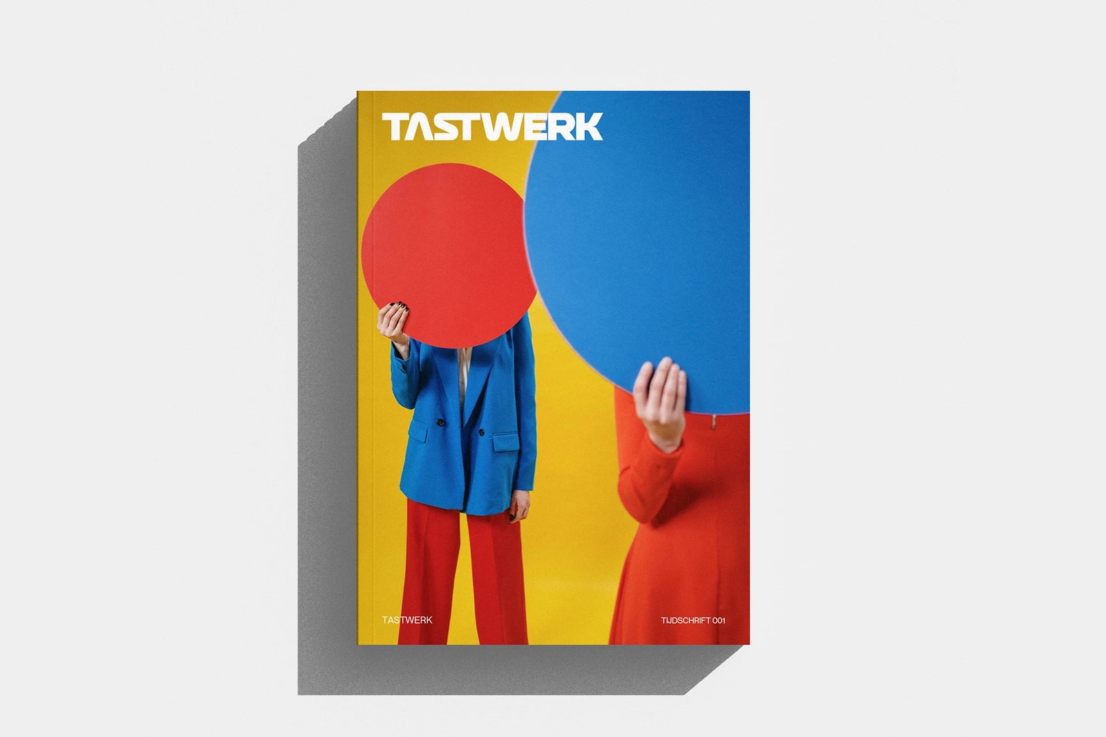
The cover sets the rules immediately. Against an ochre-yellow backdrop, two figures dressed in cobalt blue and vermilion red hold oversized circular discs over their faces beneath a custom geometric TASTWERK wordmark with a notched crossbar on the A. There's zero decorative filler on the grid. Inside the 240 by 288 millimeter pages laid out across a six-column InDesign structure, Hussien treats those three De Stijl primaries as structural zones. On pages 8 and 9 for the chapter Nog vóór het object, a full-bleed red left page pairs the white sans-serif headline "WAAR VORMEN ONTSTAAN" and a yellow condensed pull quote ("IK VOLG HET MATERIAAL, NOOIT HET PLAN.") opposite a calm grey-backed profile portrait. The contrast hits hard.
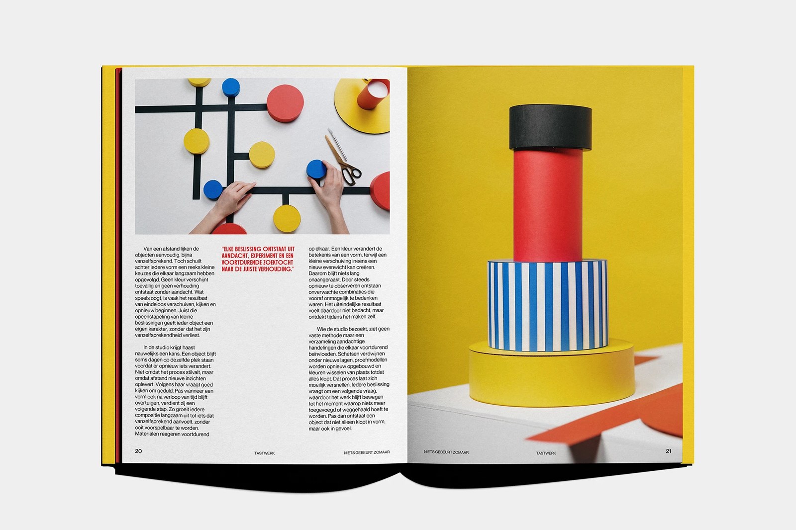
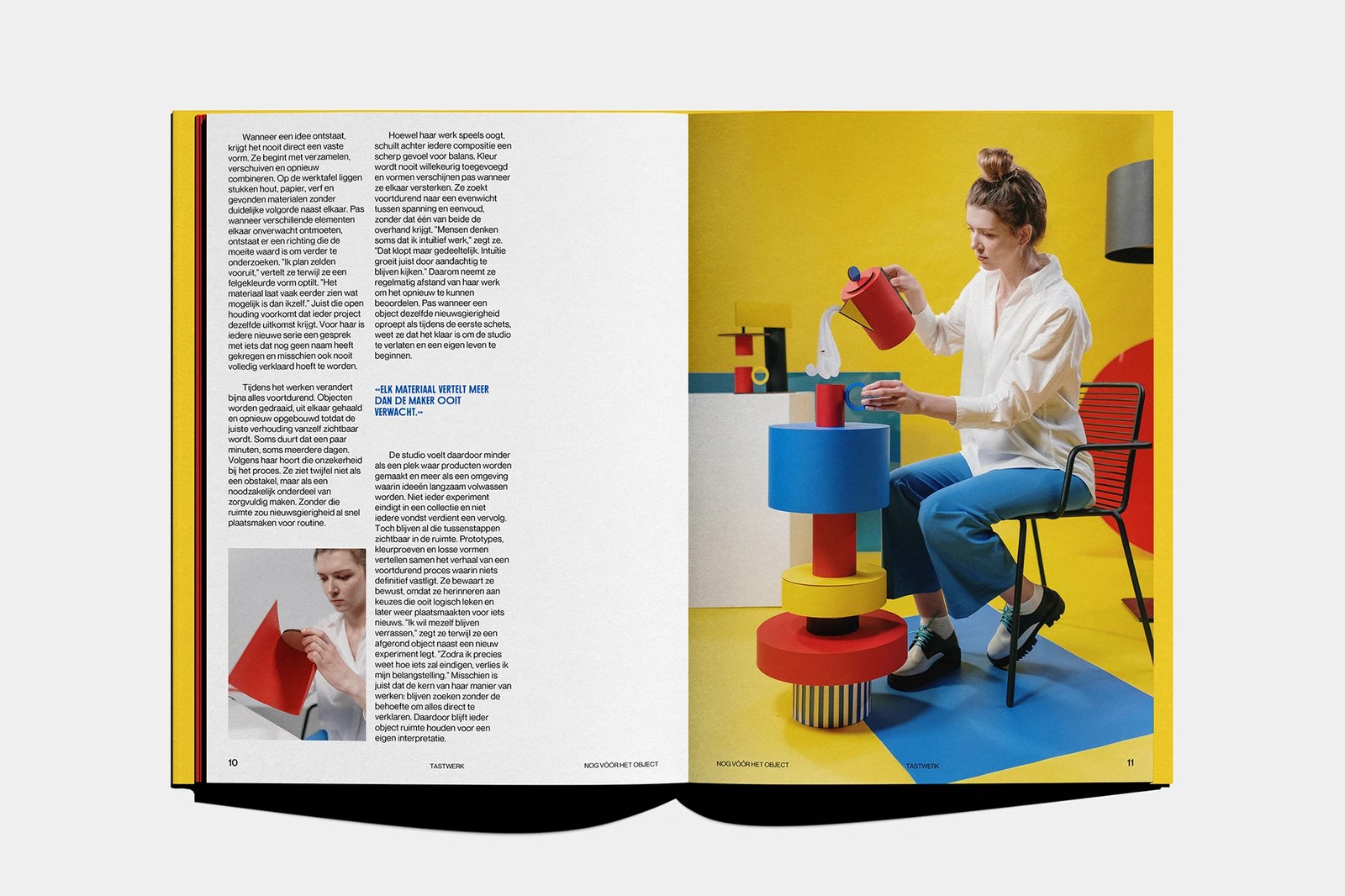
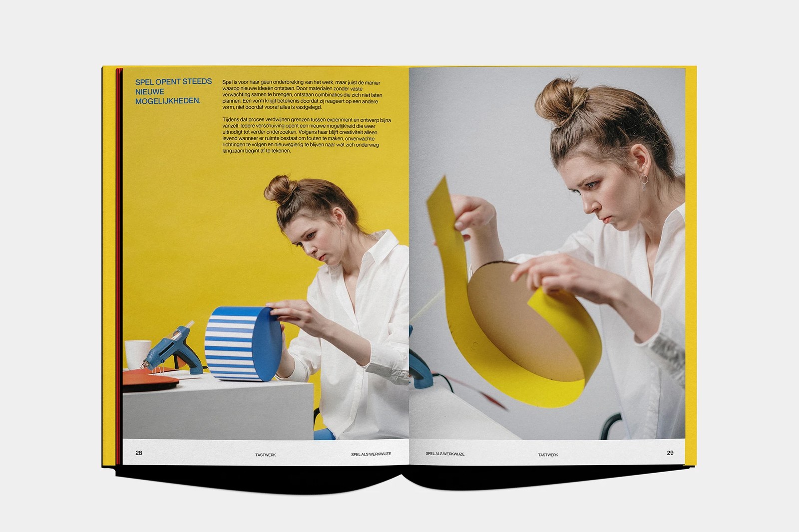
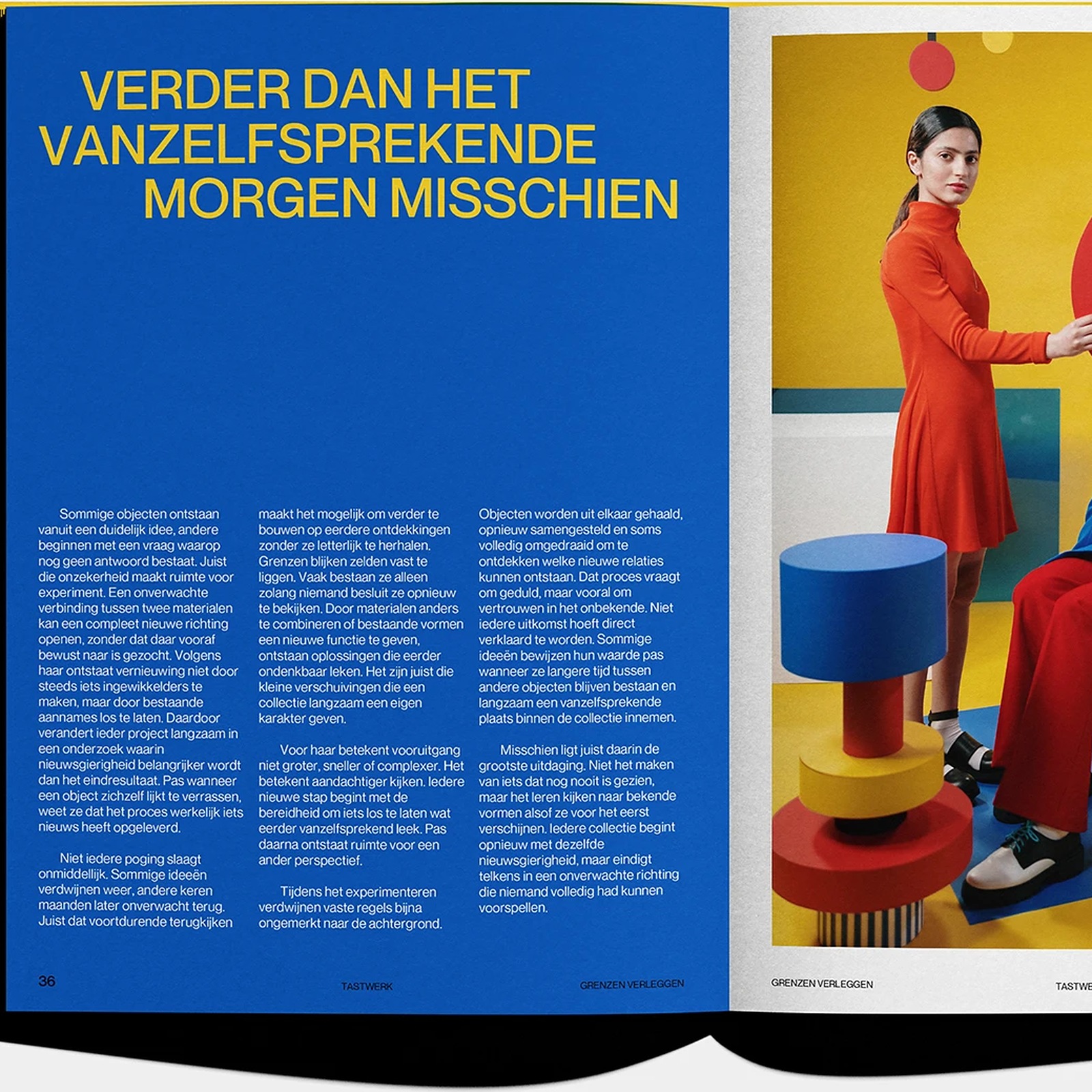
Pacing shifts from spread to spread without losing the underlying baseline. Pages 10 and 11 open onto clean white paper where two asymmetric text columns wrap around a cobalt pull quote and an inset workshop photo, facing a stacked totem of red, yellow, blue, and blue-and-white striped cylinders. Later in Niets gebeurt zomaar (pages 20 and 21) and Spel als werkwijze (pages 28 and 29), top-down flat lays of brass scissors on a black orthogonal strip grid sit beside candid shots of hot-glue assembly and curved yellow cardboard rings — proving that disciplined editorial design doesn't treat studio play as chaos. By pages 36 and 37, a deep blue three-column spread ("VERDER DAN HET VANZELFSPREKENDE MORGEN MISSCHIEN") locks the whole editorial design system together.
See the full project by Wessam Hussien on Behance.