Peers Visual Identity and Modern Typography Branding
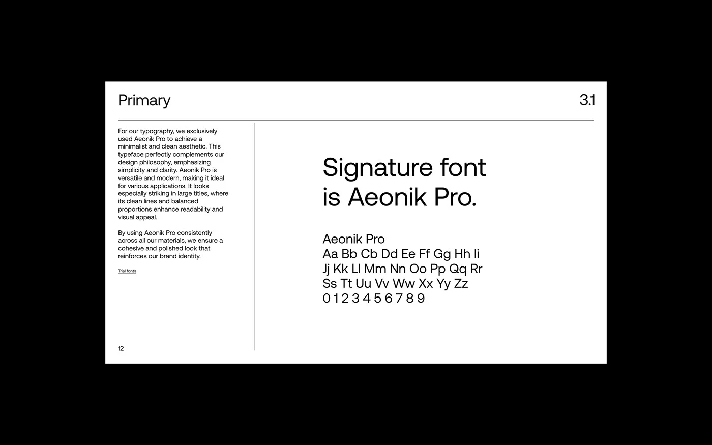
Peers is a visual identity and corporate branding project by Anvar K. built around custom typography and clean grid systems.
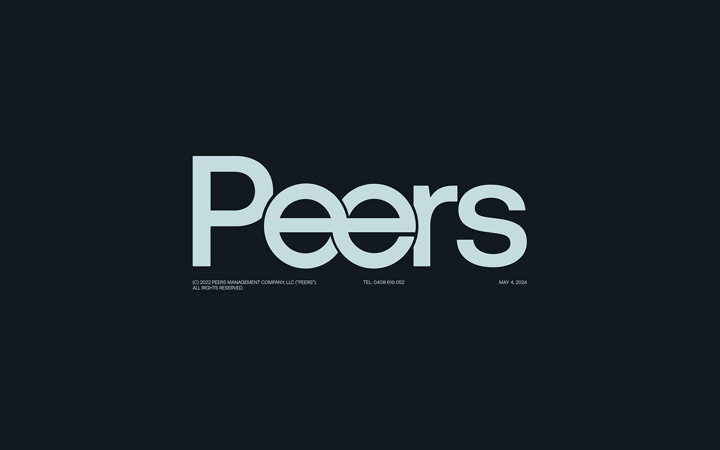
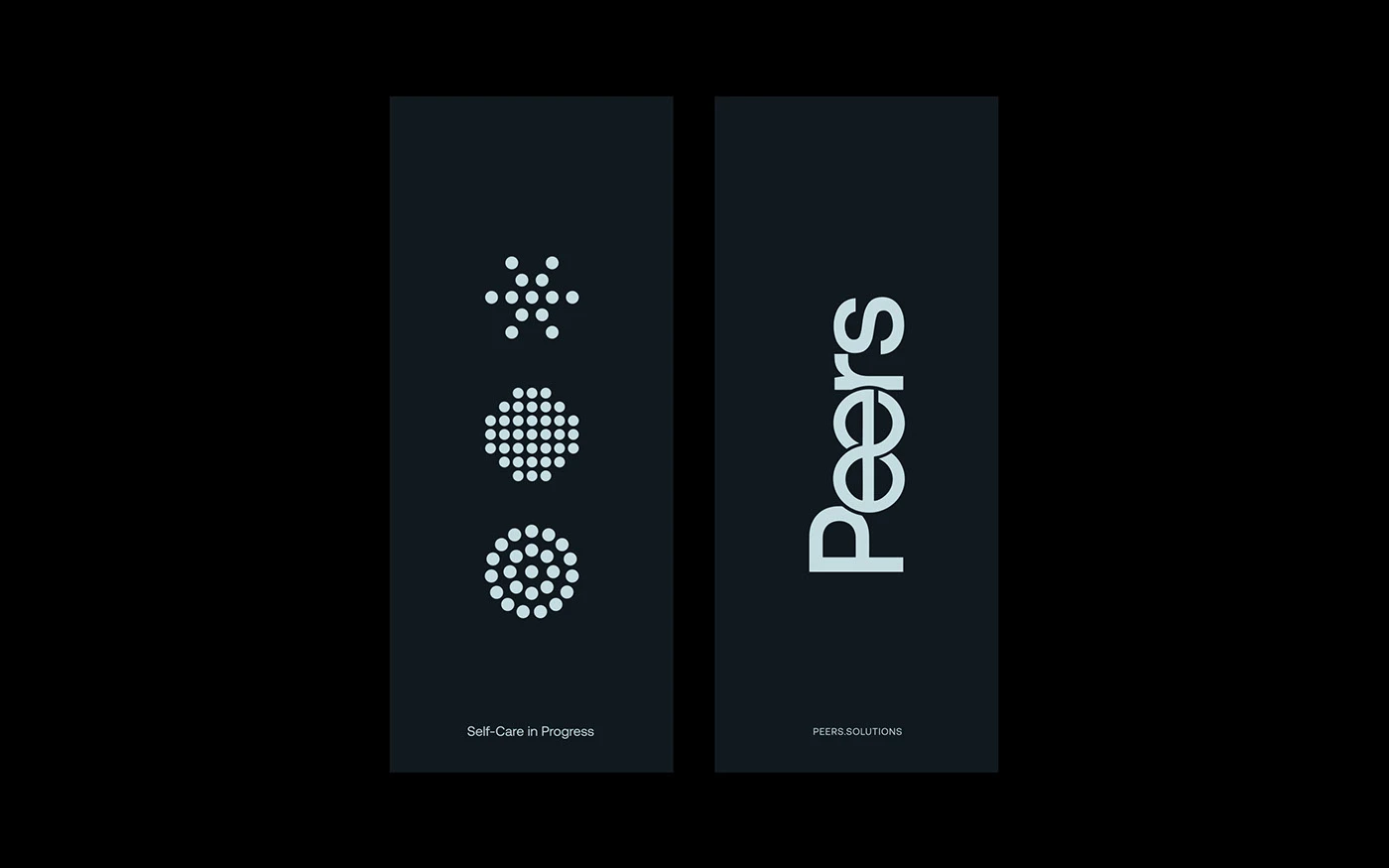
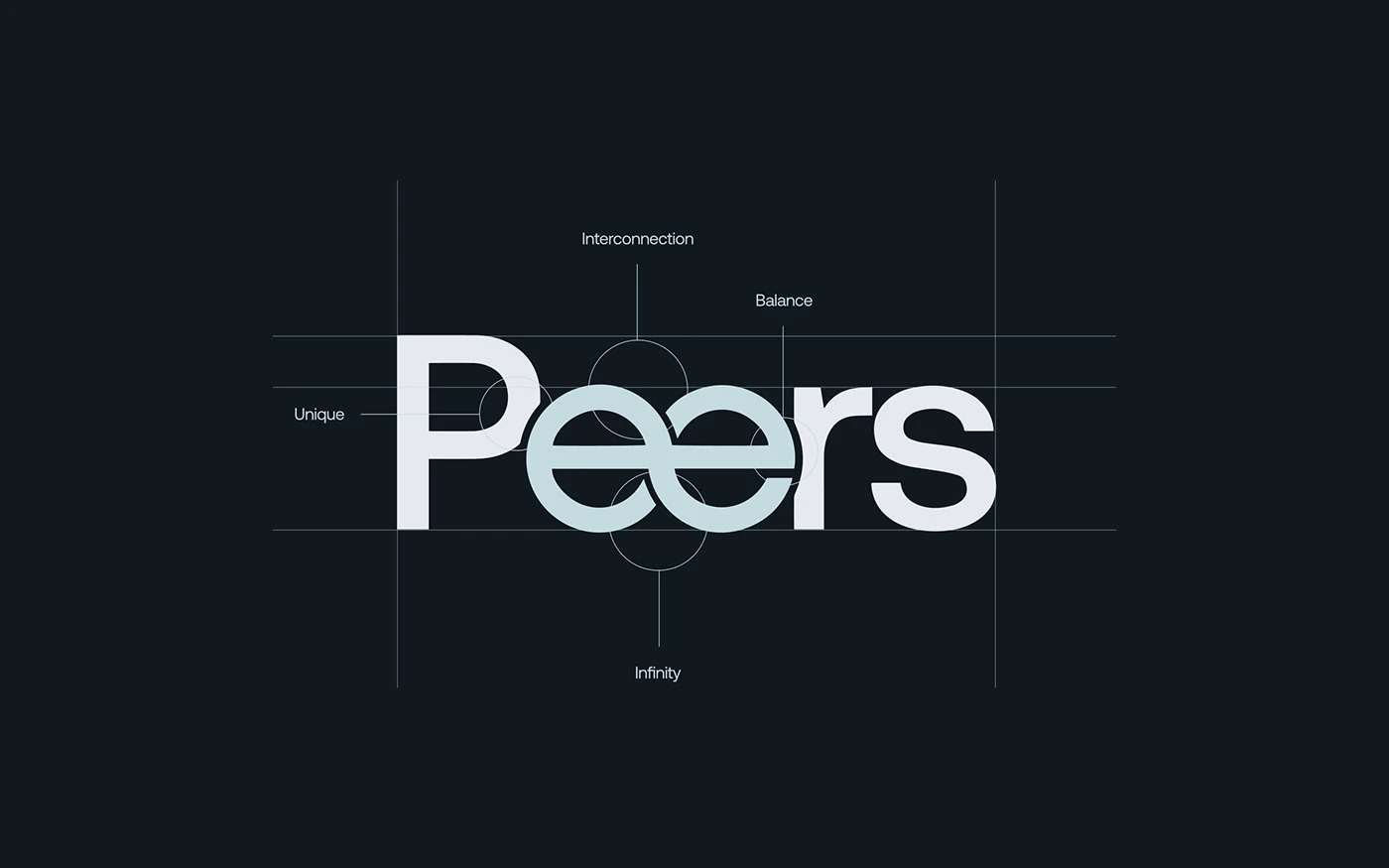
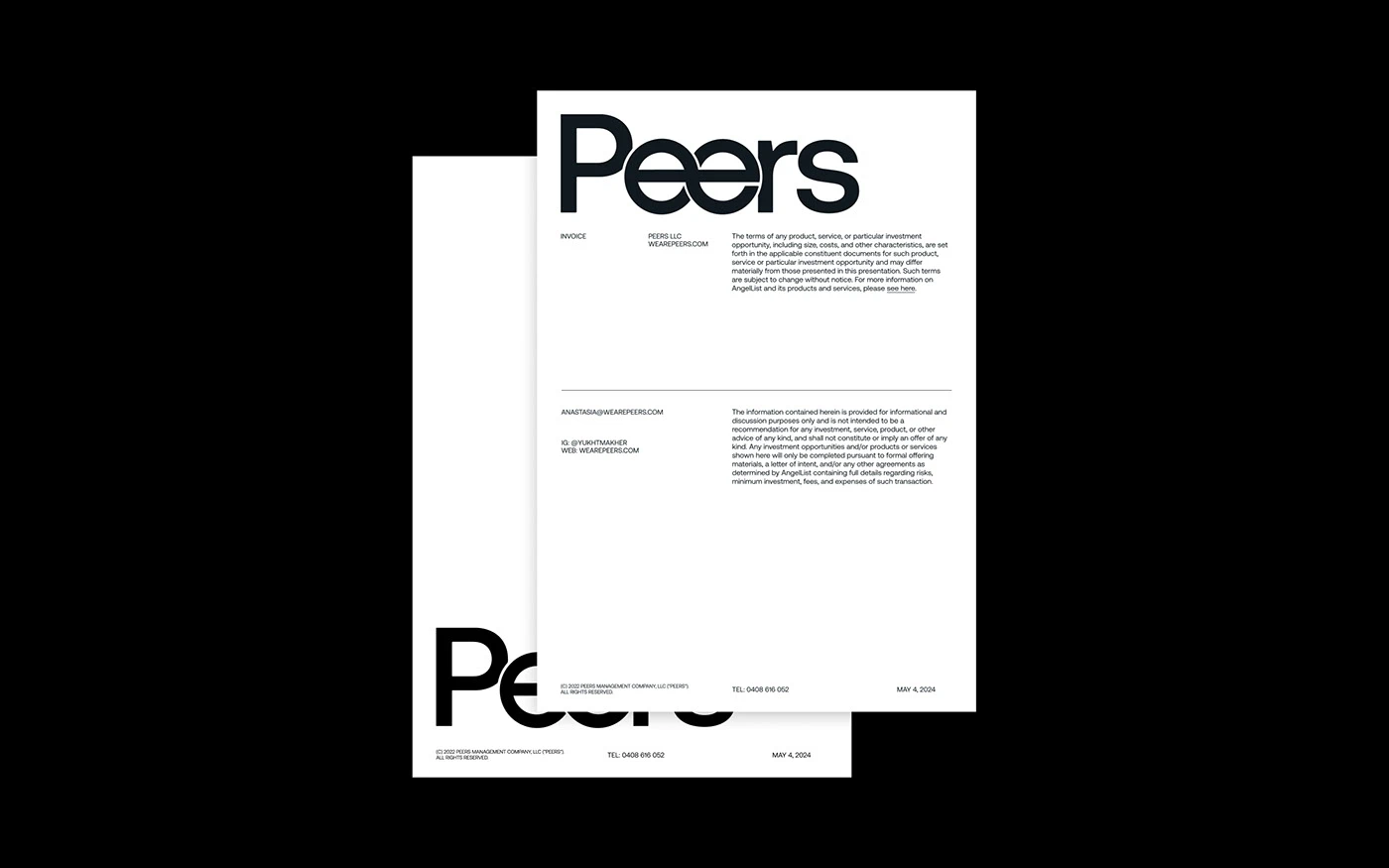
The visual system relies on a strong wordmark with custom letterforms. At the center of the branding sits the name Peers with twin interlocking e letters. Designer Anvar K. draws these connected forms to reflect shared work and team unity. The mark uses a cold pale blue tone against a deep navy background. Small catalog text along the bottom edge adds a precise spec look. The layout pairs this bold wordmark with dot matrix icons that show self care and team progress. Geometric dot patterns form circular badge symbols on dark card stock.
Systemic Typography and Flexible Stationery Branding
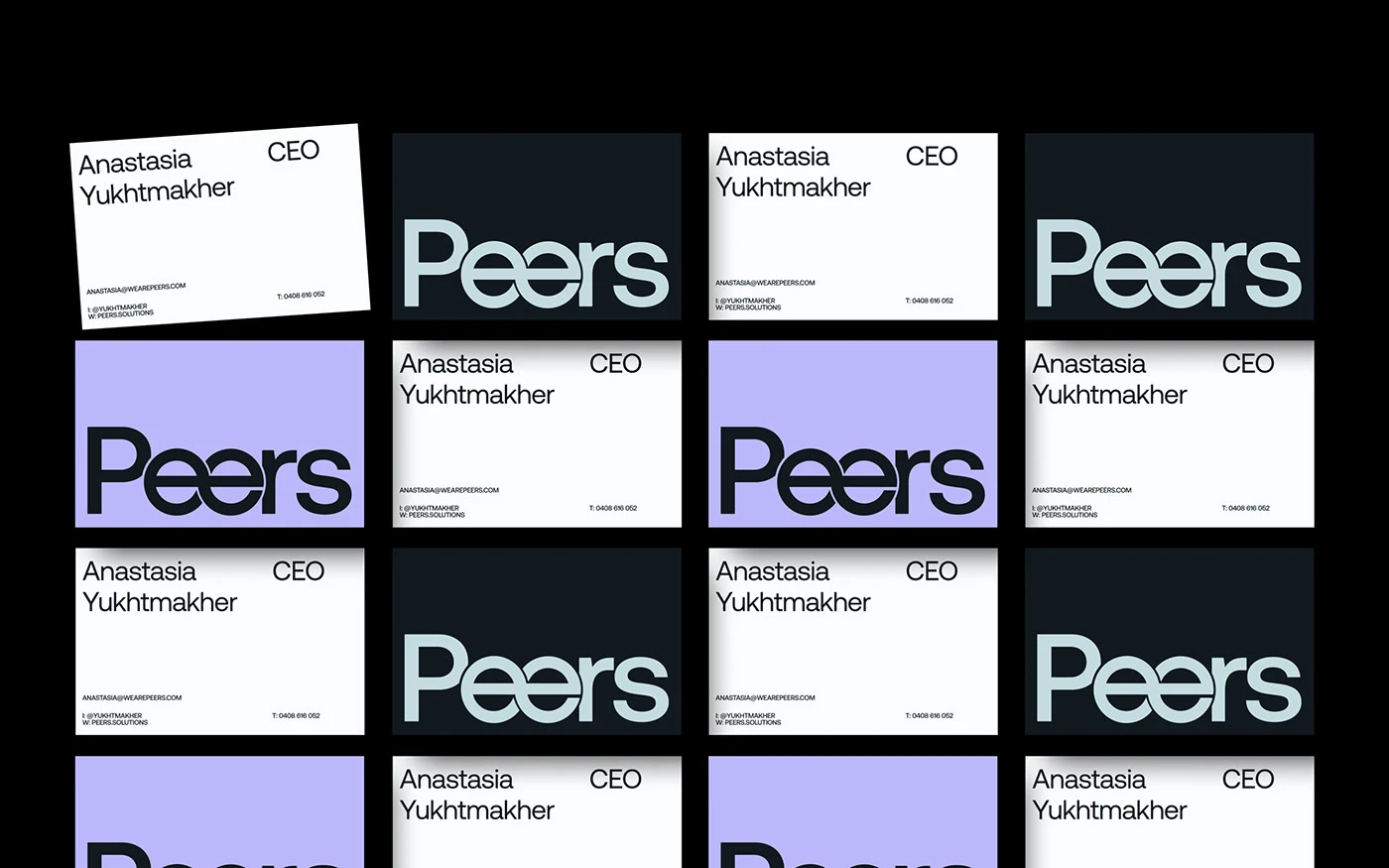
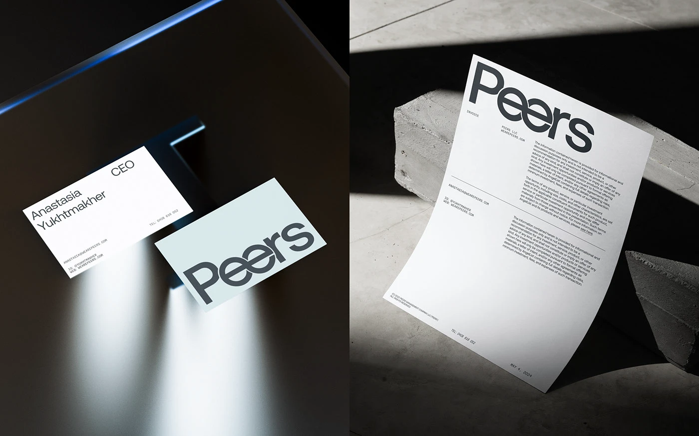
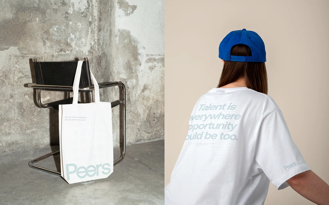
Physical collaterals expand the core branding into real office tools. Printed business cards display a clean grid of white, periwinkle, and dark navy cards. Heavy invoice sheets use a tall serif font for main headers and clean sans serif text for line items. Hard shadow lighting on raw concrete blocks highlights the texture of smooth card stock. Tote bags and staff shirts use soft gray print on white cotton. Each item shows how the mark scales across print and cloth. The visual rhythm stays clean on every material surface.
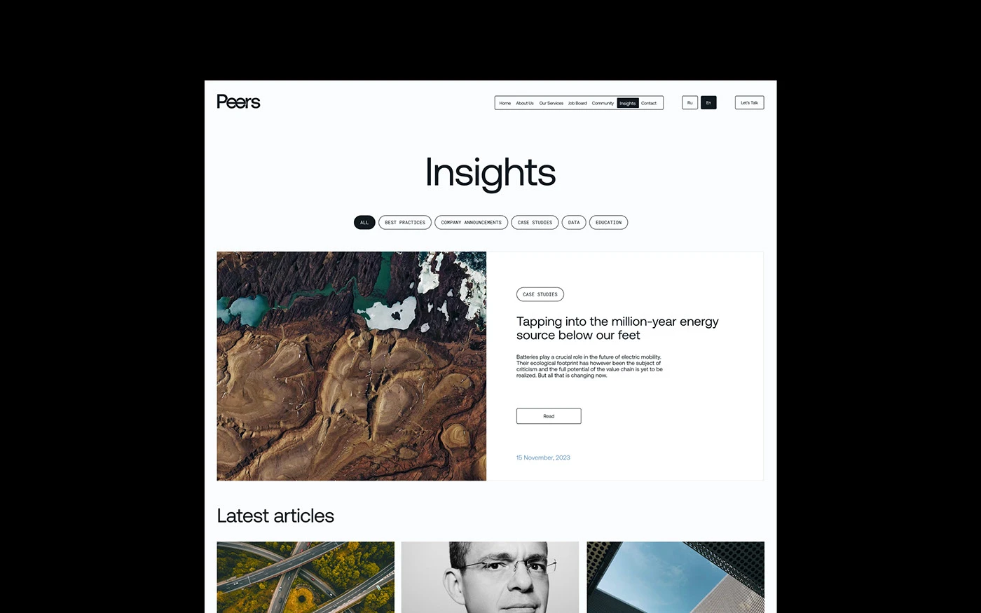
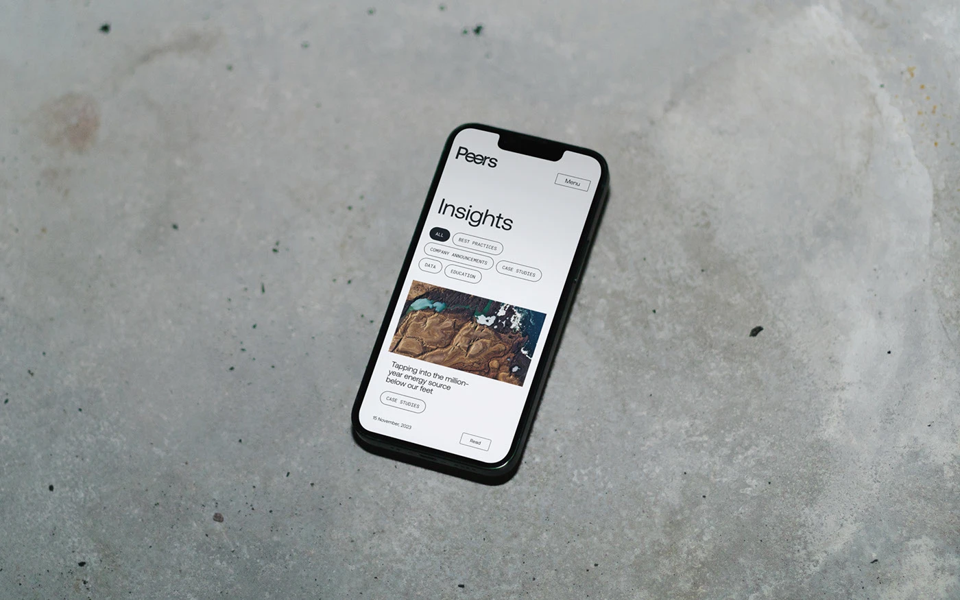
Digital touchpoints extend the brand language to web screens and mobile apps. The online layouts use wide white space and clear content blocks to guide the reader. Soft gray tone fields separate case studies from news articles without heavy dividing lines. Clean menu buttons and simple icon grids keep the user focus sharp on every page. This minimalist branding strategy creates a cohesive look across physical and digital formats. View the full identity project on Behance by Anvar K.