Studio Kiln brings motion-first thinking to BAFTA’s new identity
The design studio has refreshed the organisation’s four awards ceremonies with a cohesive particle-based system, featuring updated colour palettes
Studio Kiln has unveiled a new visual identity for the 2026 BAFTAs, introducing a flexible motion-led system designed to unify the organisation’s four annual ceremonies while giving each its own distinctive character.
Spanning Film, Television, Games and Craft, the work replaces BAFTA’s previous colour-led system with one built around evolving particle forms that draw on the idea of creative transformation.
According to Studio Kiln, the original brief from BAFTA centred on gemstones and was intended to reflect the journey ‘from raw to refined’. Rather than taking that metaphor too literally, however, they sought to visualise how gems are formed and the spark from which they are born.
“We wanted to show the creative energy behind that,” says designer Meg Mardon. “When something goes from rough to refined, well, what’s the process behind that? It’s being eroded, impacted by pressure … we felt that made it a little deeper than just showing gems, which could have become quite tacky or pretentious.”
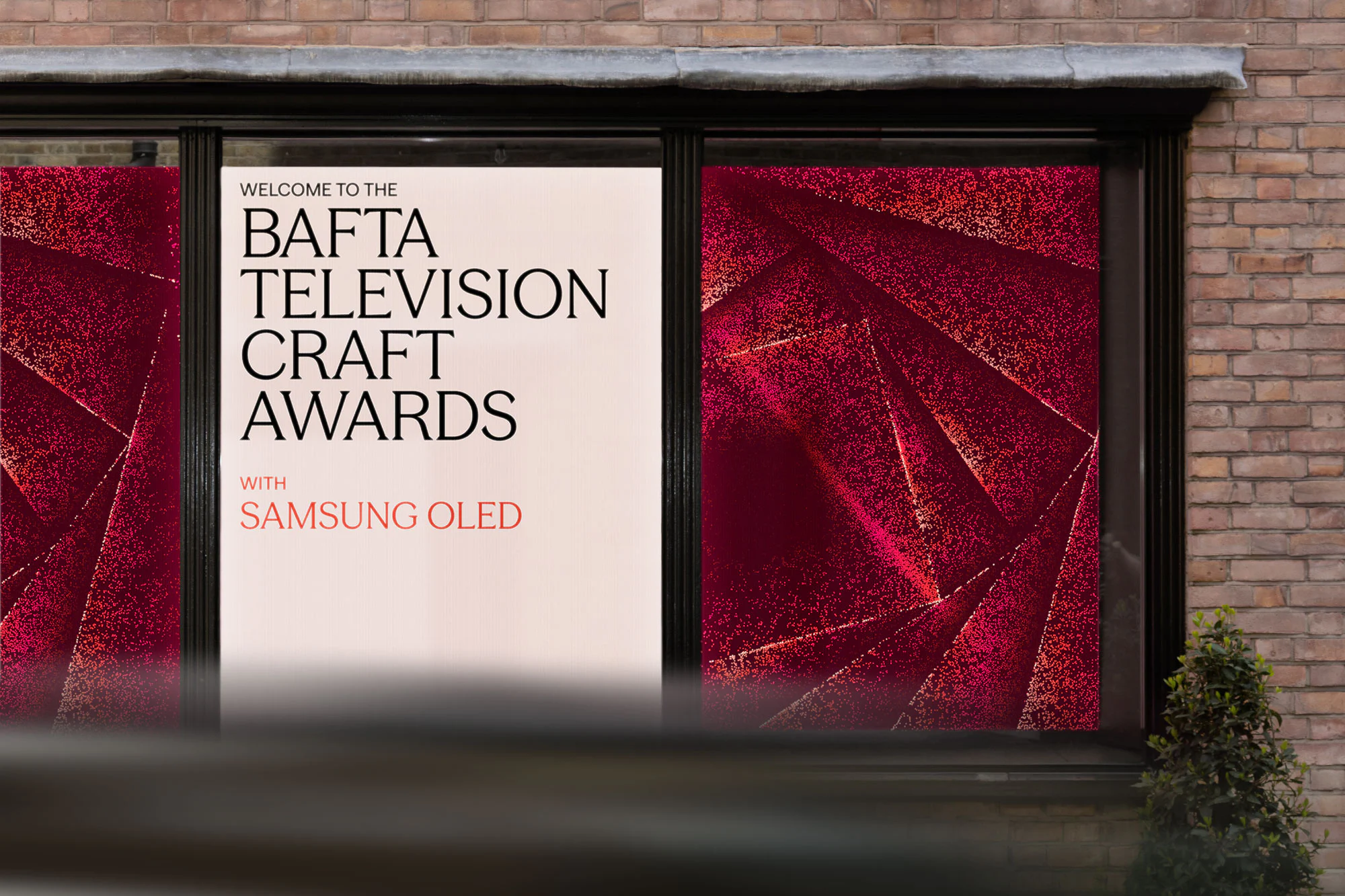
The resulting visuals feature shimmering particle fields that appear almost three-dimensional despite being built entirely in 2D. Developed in Figma and animated using Cavalry, the graphics balance fluid motion with restrained geometry, creating an identity that feels dynamic enough for screen while remaining sophisticated on stage.
Although BAFTA’s four awards have historically been distinguished primarily through colour, Studio Kiln wanted each ceremony to have a more individual visual language without losing the clarity of a single system. Film has the most pared-back execution, while Games introduces more complex, puzzle-like forms and Craft looks beneath the surface.
“The process remained the same across the four awards,” explains designer Edoardo Albertini. “You could change the shape and the colour, but the way everything appeared stayed consistent enough that you’d always recognise it as BAFTA.”
Existing sponsorship agreements meant that several colour palettes were effectively fixed, limiting how far the studio could push each look. Instead, Mardon and Albertini focused on increasing vibrancy and contrast within those parameters, helping the particles achieve a sense of depth and luminosity while respecting established brand associations.
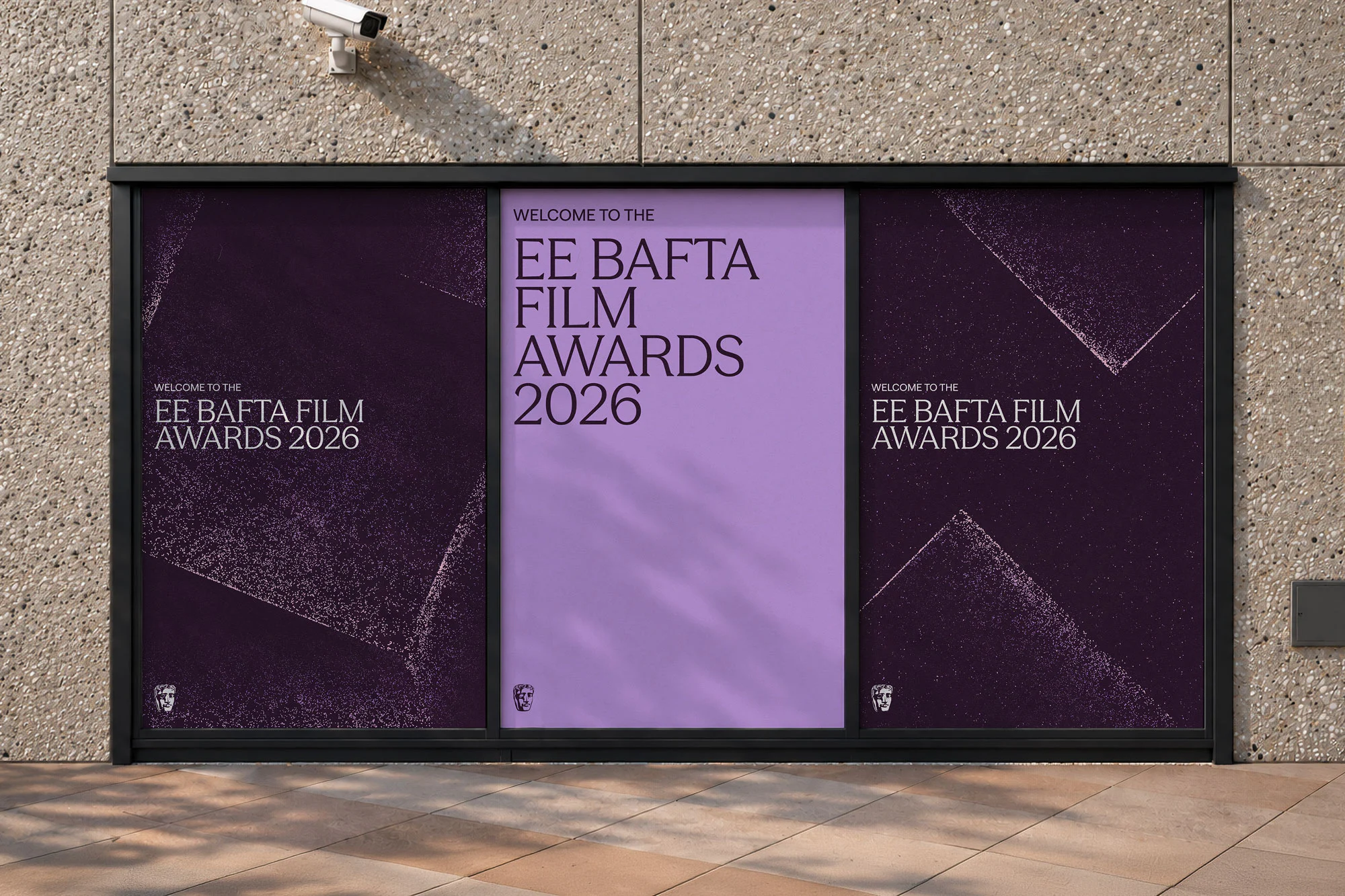
Typography also required a careful balancing act. The studio experimented with more radical directions before settling on a contemporary serif that could retain BAFTA’s sense of heritage without feeling stuffy or overly traditional. “It has this openness and modernity,” says Albertini. “It feels contemporary, but still carries that elegance and sense of craft.”
Perhaps the most unusual aspect of the project, however, was the order in which it was developed. Rather than beginning with logos, typography or layouts, the identity was shaped through motion first, allowing animation to inform every subsequent design decision.
“The moving key art came before anything else,” says Mardon. “We didn’t start on the type or the wider system until we’d figured out the motion. It felt like that was the living system, and everything else followed on from that.”
Studio Kiln has increasingly begun treating motion as the foundation of visual identity rather than an application added at the end of the process. In BAFTA’s case, the approach feels particularly fitting – the work positively fizzes with creative energy, yet still feels coherent as a whole.