Brand Identity: Calendly Rebrand by Smith & Diction
Smith & Diction designs a flexible brand identity for Calendly, featuring the ripple C mark, TT Neoris type, and organic flex bubbles.
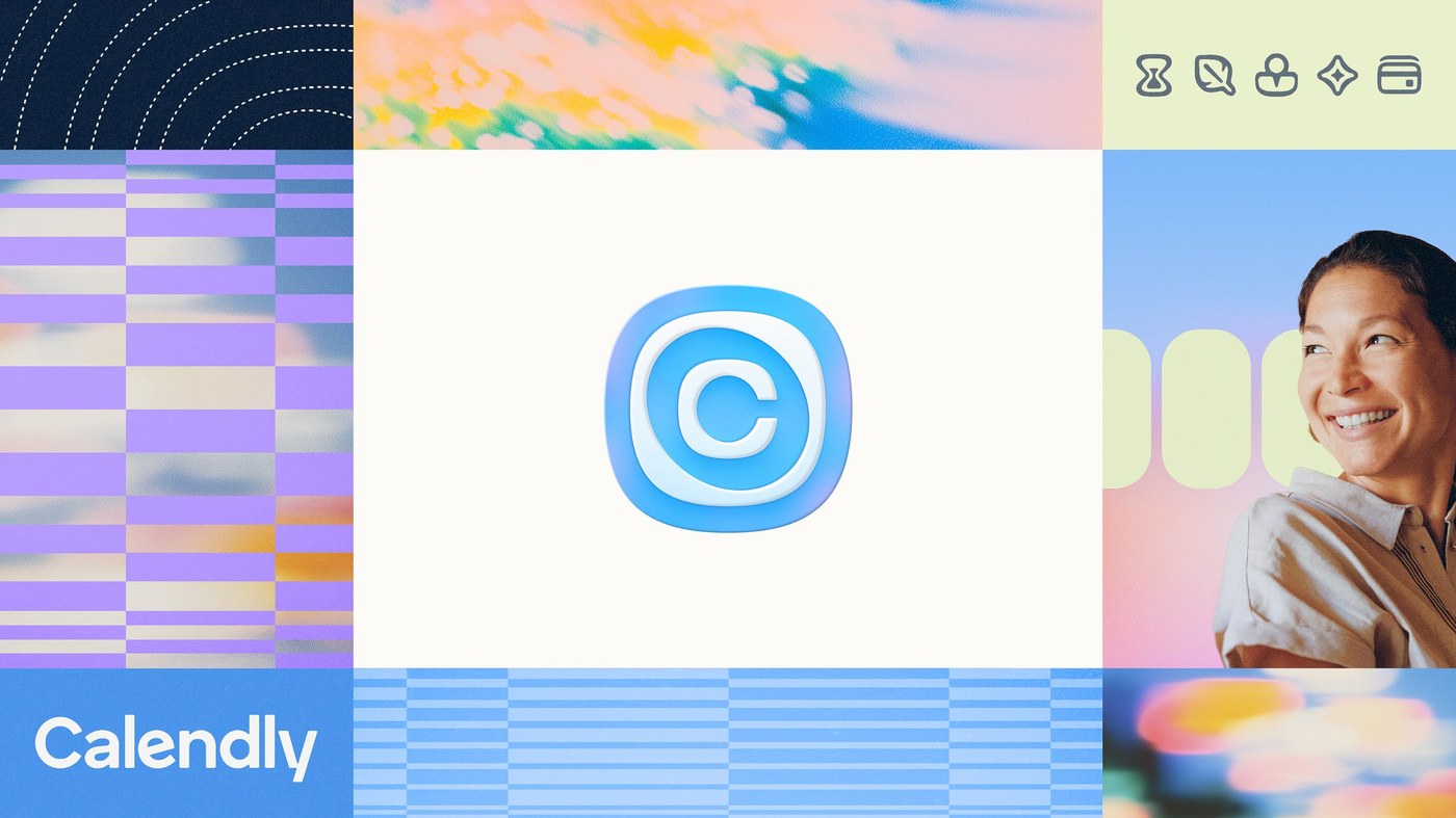
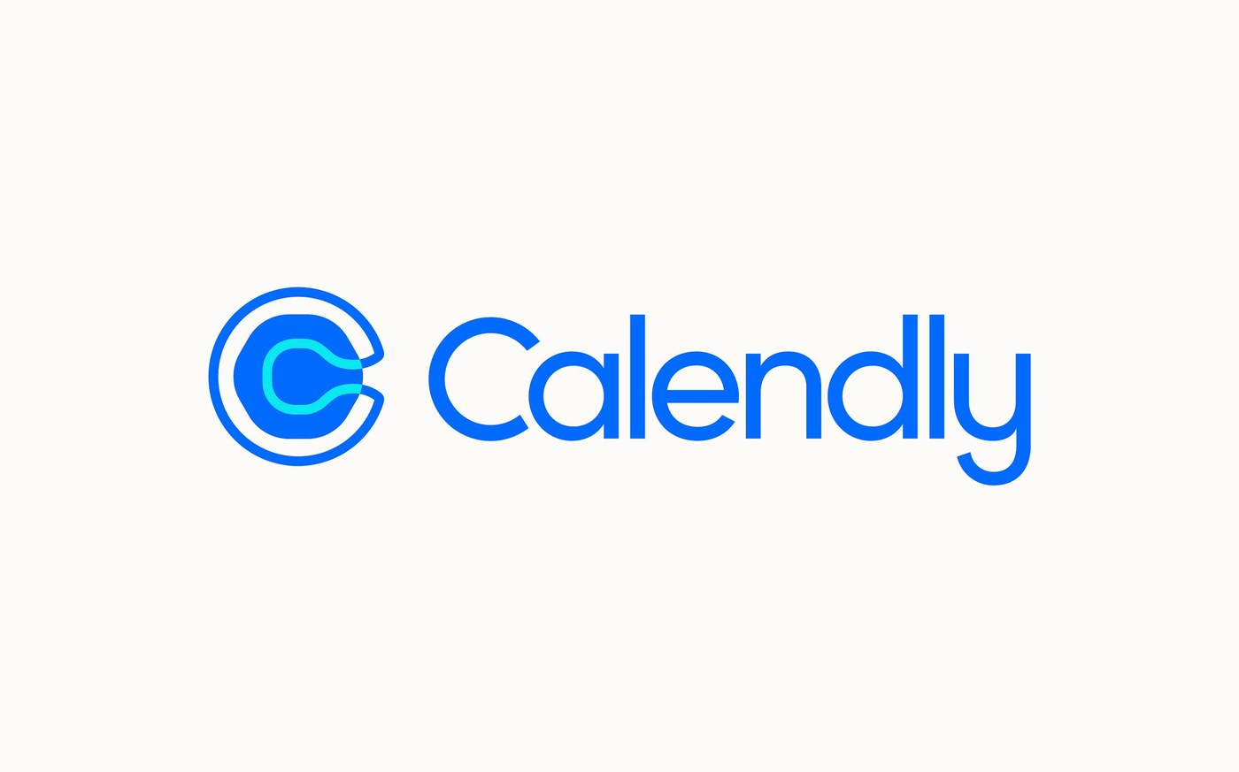
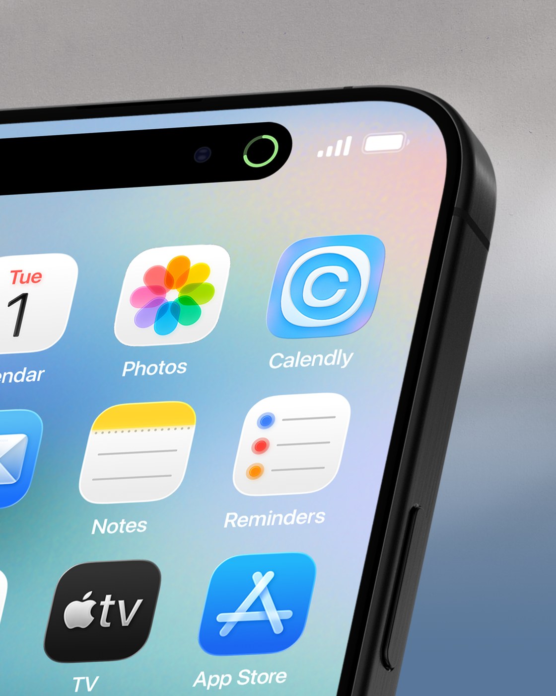
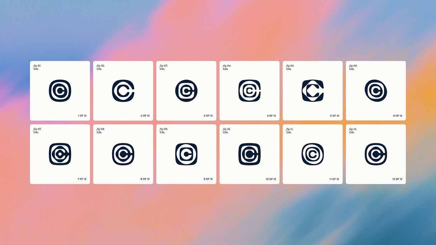
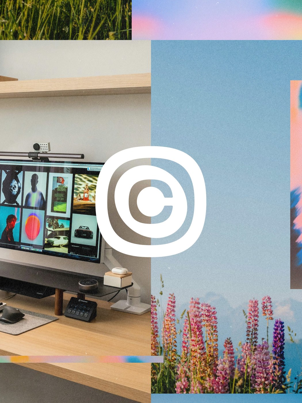
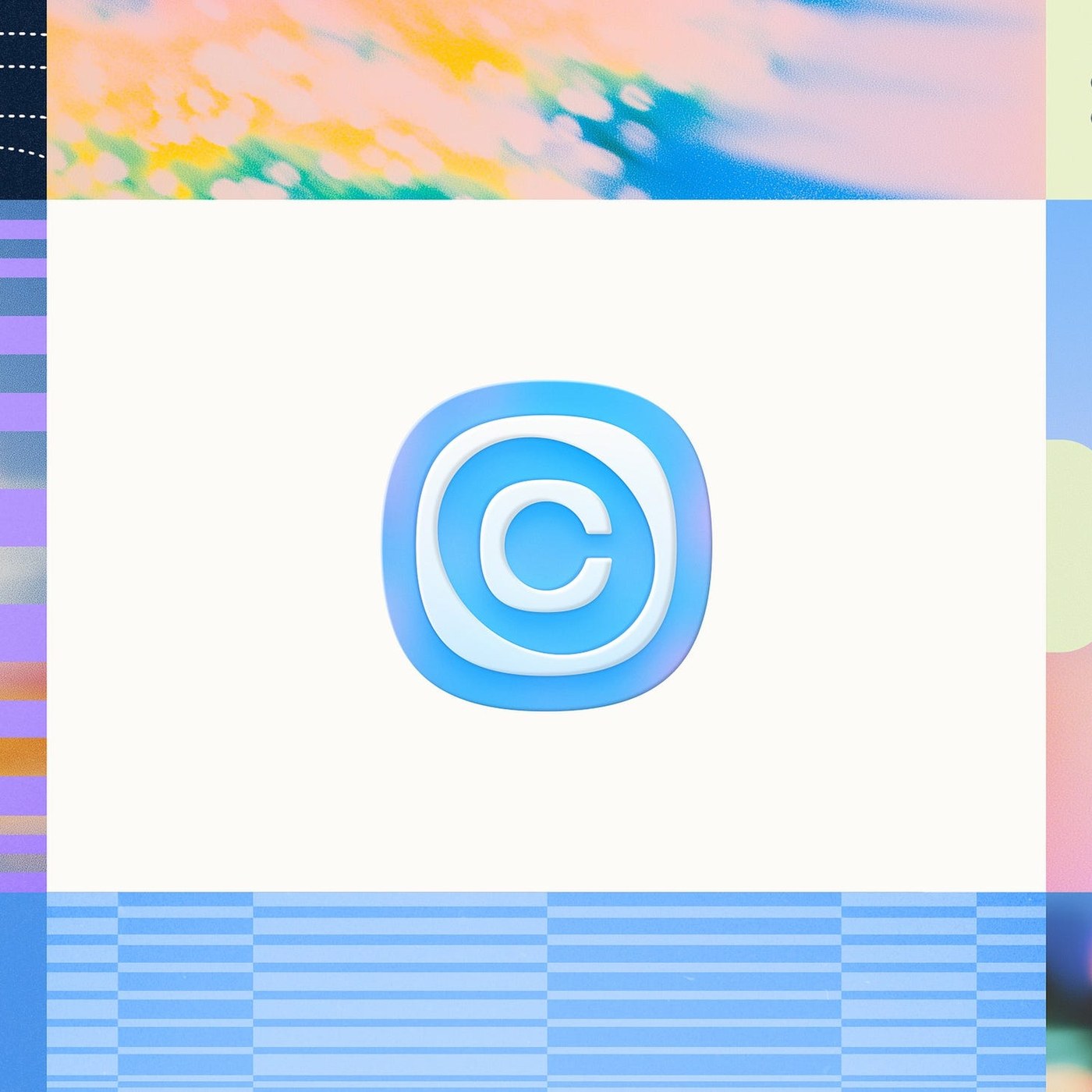
Calendly evolved well past its origins as a basic booking link into a comprehensive meeting platform. To reflect this shift, Philadelphia design studio Smith & Diction built an expansive brand identity centered on making space in the workday. The previous generic calendar glyph gave way to an asymmetrical monogram that functions as a continuous ripple effect inside an offset squircle container. Paired with this dimensional symbol is a custom wordmark crafted in collaboration with Gavin Potenza, featuring deliberate micro-connections linking characters such as the initial loop into the adjacent stem. The refreshed palette pairs deep navy and electric cyan with crisp paper white, giving digital workflows clear optical contrast without unnecessary visual clutter.
Typographic Hierarchy and Modular Flex Bubbles in Brand Identity
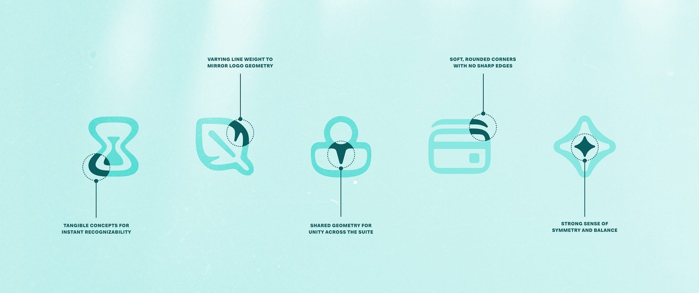
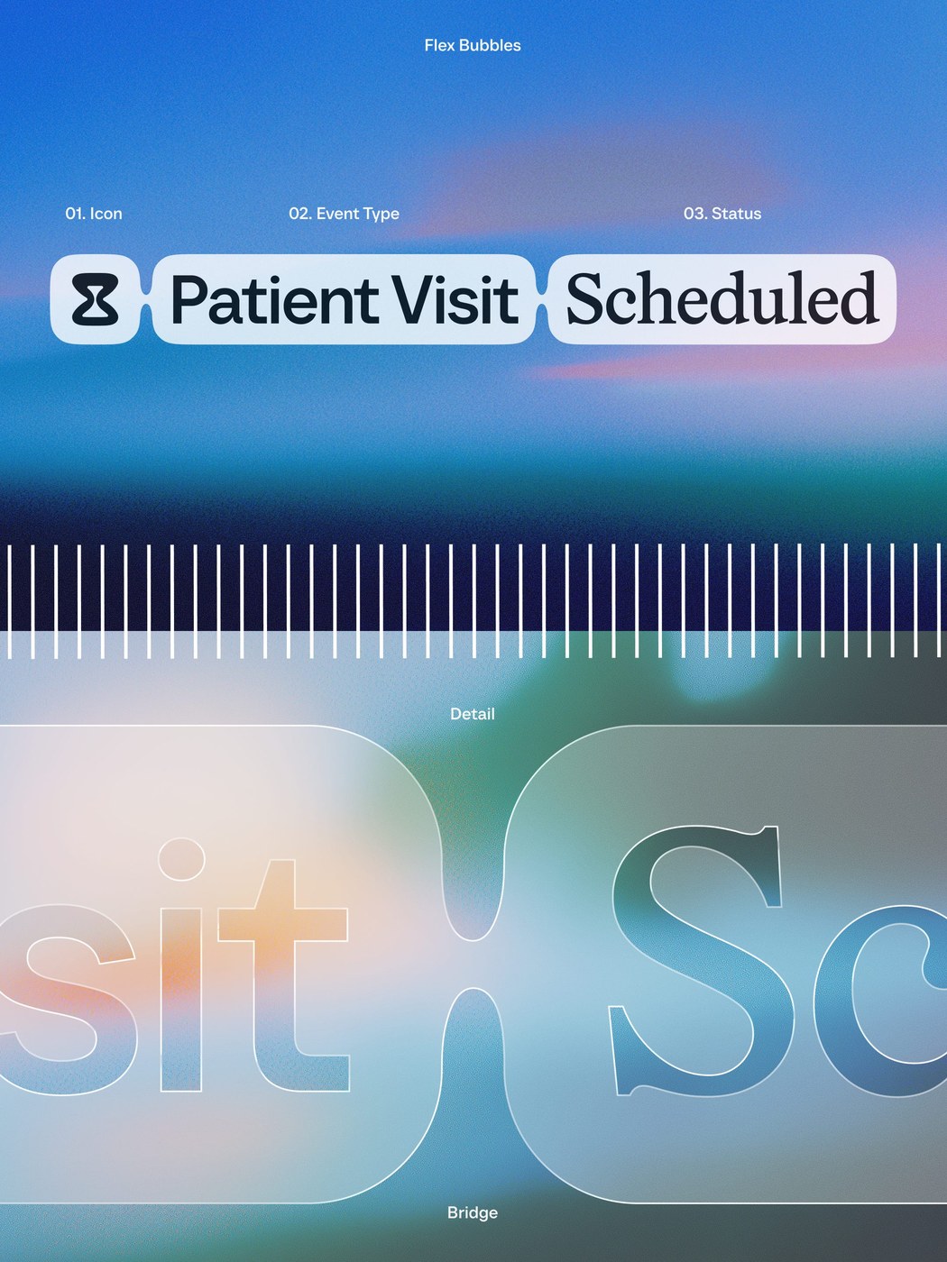
A central challenge in enterprise software branding is maintaining expressive character across high-utility digital surfaces. Within this brand identity, typography carries that weight through a disciplined three-tiered editorial structure. Smith & Diction paired TT Neoris from TypeType for display headlines with Wulkan Display for warm editorial pacing, while anchoring dense product interface metadata with Geist from Vercel. For feature naming and campaign messaging, the team developed the flex bubble system: rounded pill forms connected through organic gloop radii that expand dynamically around variable headline copy in Figma and Rive. This fluid geometry directly informs the subbrand icons, establishing visual cohesion across complex digital workspaces.
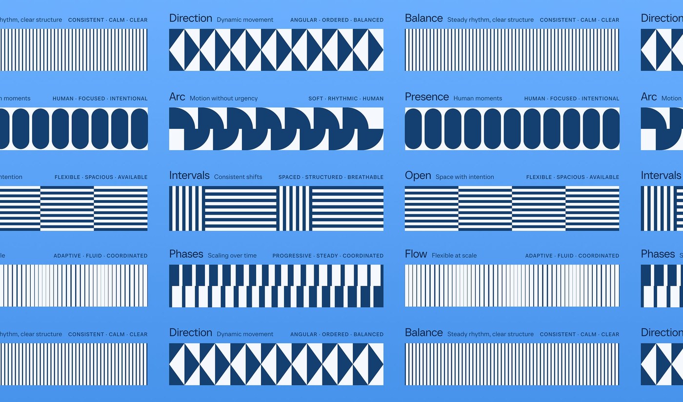
Beyond static application layouts, the brand identity introduces an abstract pattern language derived directly from calendar time blocks. Categorized into distinct vector motifs including Balance, Direction, Intervals, and Flow, these rhythmic forms scale effortlessly across large-format billboard displays and interactive web touchpoints. Micro-interactions utilize soft easing curves to guide users through meeting confirmations, schedule changes, and team availability settings. The finished visual language balances enterprise reliability with approachable human personality, demonstrating how rigorous graphic design and typographic restraint can bring structure to modern digital productivity tools.
See the complete case study by Smith & Diction.