Brand Identity: Newcastle United Crest, Redesigned by Fans
The new Newcastle United crest is a fan-voted brand identity evolution, refining 38 years of civic heritage for screens, shirts and signage.
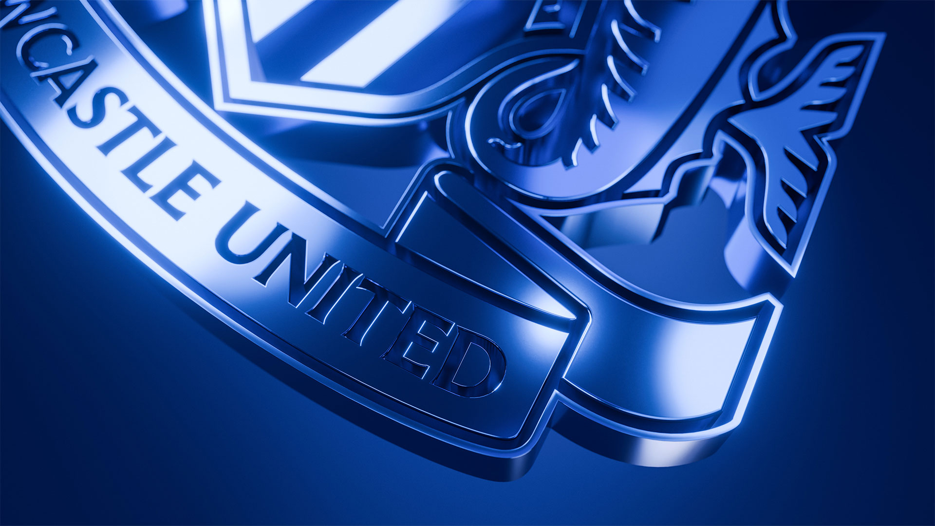
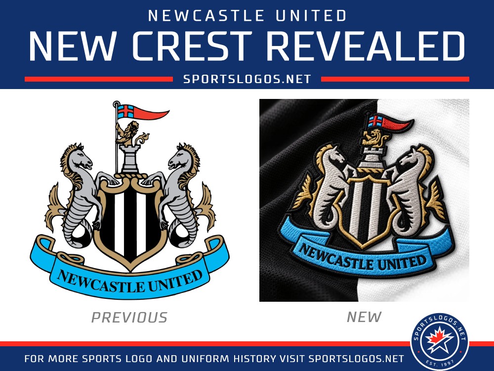
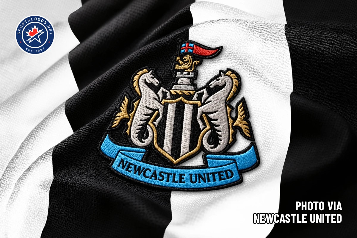
On October 1, Newcastle United unveiled the first change to its club crest since 1988. After a two-year process, the update keeps every element supporters recognize — the castle, the black-and-white striped shield, the twin hippocampi, the golden lion holding a St George's pennant, the ribbon carrying the club name — and redraws them with sharper, more deliberate linework. Nothing was changed simply because it could be: 84 percent of surveyed supporters asked the club to update the existing badge rather than replace it, and the final design honors that instruction. The result reads as a careful restoration of civic symbolism, tuned for the formats the 1988 original struggled with: phone screens, broadcast graphics and embroidered kits.
Newcastle United Crest: A Brand Identity Drawn by Its Supporters
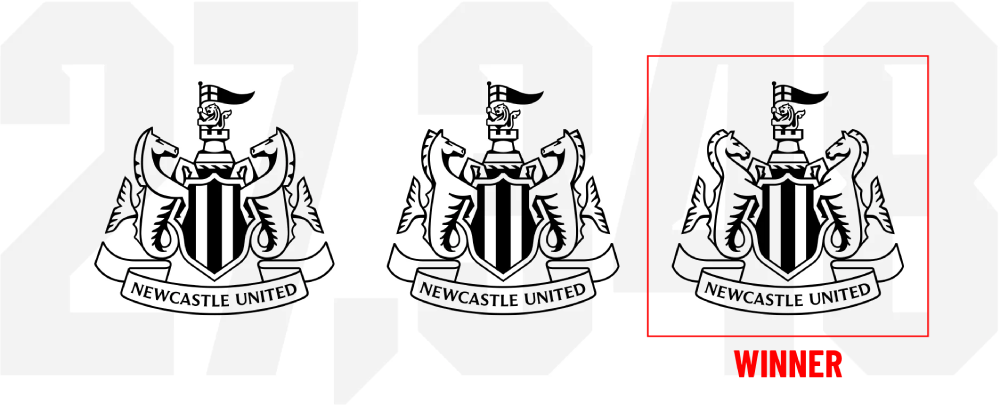
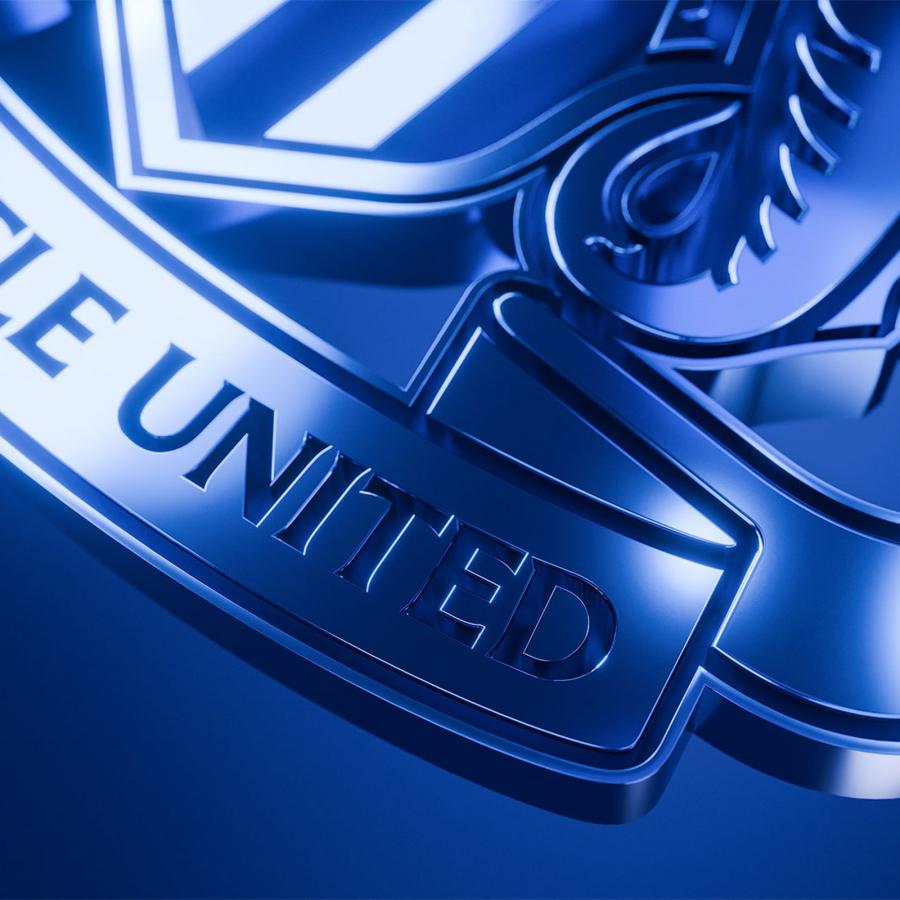
The redesign sits inside a wider design system that includes bespoke typography and a new secondary logo mark, built to carry the club's sporting and commercial ambitions over the coming decades. Refinement rather than reinvention drives the details: the lion stands more stately, the castle geometry tightens, and line weights have been recalibrated so the badge holds together at favicon scale and on stadium signage alike. Supporters chose between three final options in an independently administered poll held August 6–27. All three shared the same shield, banner, castle and lion, differing only in the hippocampi. The winner, Option C, took 64.8 percent of first-choice votes from 27,348 supporters, distinguished by rounder heads, more pronounced manes and less shading beneath the jaws.
The project was led by chief creative officer Kenneth McIver, a lifelong supporter who previously worked at Nike, under unusual public pressure — he describes two years of scrutiny from family, friends and a merciless group chat. That pressure produced something rare in football identity work: a redesign with a democratic mandate. The new Newcastle United crest enters use immediately across digital channels, rolls out across physical signage and broadcast over the coming months, and reaches the kits for the 2027/28 season, with a first matchday shirt appearance slated for the final home fixture against Crystal Palace. For a club whose badge descends directly from the city's coat of arms, the message is continuity made legible. Heritage redrawn line by line until it works everywhere.
See the full story on the new crest at Creative Review.