Branding Design: W.T.VILLA by María Centeno
Discover the industrial branding design and tactile workwear identity for W.T.VILLA by María Centeno, featuring embroidery and geometric grids.
Developed in Buenos Aires by designers María Centeno and Ezequiel Cafaro Studio, W.T.VILLA—short for Welcome To Villa—is a comprehensive branding design and identity redesign for an Argentine heavy-duty workwear label. Commissioned under the creative direction of Lorena Olivieri and documented through the tangible photography of Mechi Bassano, the project rejects cosmetic fashion tropes. Instead, it engineers an uncompromising visual system tailored for intensive physical utility, heavy cotton twill substrates, and authentic artisanal manufacturing.
Dual-System Architecture: The Polysemic Knot Monogram and Stencil Logotype
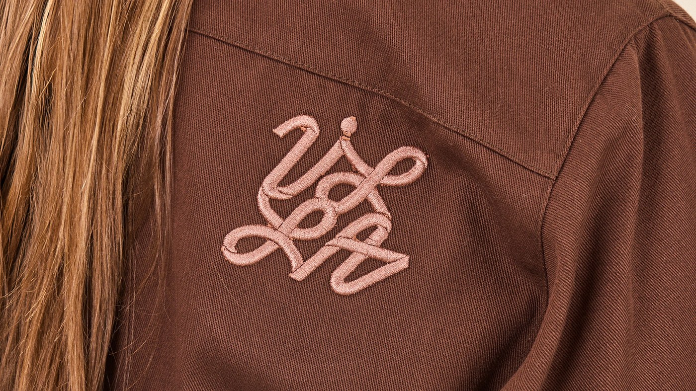
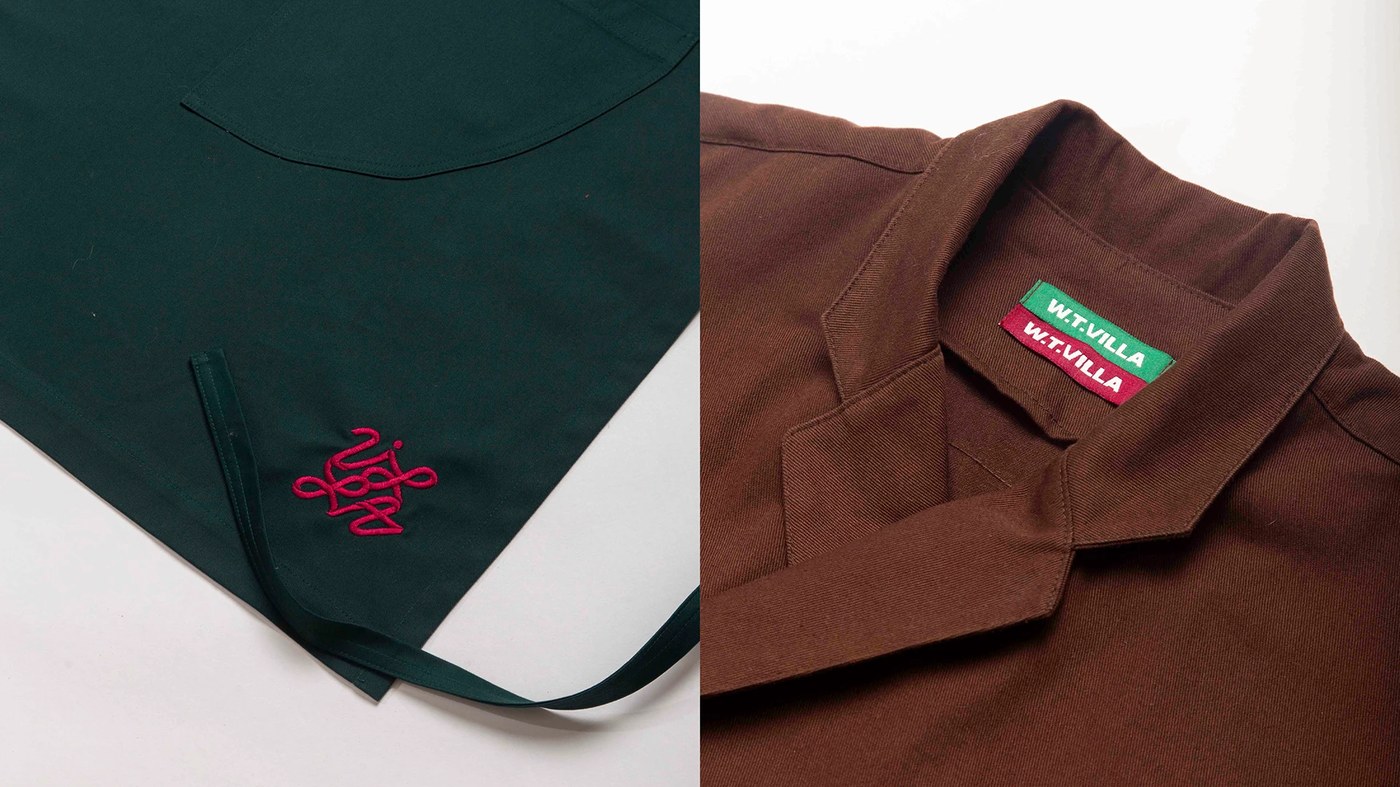
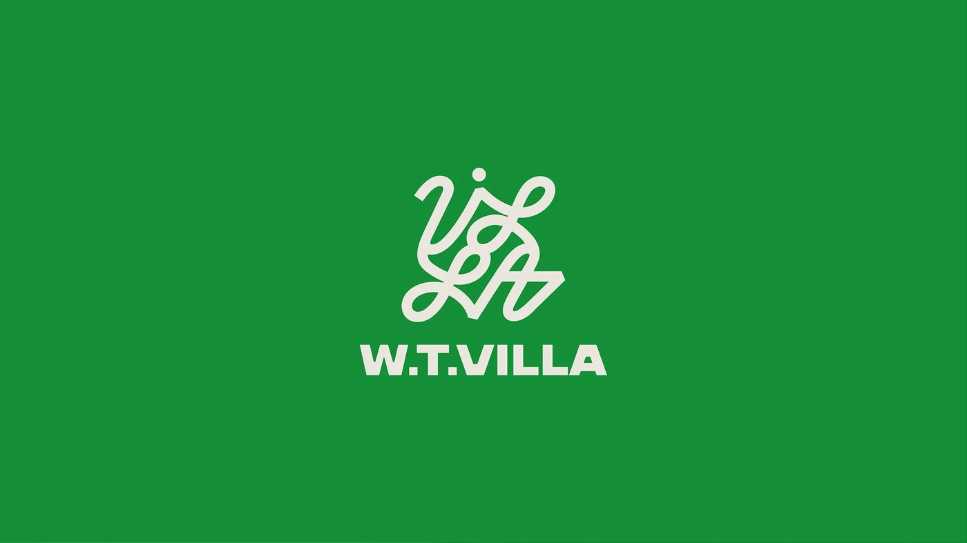
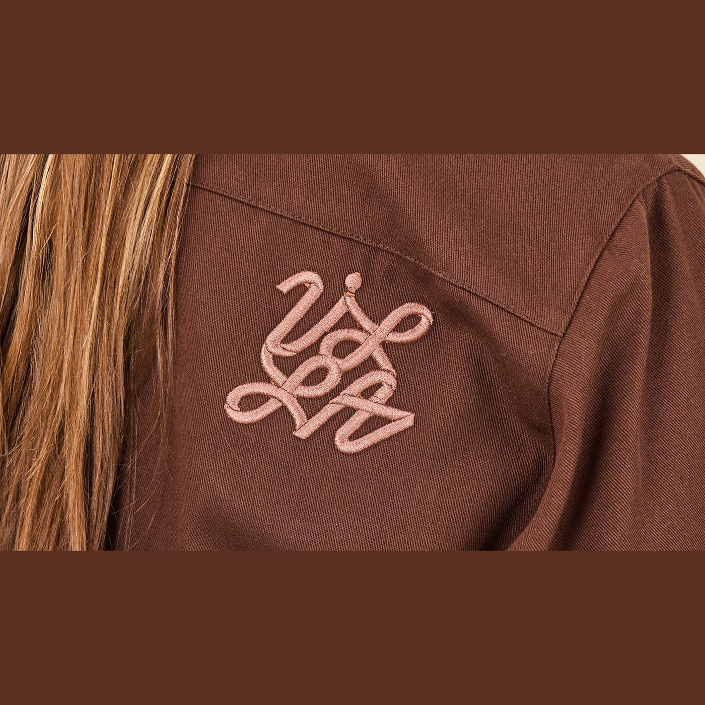
The visual identity operates through two independent yet complementary components designed to scale across different media. The primary brand anchor is a continuous, polysemic monogram that shifts dynamically between a nautical knot, an infinity loop, and an architectural labyrinth. Applied directly onto heavy chore jackets and utility aprons through dense satin-stitch embroidery in soft copper-rose thread, this tactile symbol brings sculptural relief to durable workwear garments.
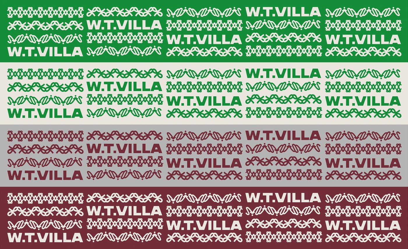
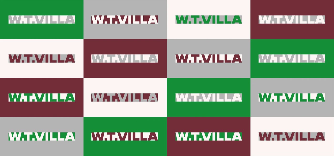
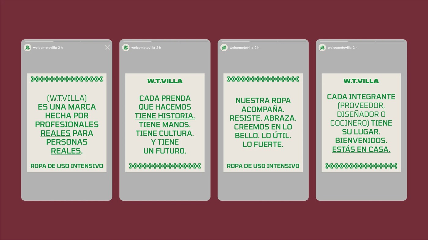
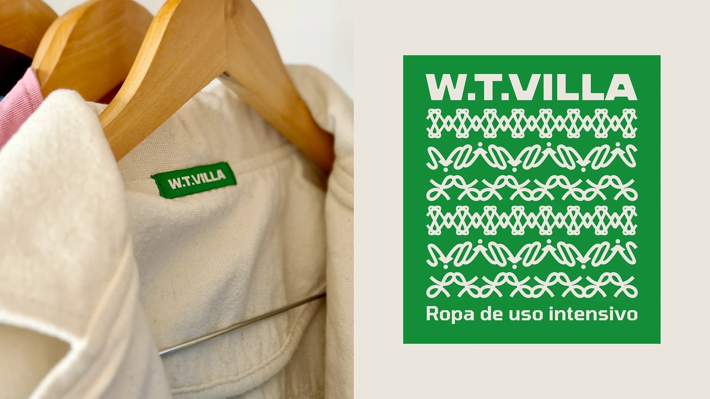
In contrast, the nominal logotype features a bold, extended geometric grotesque sans-serif punctuated by precise horizontal stencil incisions. This structured wordmark anchors technical collar tags, woven care labels, and informational catalog collateral. Woven jacquard ribbon trims translate the knot geometry into rhythmic decorative borders that frame editorial quotes and garment hems.
Utilitarian Materiality and High-Contrast Industrial Chromatics
The chromatic matrix pairs industrial utility with refined editorial discipline. A high-contrast quartet of Kelly Green, deep Burgundy Wine, concrete grey, and unbleached cotton off-white provides chromatic versatility across screenprinted shipping boxes, kraft paper packaging, and digital lookbooks. Garments constructed from heavyweight brown and slate-grey twill are framed by clean white borders and crisp bilingual typography detailing the brand manifesto: «Ropa de uso intensivo».
See more branding design and visual identity work on the Behance project page or check out María Centeno and Ezequiel Cafaro Studio.