Why it’s time to take ugliness seriously
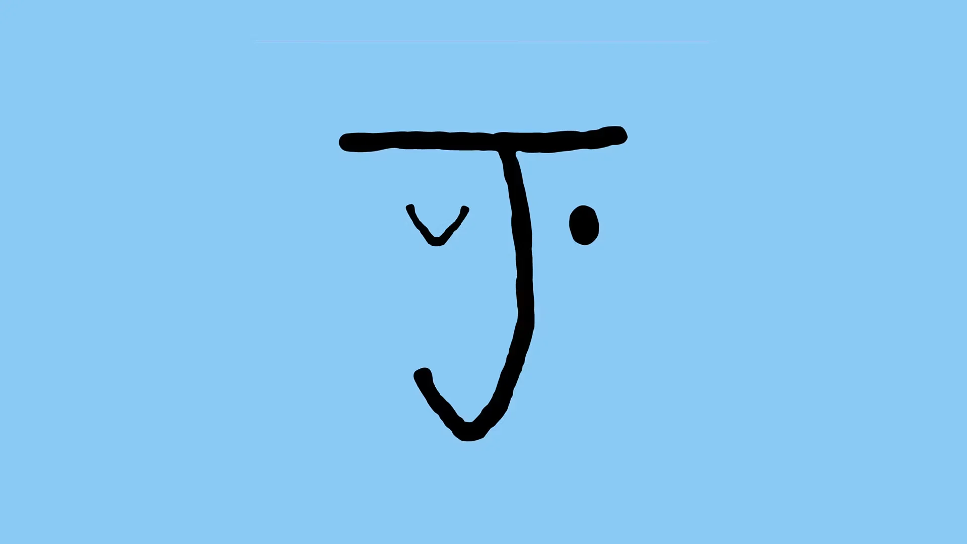
The trend for brands using hand-written fonts and messy aesthetics is more than just fashion, it’s a reaction against big tech and AI, says Kyle Raymond Fitzpatrick, author of the Trend Report newsletter
16/07/2026 9:25 am
Seven years after Jolene first launched in London, it is gaining global attention for reasons beyond its food. With five bakeries and three restaurants across the city, its Shoreditch location on Redchurch Street has become a cultural bullseye.
Opened in 2021, its dusty pink brick exterior and scrawled logo evoke a warm human touch extended through speckled Carmel Eskell ceramic cups and wooden accents to display sweets. All of this is designed to appeal to those wielding phones, seeking to see and be seen at such an aesthetic spot.
But it’s the Studio Frith logo that has caused the most commotion, given that it evokes an appealing messiness associated with childhood. This is intentional, as the restaurant’s founder Jeremie Cometto-Lingenheim has noted.