Poster Design: Follow the Dot by Molnár Péter
Molnár Péter explores geometric tension, modular calligraphy, and chromatic discs in his experimental poster design series Follow the Dot.
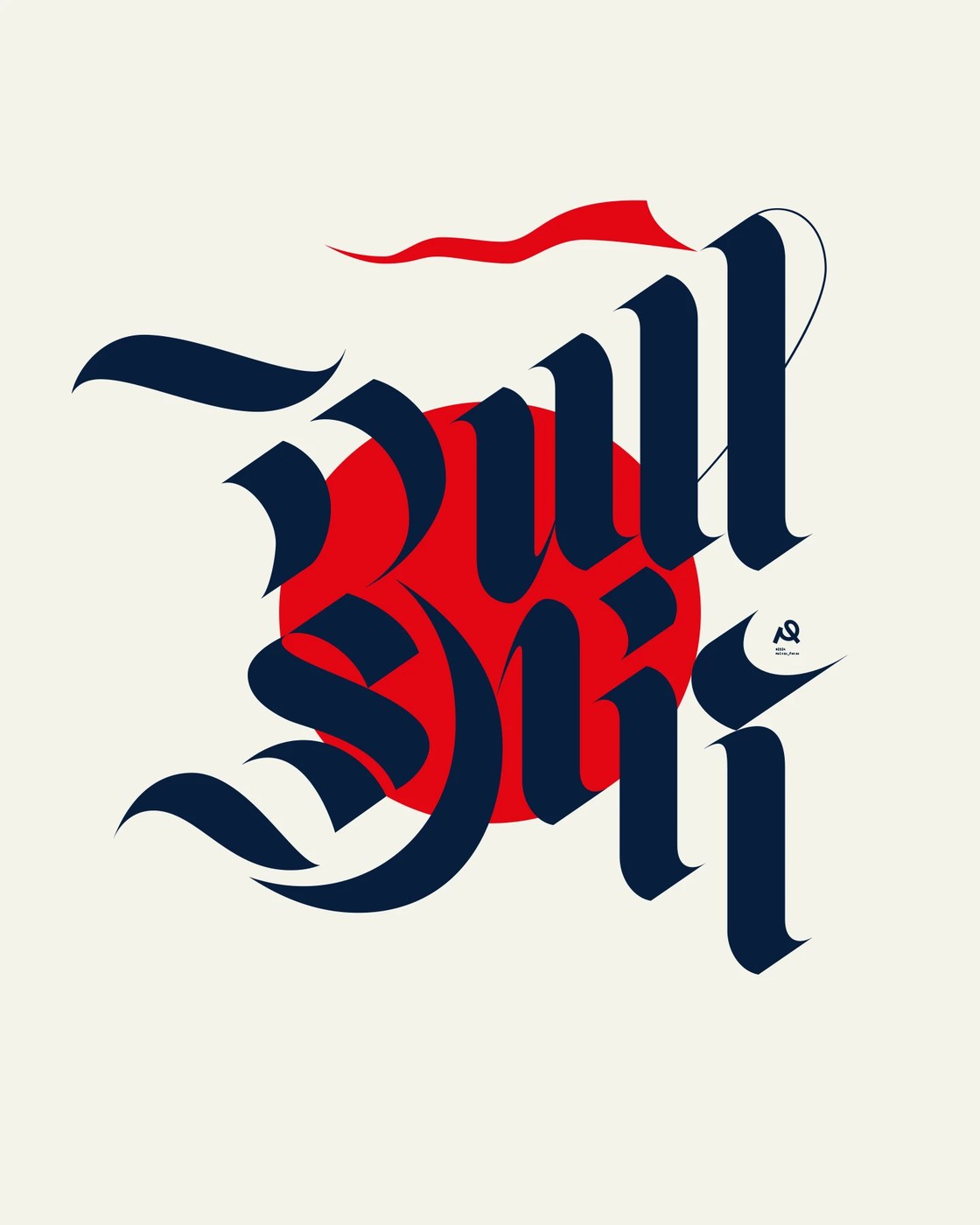
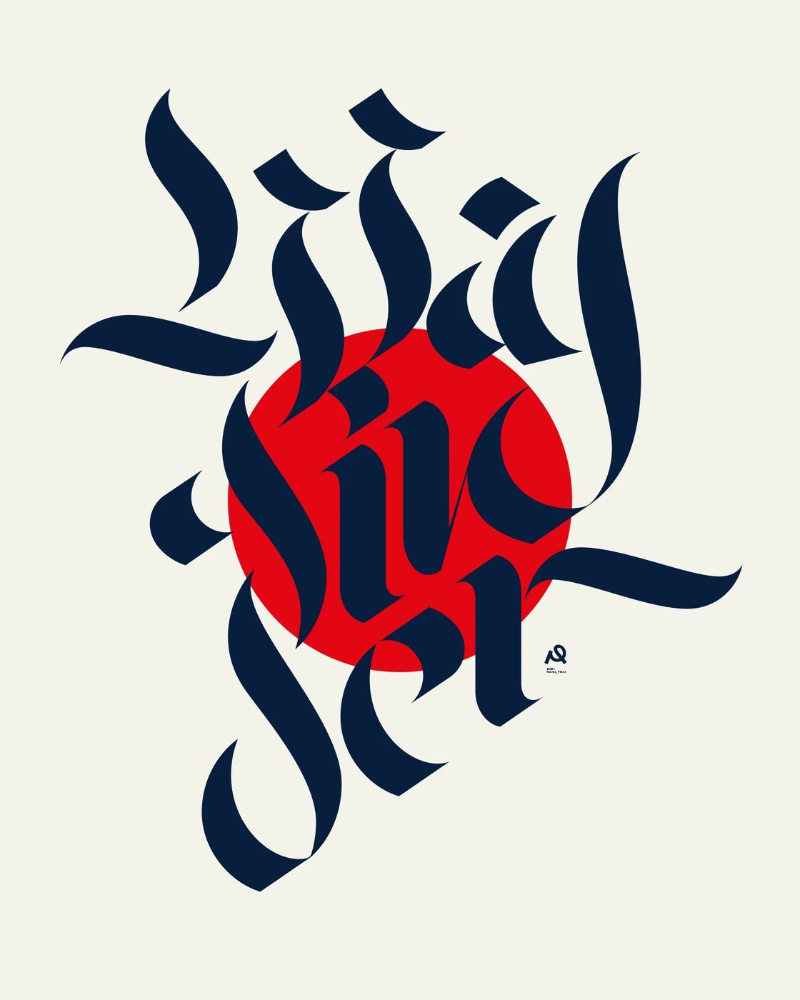
Molnár Péter constructed the collection as an exploratory laboratory investigating how historical letterforms collide with pure geometric anchors. The defining motif throughout the work is the singular graphic disc—a saturated crimson circle or soft circular plane that provides an optical anchor amidst dynamic typographic energy. In pieces like the fractured gothic composition set over a fiery red sun and the multi-layered modular letterform studies, the contrast between dark broad-nib strokes and pure circular geometry generates intense visual tension. Warm cream backgrounds, deep midnight navy inks, and saturated cadmium reds establish a high-contrast chromatic system rooted in both classic printmaking and modern graphic discipline.
Modular Typography and Optical Discs in Poster Design
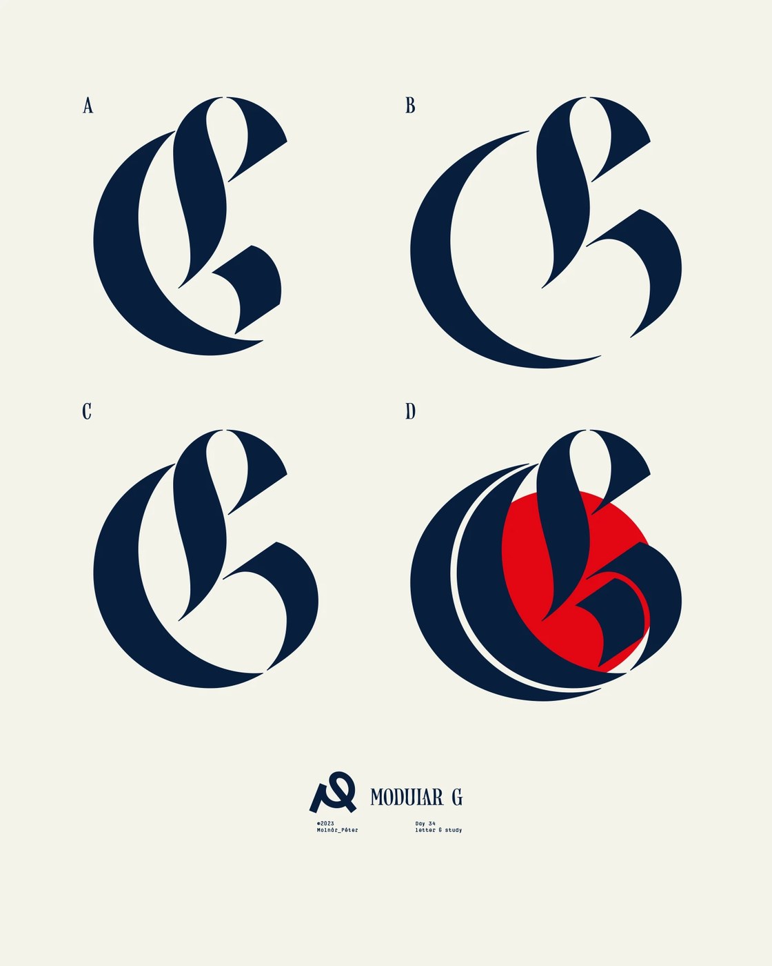
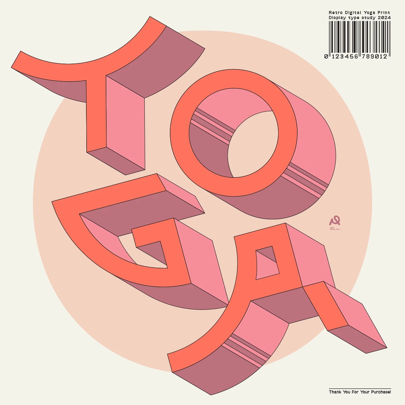
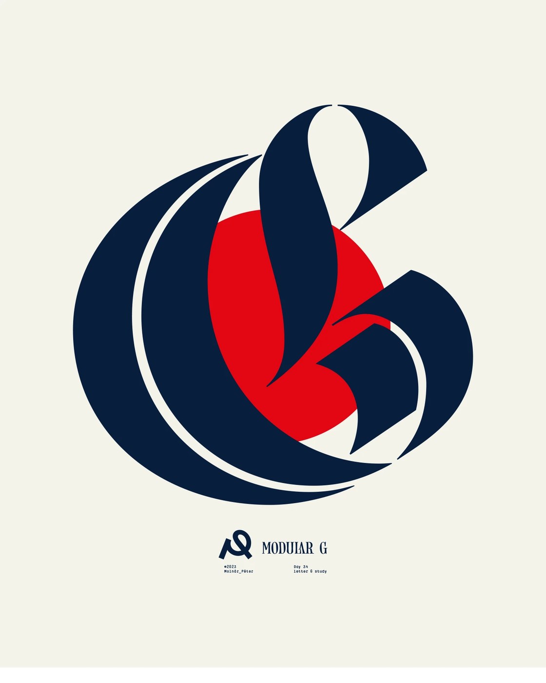
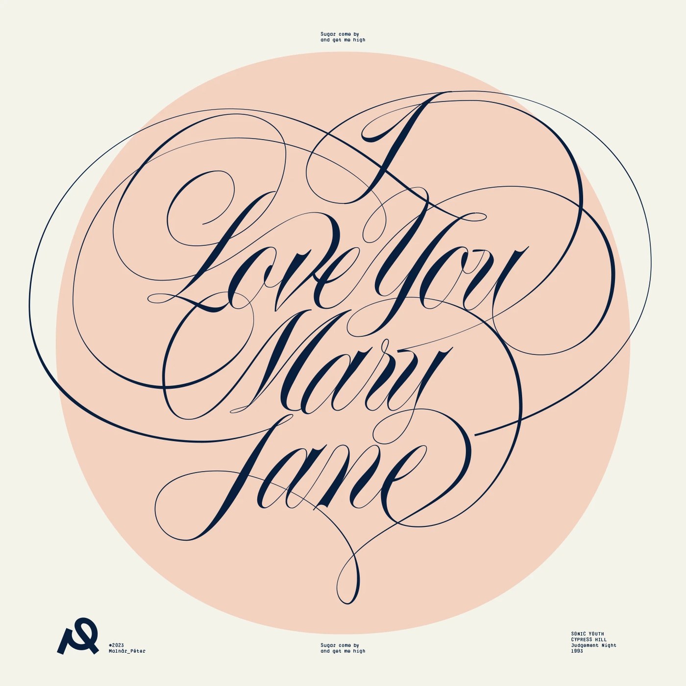
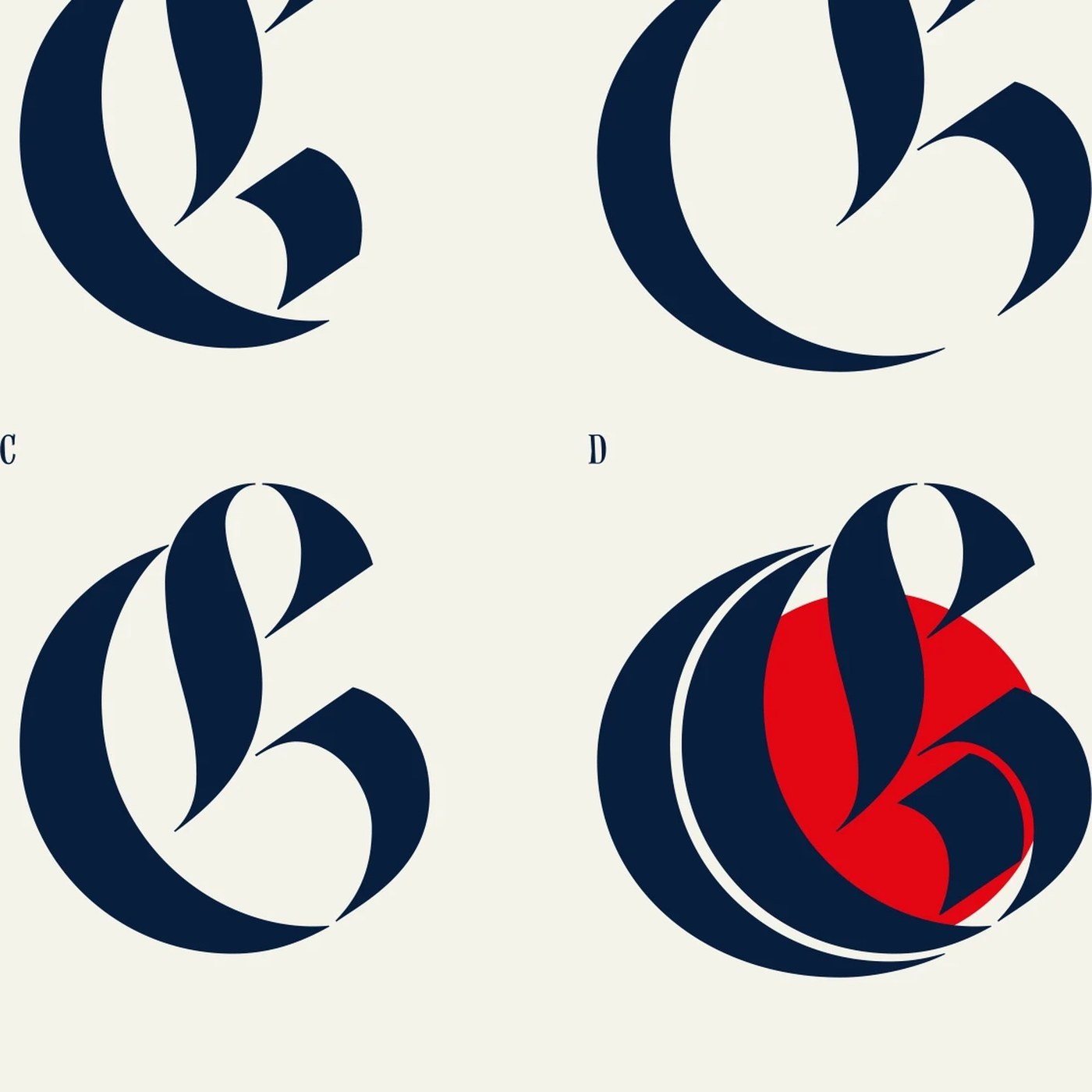
The series highlights Molnár Péter’s range across historical and contemporary letterform structures within the poster design framework. In the Modular G specimen, the Hungarian graphic artist deconstructs a blackletter majuscule across four iterative phases, analyzing how broad-nib calligraphic curves interact with sharp architectural terminals and geometric counter-forms before locking the glyph over a bold red disc. Elsewhere, three-dimensional isometric lettering emerges in the Retro Digital Yoga Print, where salmon-tinted letterforms project outward with deep extrusion shadows against circular backdrops. Hairline Spencerian script flourishes in I Love You Mary Jane demonstrate calligraphic control, while tight modernist metadata and barcode grids ground the compositions with clinical typographic discipline.
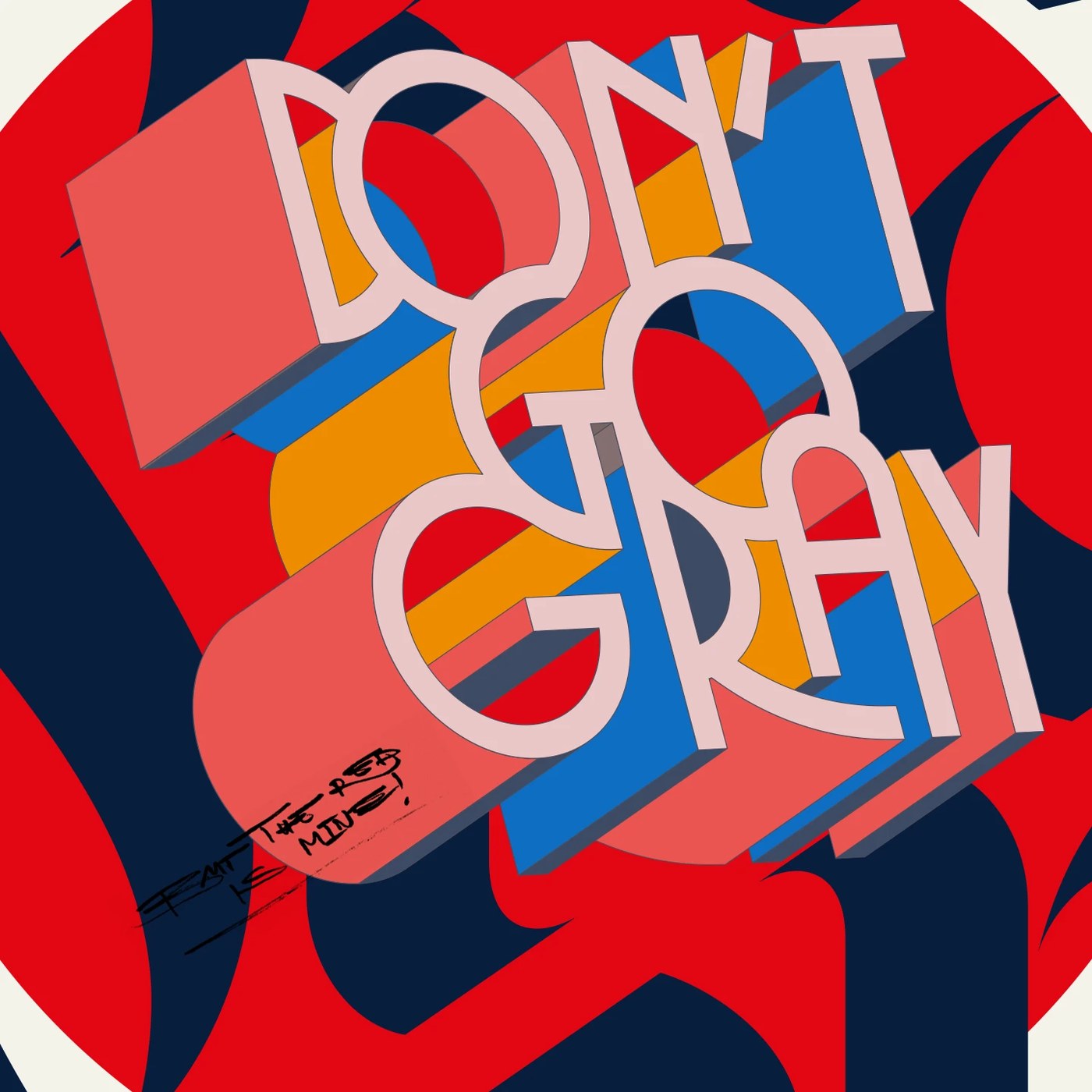
Molnár Péter achieves dimensional presence through controlled vector shading and print-inspired surface restraint. In the sculptural 6ERS and Don’t Go Gray compositions, heavy isometric blocks and layered color planes mimic the density of silkscreen production, where opaque pigments overlap with mechanical precision. Handwritten studio annotations like "The red is mine!" and precise date stamps introduce authentic workshop intimacy to the poster design collection. By balancing monumental glyphs with microscopic Swiss typographic notations, the sequence transforms individual letterform exercises into commanding visual artifacts built for exhibition walls.
See more from Molnár Péter on Behance.