Brutalist Typography: SL24 by Kseniya Artman
Explore brutalist typography in SL24 by Kseniya Artman, merging 12-column Swiss grids with industrial cargo telemetry and safety orange accents.
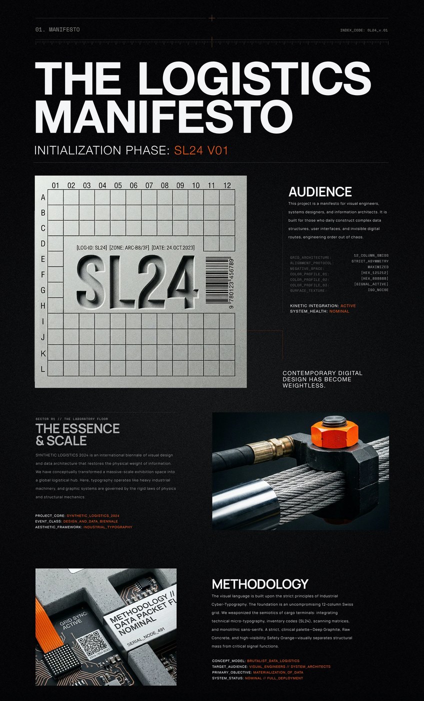
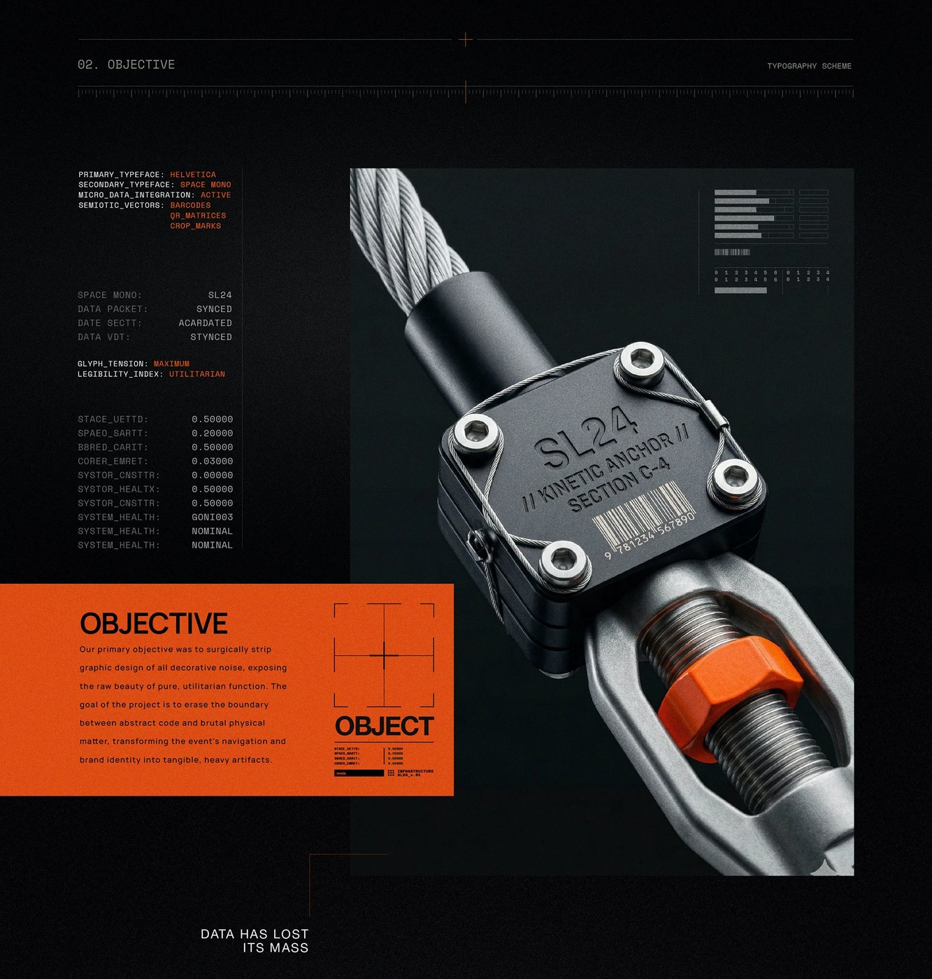
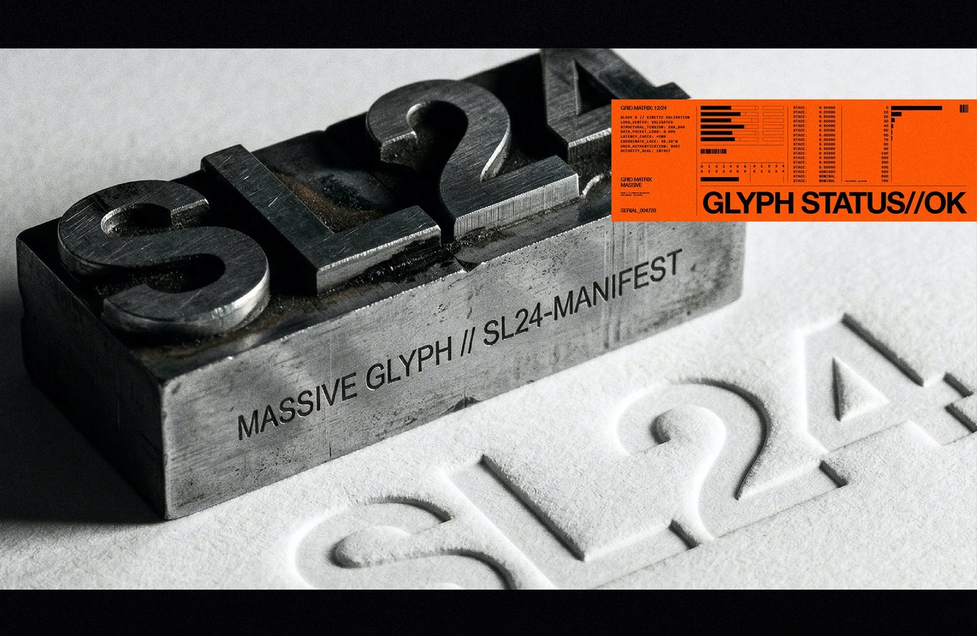
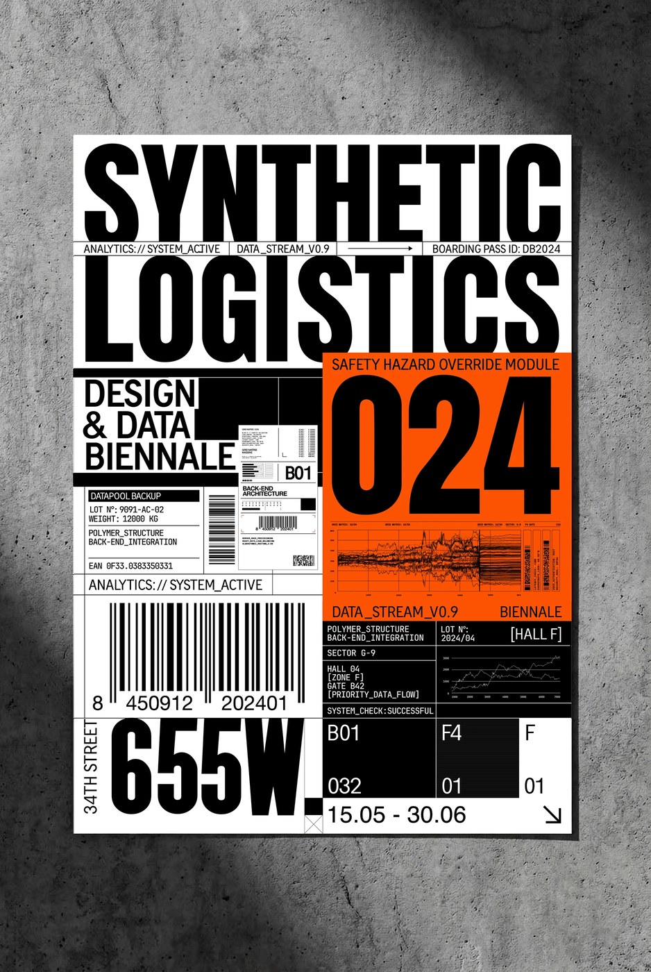
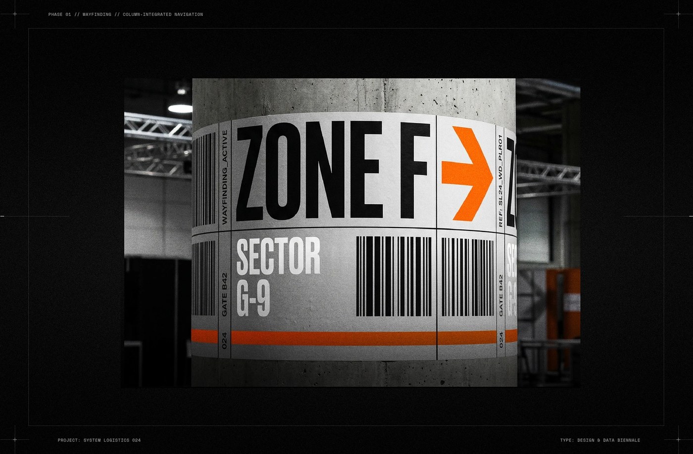
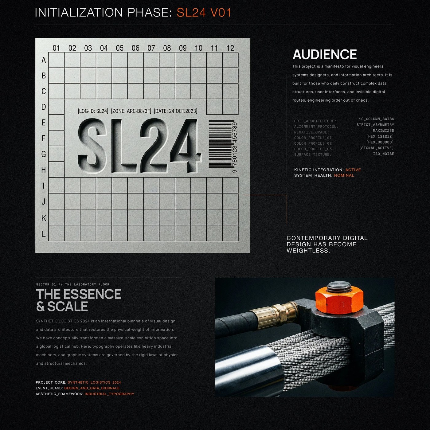
Berlin-based designer Kseniya Artman constructed this monumental brutalist typography system for Synthetic Logistics 2024 (SL24), a biennial exhibition exploring visual engineering and data architecture. Confronting the weightlessness of contemporary screen design, the conceptual identity treats raw data as physical cargo governed by structural mechanics and kinetic tension. Artman envisioned the exhibition hall as a massive freight hub, where letterforms function like heavy industrial equipment rather than passive body copy. Through an uncompromising aesthetic of clinical brutalism, the graphic system weaponizes the visual language of intermodal transit terminals, restoring tangible mass and structural gravity to complex algorithmic information streams.
Industrial Data Architecture and Brutalist Typography
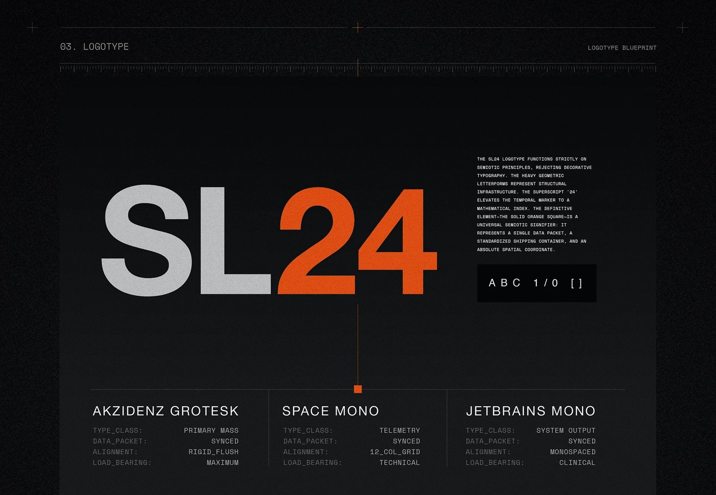
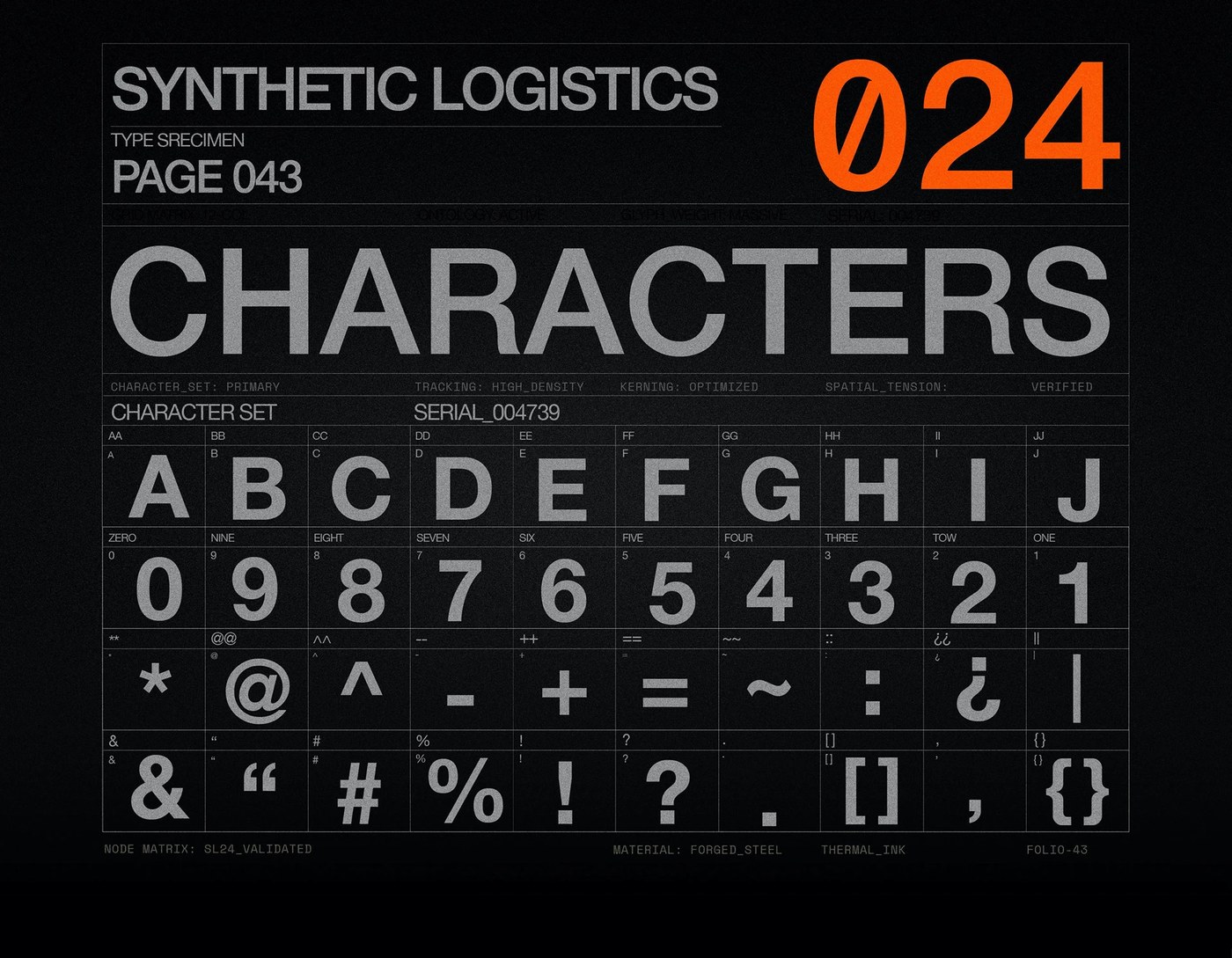
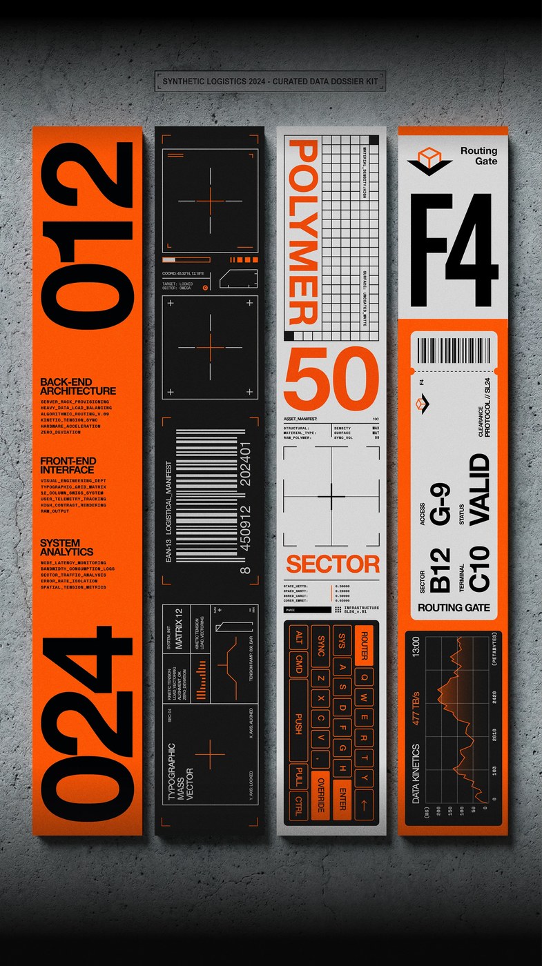
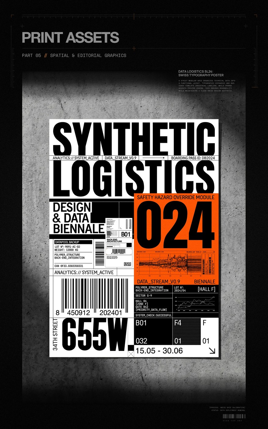
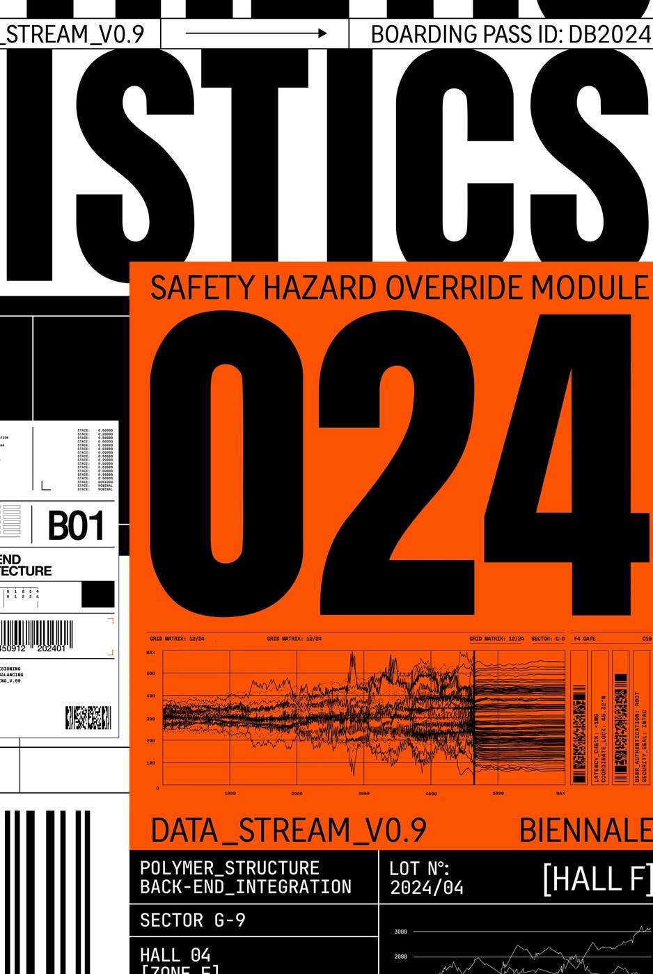
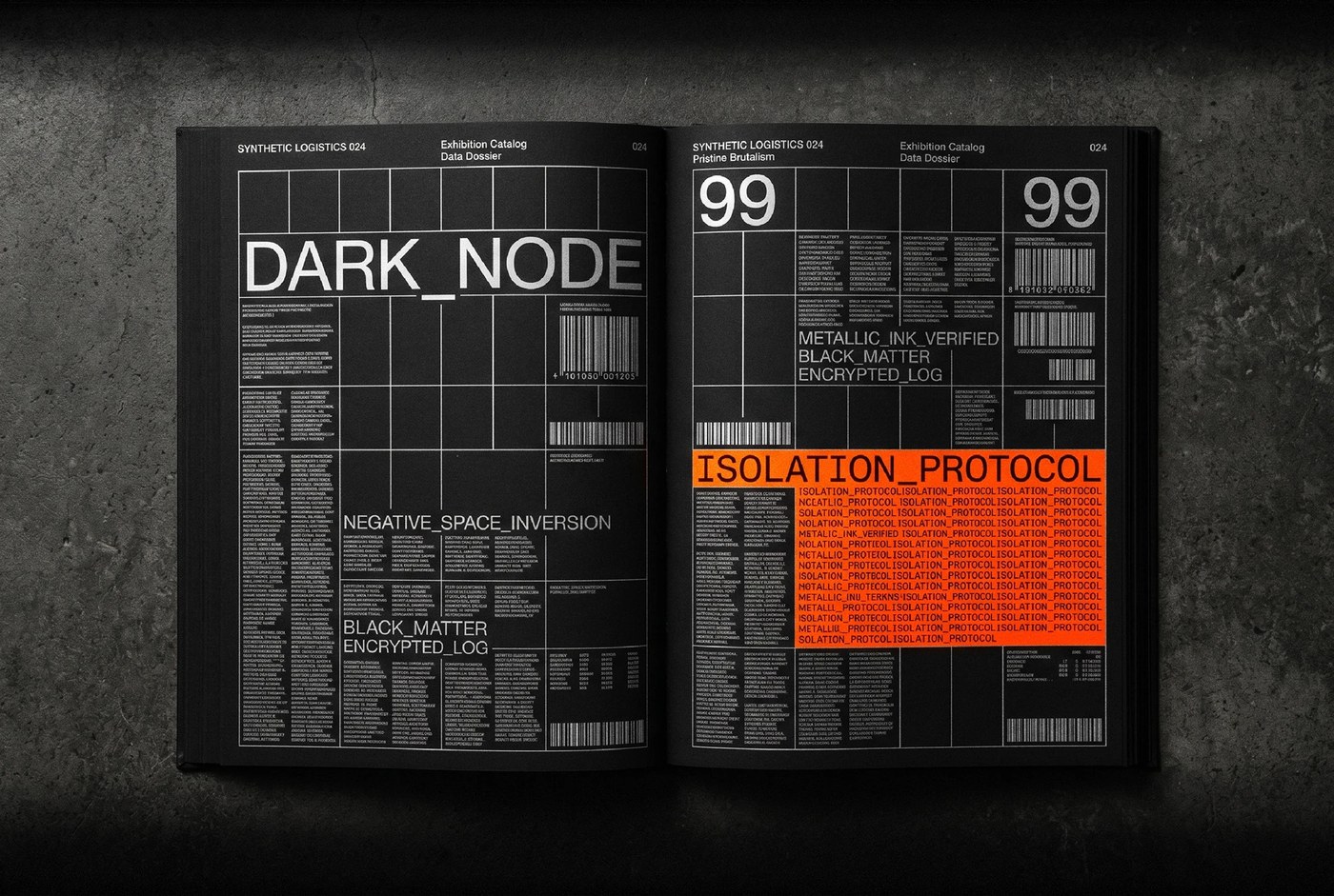
The brutalist typography achieves intense visual tension through scale disparity and rigid grid alignment. Built upon an exacting 12-column Swiss grid, the compositions position massive, condensed sans-serif glyphs against minute technical telemetry. Alphanumeric inventory codes, scanning matrices, barcode modules, and directional transit markers operate as precision graphic ornaments. Massive numerals push directly against outer margins, establishing dominant focal points that contrast with dense blocks of tabular metadata. The deliberate collisions between heavy vertical strokes and hairline coordinate axes create an architectural cadence, turning technical specifications and cargo manifests into commanding display posters that command immediate attention across distant viewpoints.
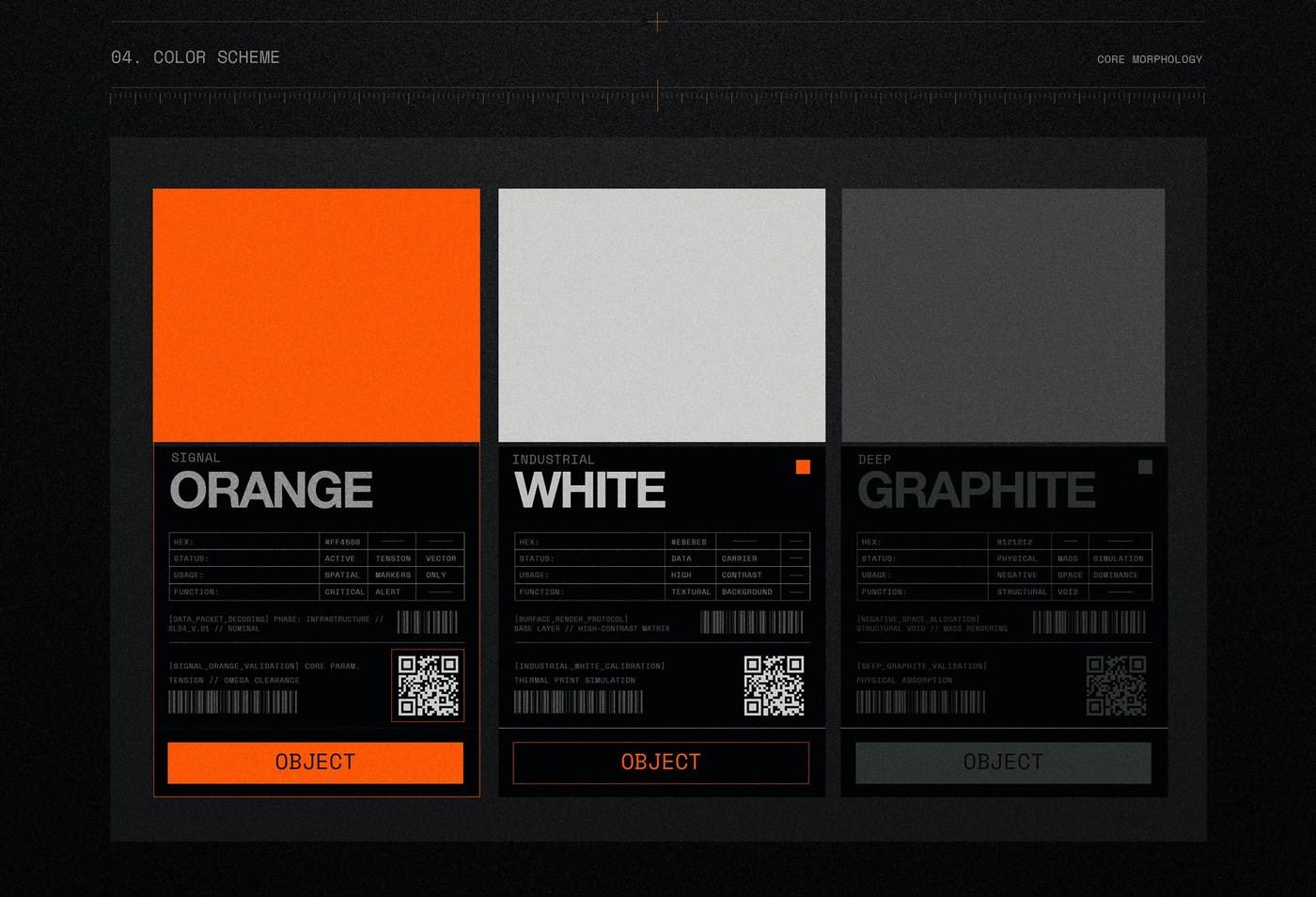
A strictly functional color profile reinforces the industrial severity of the project. Deep graphite fields absorb the background void, cold steel greys and raw concrete tones provide physical density, while fluorescent safety orange serves as an optical isolator for critical data warnings. Produced using Adobe Illustrator, InDesign, and Photoshop, the identity translates smoothly across screenprint manifestos, architectural monoliths, and digital terminal interfaces. Through this speculative visual engineering, the brutalist typography transforms exhibition ephemera into durable artifacts, demonstrating how forensic information design and heavy industrial semiotics establish a formidable contemporary graphic voice.
See the full project by Kseniya Artman on Behance.