Originbiotics Packaging by Maja Regula
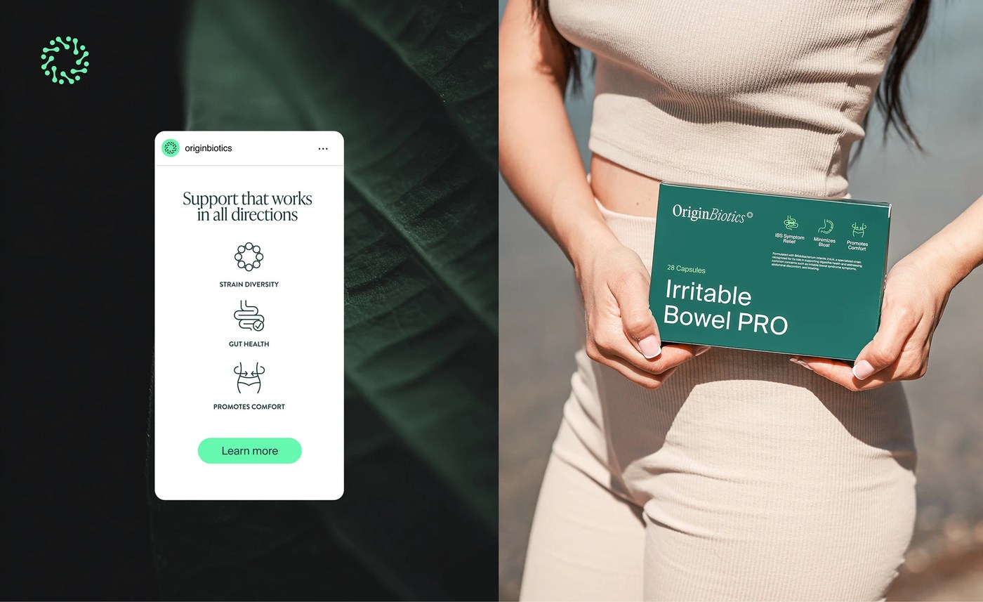
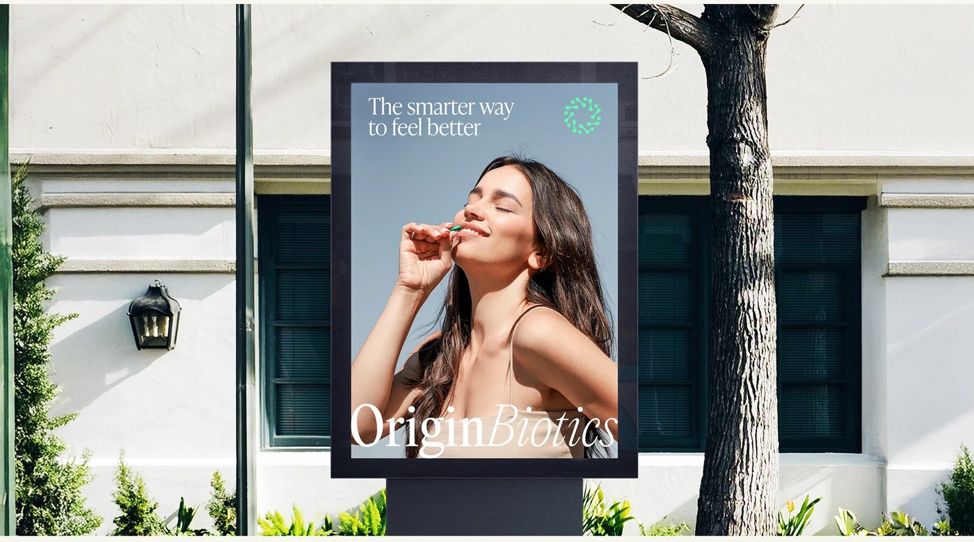
Originbiotics packaging design by Maja Regula balances scientific precision with a calm, deep green palette and minimal typography.
Maja Regula designed the identity for OriginBiotics, a probiotic supplement brand focused on clarity and precision. This originbiotics packaging system is anchored by a deep forest green color, which brings an organic yet professional feel to the supplement line. Minimal labels with strict vertical grids structure the technical details on each bottle. White and black accents provide clear contrast against the dark green background, creating a visual rhythm that feels clinical yet highly accessible. The packaging avoids typical wellness tropes, opting instead for structural simplicity and material restraint. By focusing on clean layouts and a controlled palette, the bottles establish a strong shelf presence.
Originbiotics Packaging Systems
At the foundation of this originbiotics packaging is a disciplined typographic and grid hierarchy. By establishing rigid structural boundaries, the layout allows empty space and clean alignments to guide the viewer’s eye. The typography utilizes sans-serif letterforms in disciplined, highly readable sizes, organizing ingredients and dosage instructions into clear sections. Micro-metadata, such as product weight and clinical annotations, are positioned at the margins to preserve breathing room on the face of the bottles. This layout strategy ensures that all information is accessible at a glance, using grid lines to create logical separations between branding and technical data.
The design stands out in the wider landscape of originbiotics packaging, where specific material decisions matter more than loud branding. Each box and label is planned with high attention to physical finishes and texture. The tactile contrast between matte paper stock and the smooth glass of the containers highlights a refined approach to originbiotics packaging. By treating every element as part of a single ecosystem, the identity shows how sustained attention to structural grids can make clinical packaging feel human. This discipline is what distinguishes the wellness brand, shifting the focus from simple commercial labels to an integrated aesthetic experience.
See the full project by Maja Regula on Behance.