Kinetic Typography: Mat Voyce Animates PUMA’s Slogan
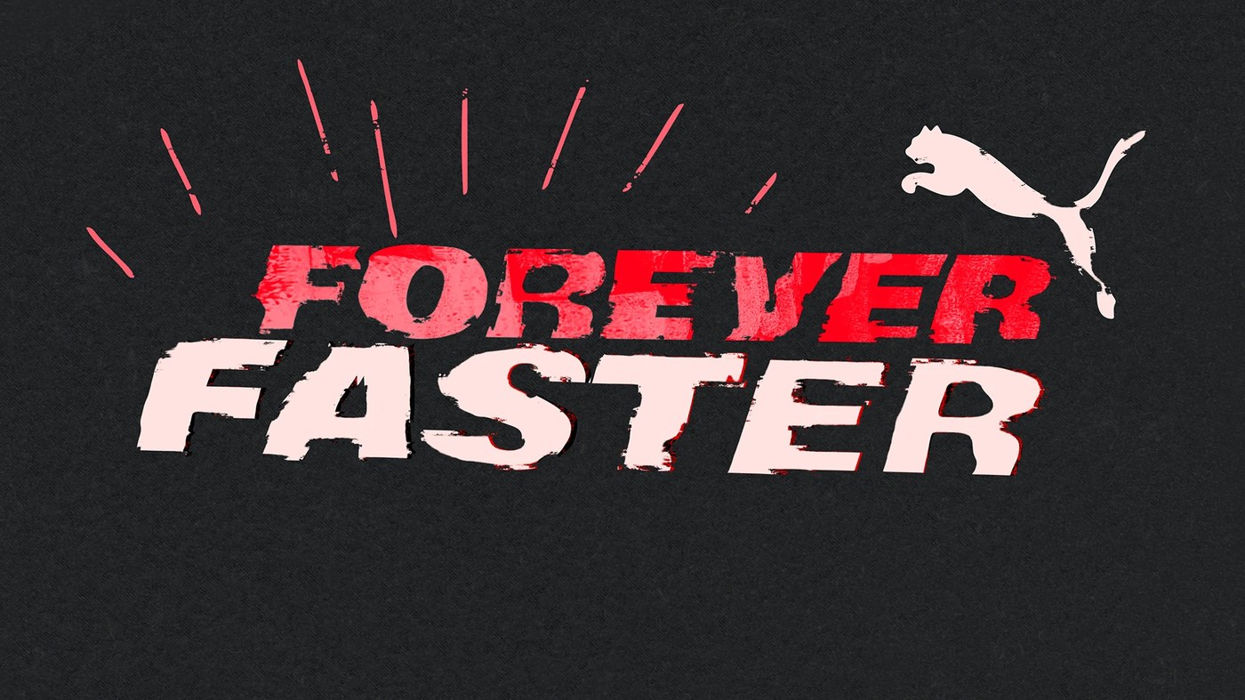
Mat Voyce uses kinetic typography to animate the PUMA slogan. The rough textured letterforms create dynamic athletic energy.
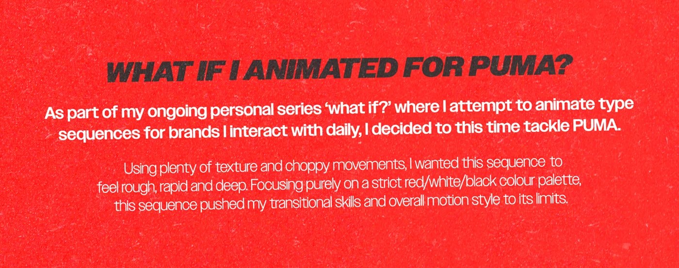
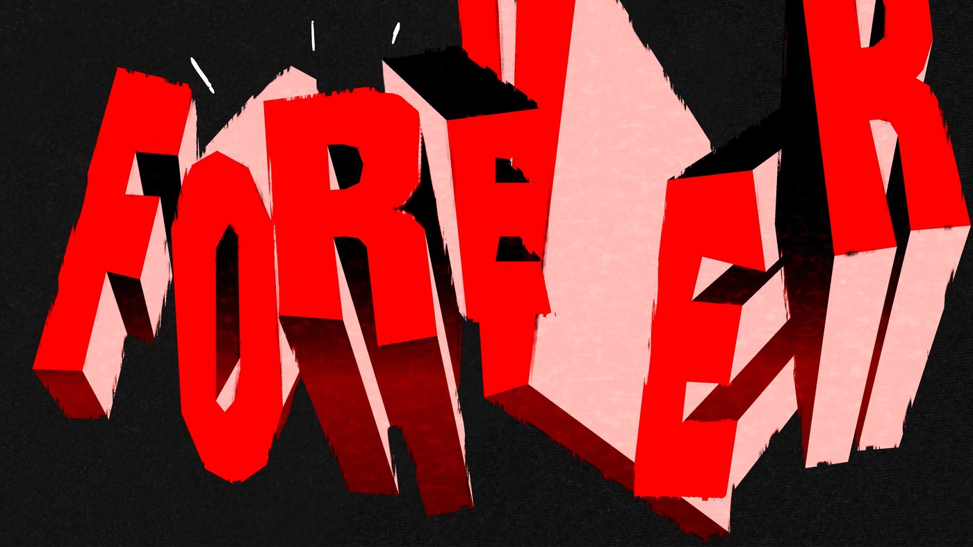
The independent British designer launched an experimental personal series. He selects daily brand touchpoints as creative playgrounds. This installment features the famous sports slogan. The animation sequence uses choppy movements to project raw velocity. Custom 2D path morphing shifts the letter shapes rapidly. This kinetic typography animation rejects smooth computer interpolation. The visual pacing feels manual and deliberate. Each character reacts to the next letter with organic weight. The designer builds compositional tension through off-center layouts. Bold geometric shapes frame the moving letters. The negative space acts as a structural anchor. Motion design works best when it feels alive. The choppy frames achieve this effect.
Kinetic Typography and Graphic Texture
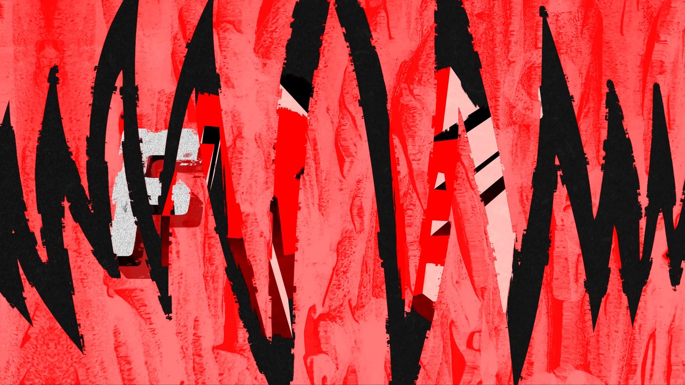
Voyce animates the letters on twos for a tactile tempo. This kinetic typography technique reinforces the rapid athletics theme. Stark black and off-white fields define the layout. High-contrast grunge textures fill the interior of each glyph. These organic layers offset the flat digital canvas. The structural hierarchy remains clean under the chaotic texture. Visual tension arises from the extreme scale shifts. Every frame mimics a screen-printed poster. The designer selects a restricted color palette. This chromatic restraint keeps the focus on the movement. Tactile paper grain overlays warm up the graphic presentation. Every detail suggests manual printing craft.
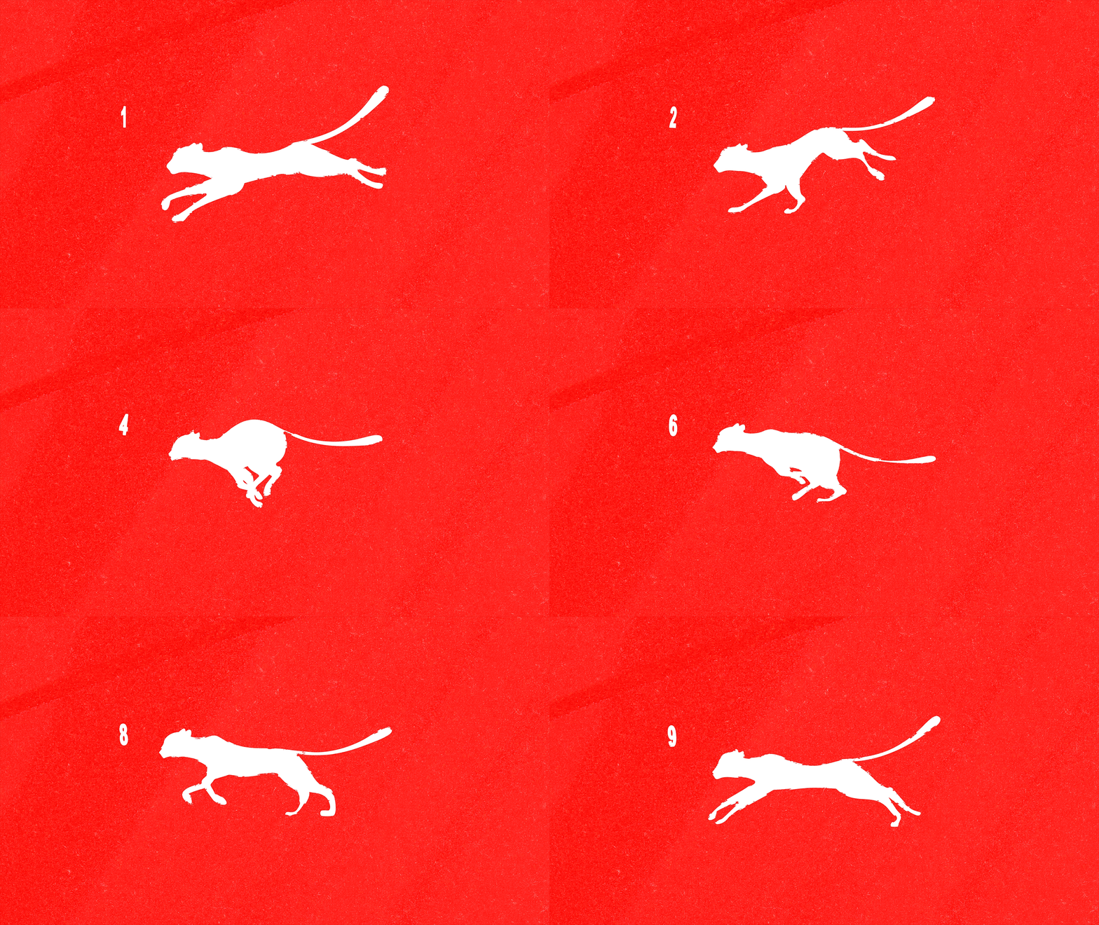
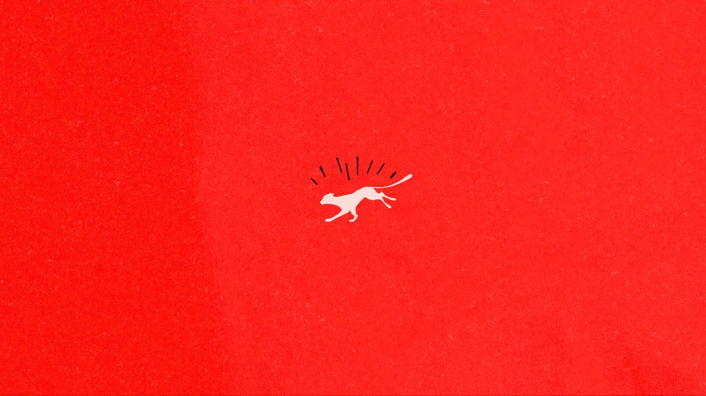
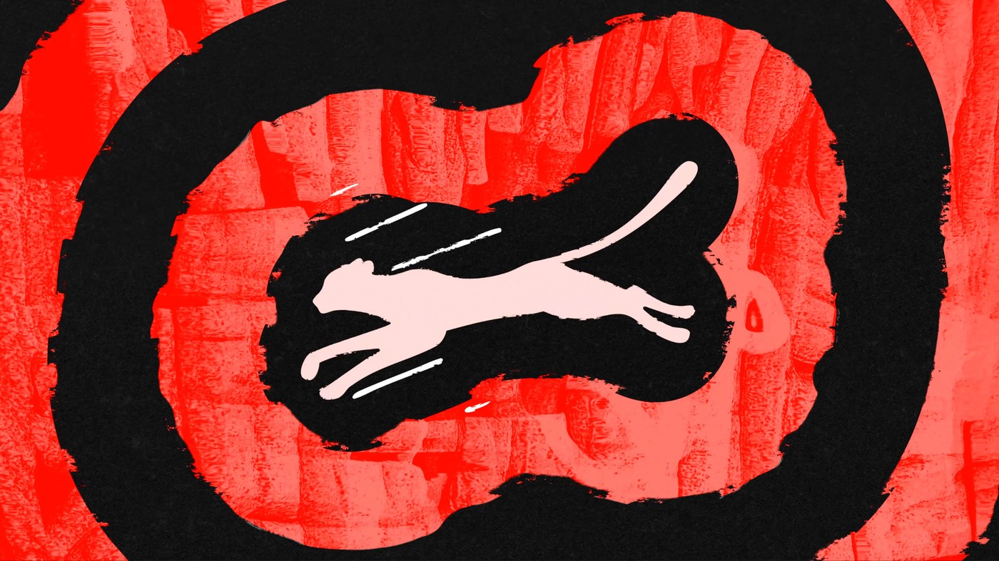
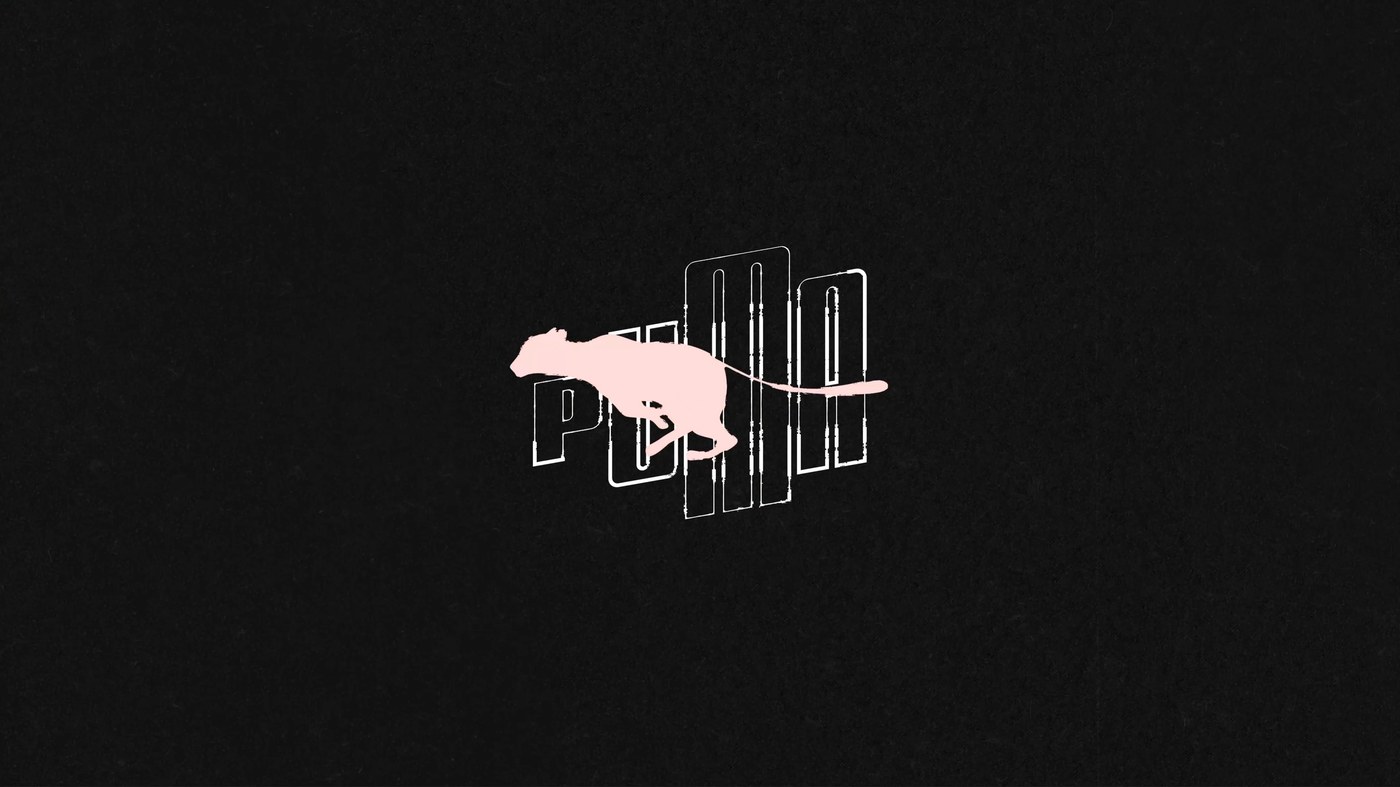
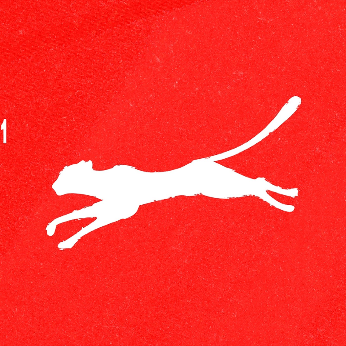
The kinetic custom type morphs into the iconic cat mark. This clean integration respects the heritage of the sportswear brand. It suggests an alternative direction for modern branding campaigns. The project highlights the value of experimental motion design. The work invites designers to push standard logo constraints. Visual assets scale cleanly across digital formats. The final sequence bridges graphic design and animation. The motion sequence demonstrates high typographic rigor. The layout remains balanced throughout the piece. View the entire kinetic typography project on the Mat Voyce page.