Kauan Lippi Unveils Bellecare Brand Identity
Kauan Lippi crafts a serene brand identity for Korean skincare label Bellecare, pairing cobalt blue restraint with minimalist packaging.
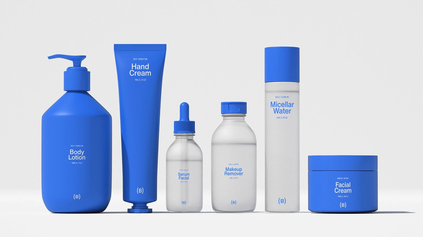
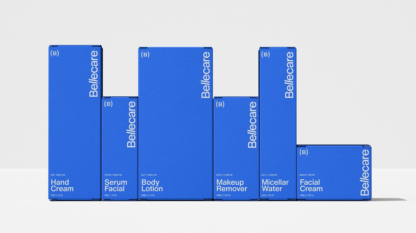
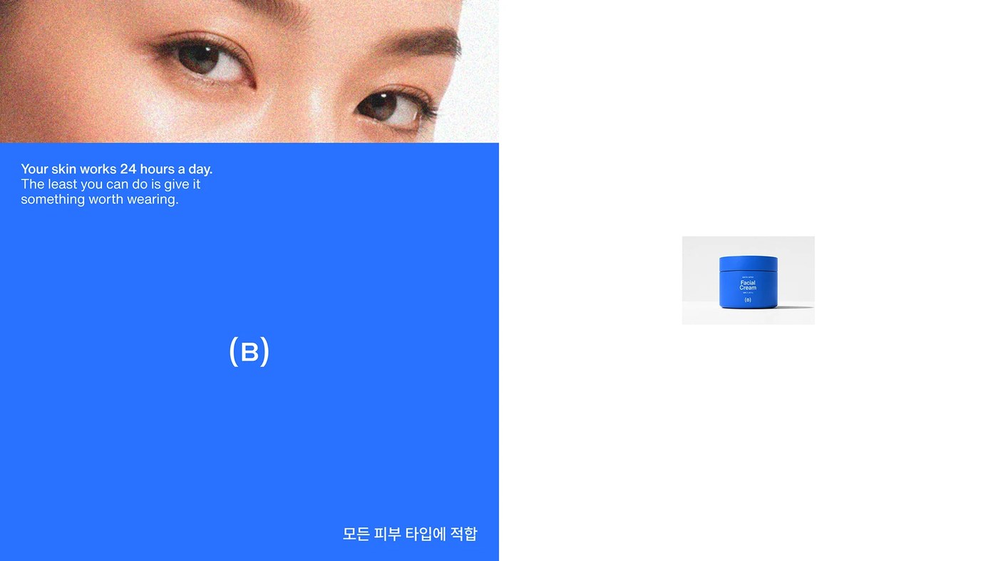
The contemporary beauty sector often buries efficacy under dense layers of botanical greens, warm earth tones, and metallic foil accents. For South Korean skincare brand Bellecare, Brazilian designer Kauan Lippi and Estúdio Lippi took the opposite trajectory by pursuing radical visual subtraction. Conceived in Seoul, where skincare routines form an essential cultural ritual, the project carves out a distinct position through deliberate reduction. Instead of relying on ornamental botanical tropes, the visual system pivots around the stark dialogue between saturated cobalt blue and clean white. In Korean visual culture, blue represents water, renewal, and natural balance. This chromatic pairing breaks cleanly from retail norms, establishing immediate shelf recognition while projecting clinical clarity across both digital touchpoints and physical containers.
Typographic Precision and Subtraction in Brand Identity
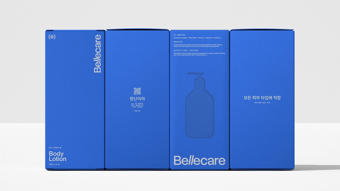
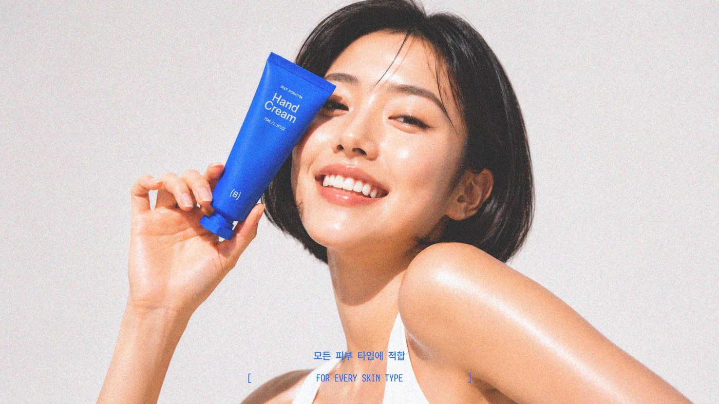
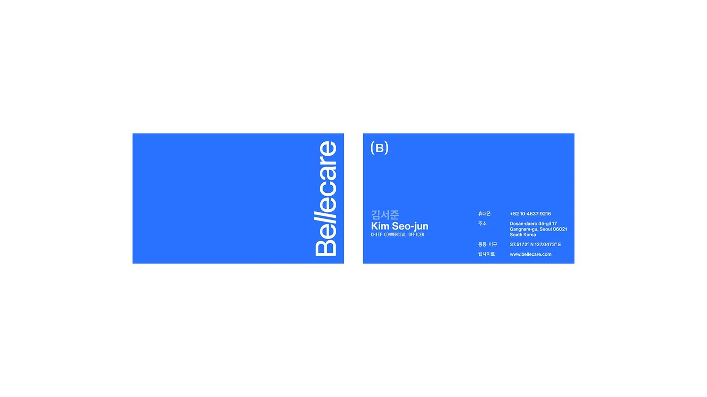
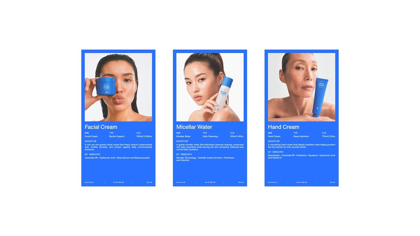
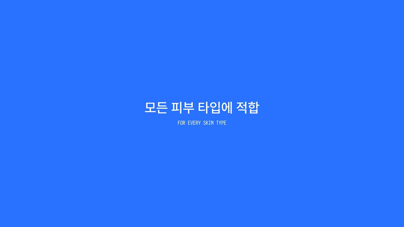
At the center of this brand identity stands a disciplined typographic language rooted in a clean Neue grotesk structure. Kauan Lippi introduced a subtle architectural customization to the letterform L, modifying its horizontal terminal to produce an exclusive structural gesture without diminishing functional legibility. This tailored glyph anchors the primary Bellecare logotype, accompanied by a compact circular (B) monogram. Typographic hierarchy remains rational and direct throughout the collateral. Primary English product labels align alongside Hangul text setting the universal claim, For every skin type. By pairing technical product metrics with quiet negative space, the typographic grid delivers information with absolute transparency.
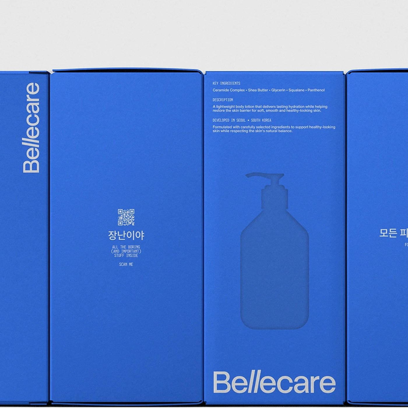
The physical packaging manifests this philosophy through structural restraint. Moving away from cluttered cosmetic boxes, the front faces of the containers—including the frosted glass facial serum dropper, cylindrical micellar water, and blue hand cream tube—feature only the brand mark and core product name. Secondary chemical declarations, ingredient breakdowns, and manufacturing details migrate to side panels and an integrated QR code on the carton exterior. Motion designer Carson Triwer extends this visual language into time-based media, introducing fluid kinetic transitions that echo the gentle viscosity of the formulas. The resulting brand identity establishes a confident benchmark for modern Asian cosmetic design.
See more from Kauan Lippi on Behance.