Typeface Design: PP Kyoto by Pangram Pangram
PP Kyoto by Pangram Pangram introduces a bold typeface design bridging Japanese writing systems with architectural slab serif geometry.
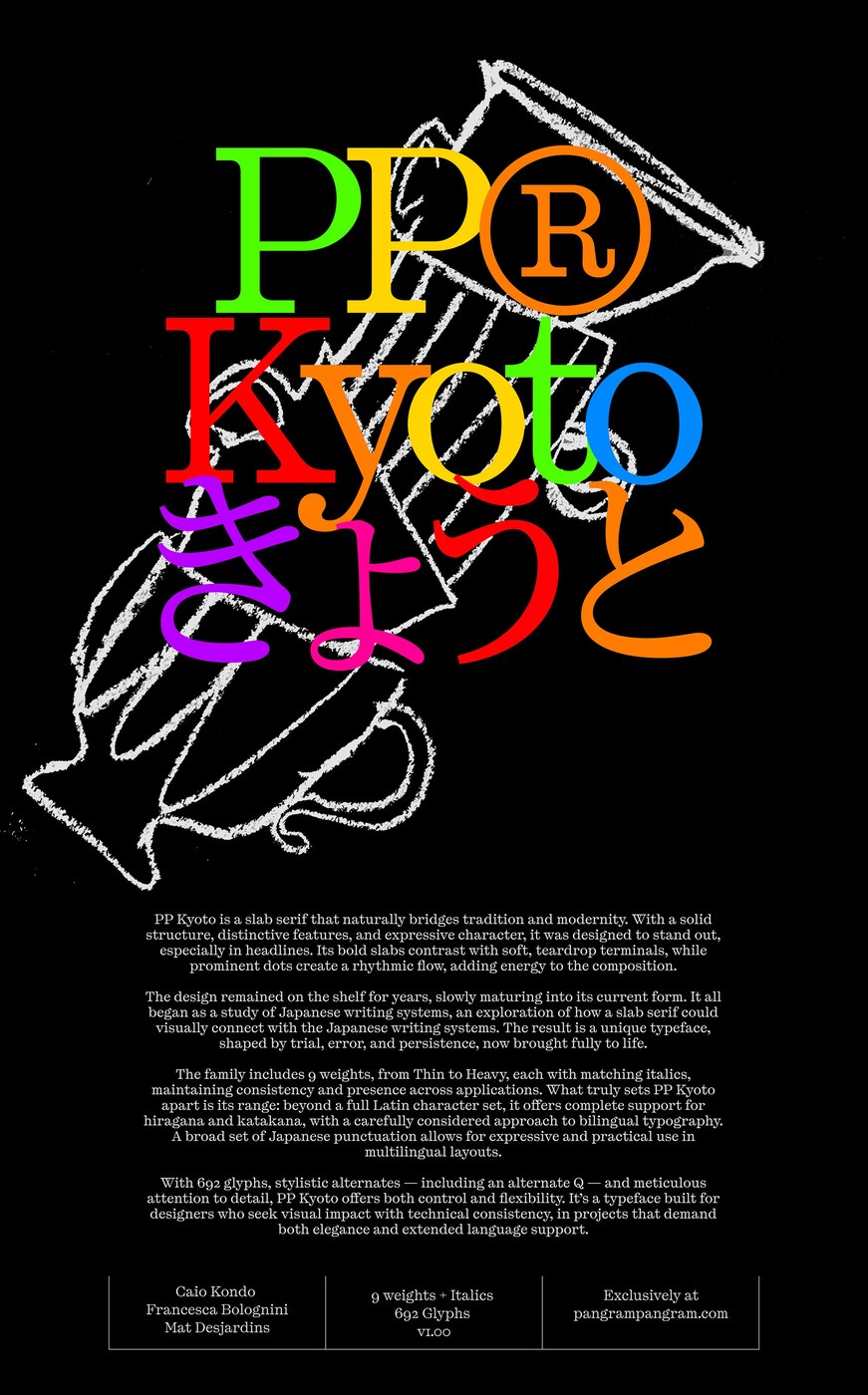
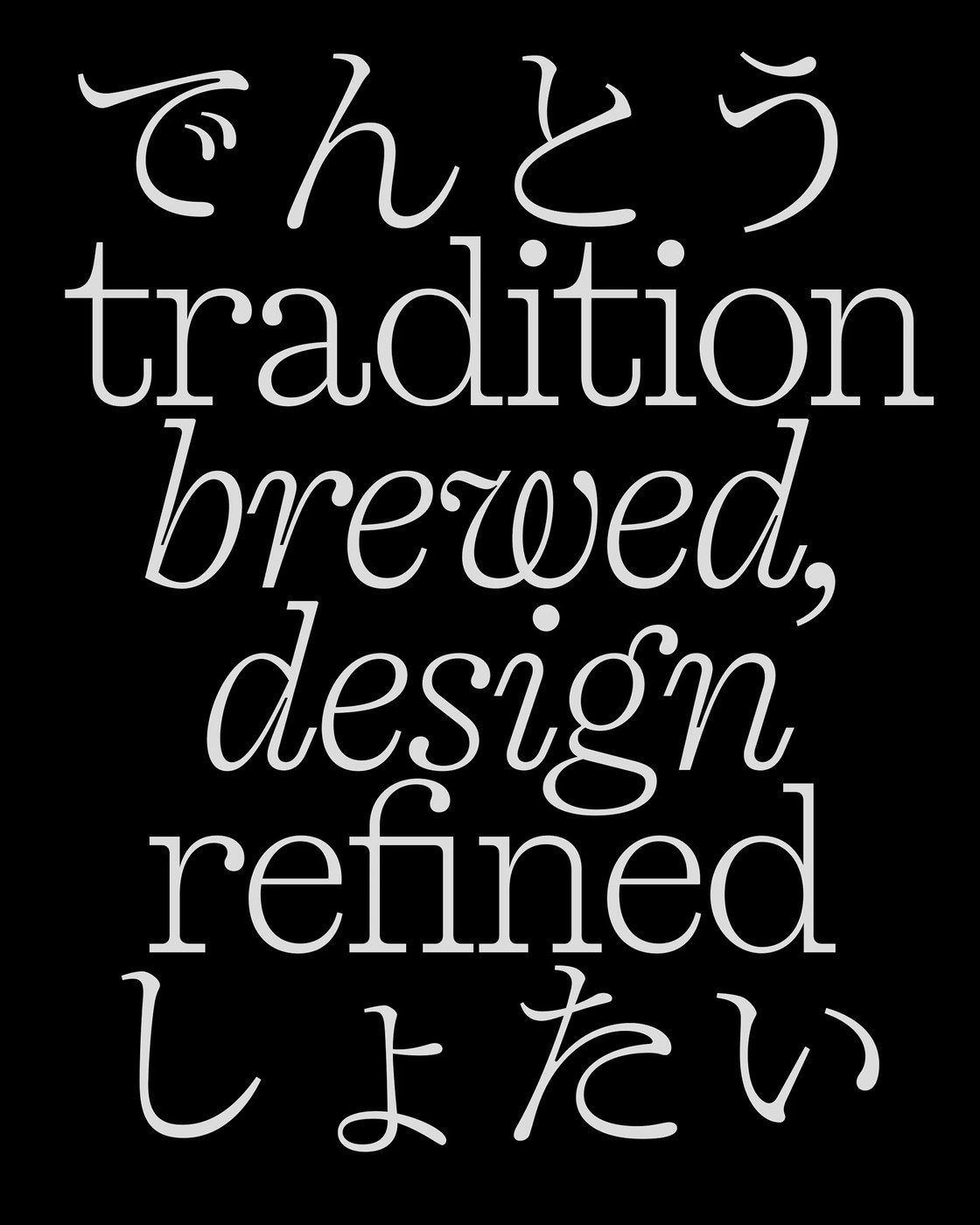
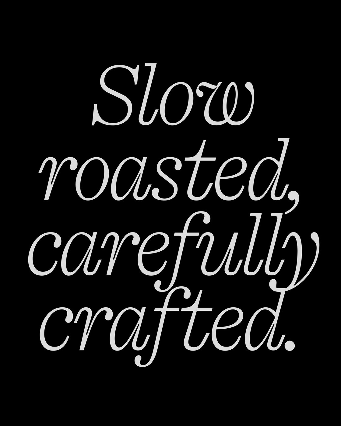
Developed by Caio Kondo, Francesca Bolognini, and Mat Desjardins at Pangram Pangram®, PP Kyoto emerged from years of iterative exploration into how Western slab serifs interact with Japanese letterforms. Rather than relying on superficial stylistic tropes, the foundry focused on the structural dialogue between solid architectural blocks and fluid calligraphic brush strokes. The resulting typeface design pairs heavy horizontal slabs with soft, sweeping teardrop terminals. This dynamic creates an arresting visual tension across headlines, packaging, and posters. Prominent circular dots punctuate the glyphs, establishing an energetic rhythmic flow that balances monumental weight with quiet poise.
Architectural Balance in Multilingual Typeface Design
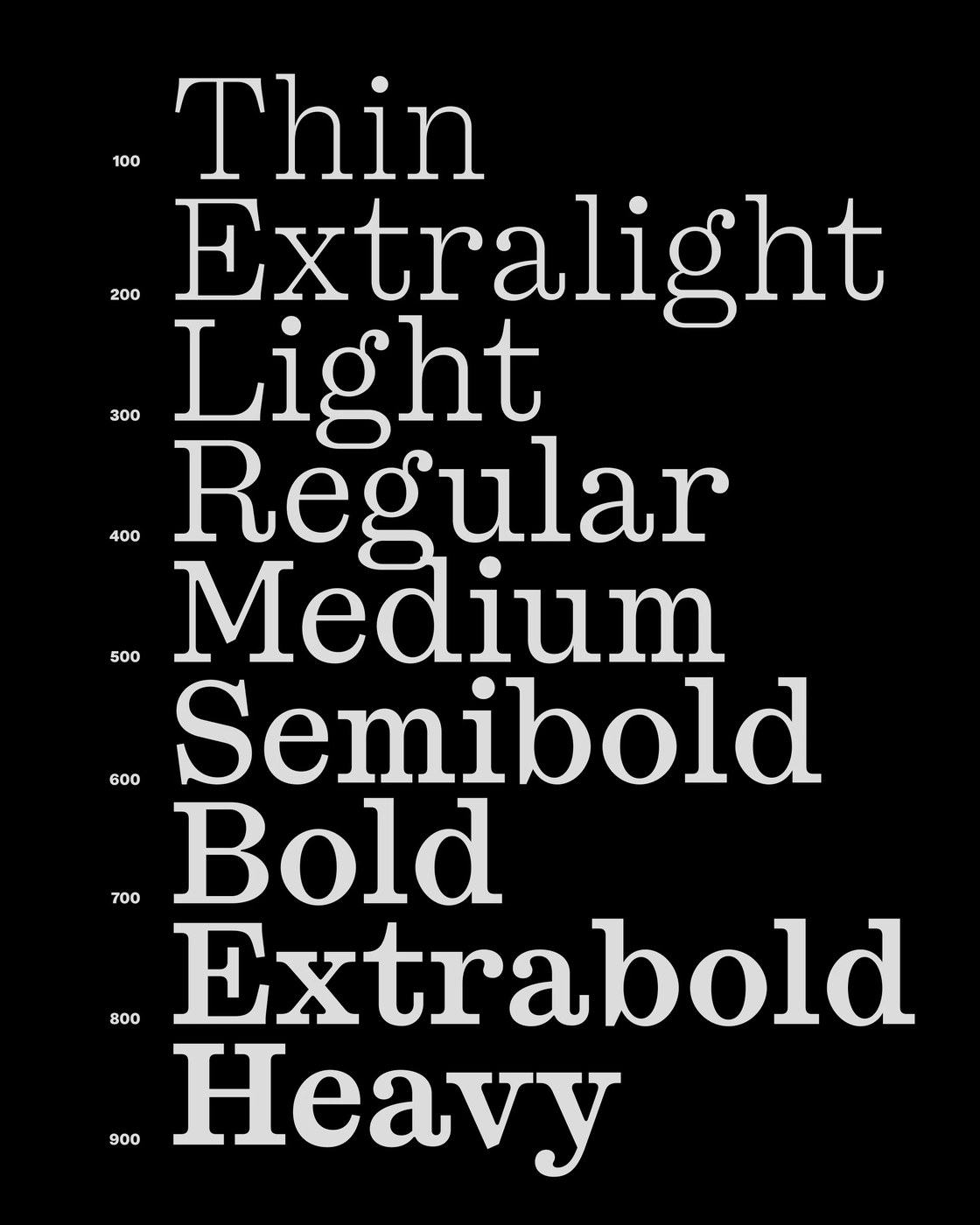
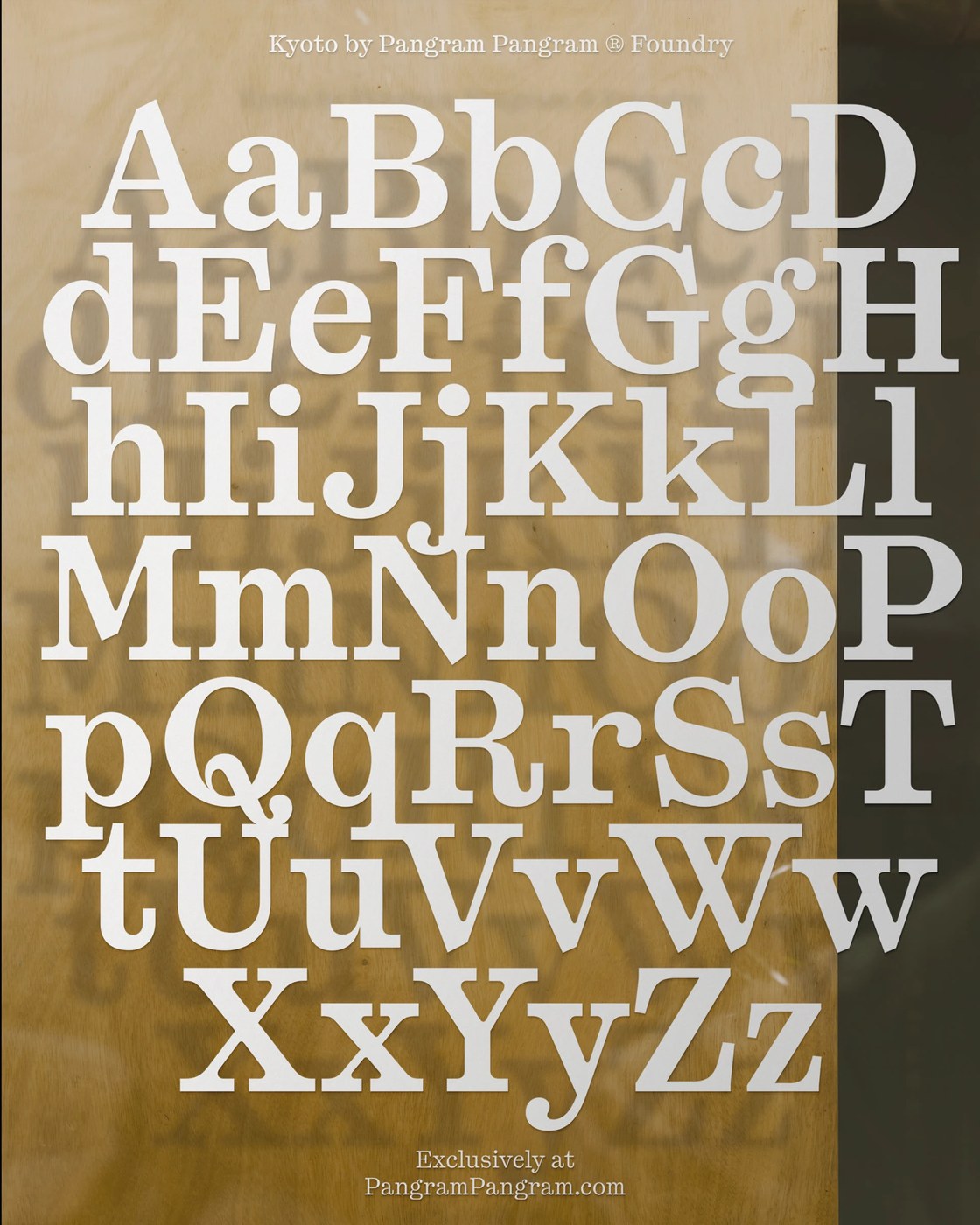
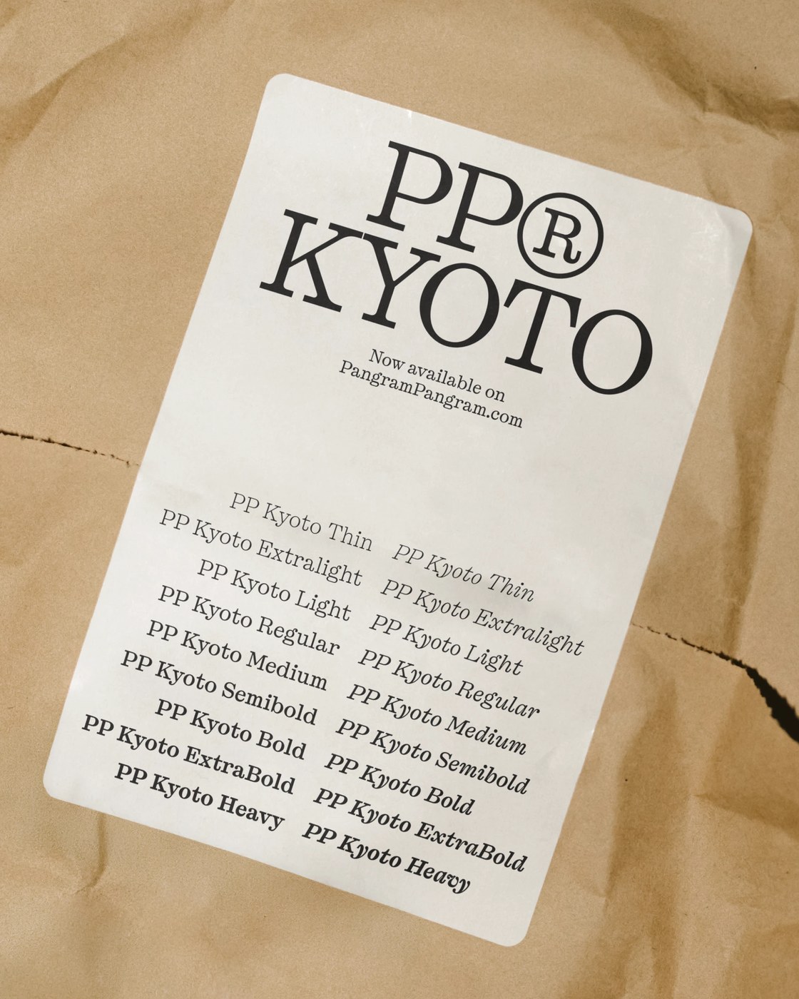
PP Kyoto features an extensive typographic system spanning nine calibrated weights from Thin to Heavy, complemented by matching italic cuts. With 692 glyphs, the family delivers comprehensive multilingual coverage across Latin characters, Japanese Hiragana, and Katakana, supported by complete regional punctuation marks. Meticulous glyph construction reveals subtle optical adjustments, including an expressive alternate Q, organic terminals, and tailored ligatures designed for display compositions. When typeset in large display scales, the stark geometric slab serifs provide unyielding structural stability. At smaller editorial text grades, the generous counterforms and fluid stroke details preserve clarity, allowing the typeface design to breathe naturally within dense multilingual layouts.
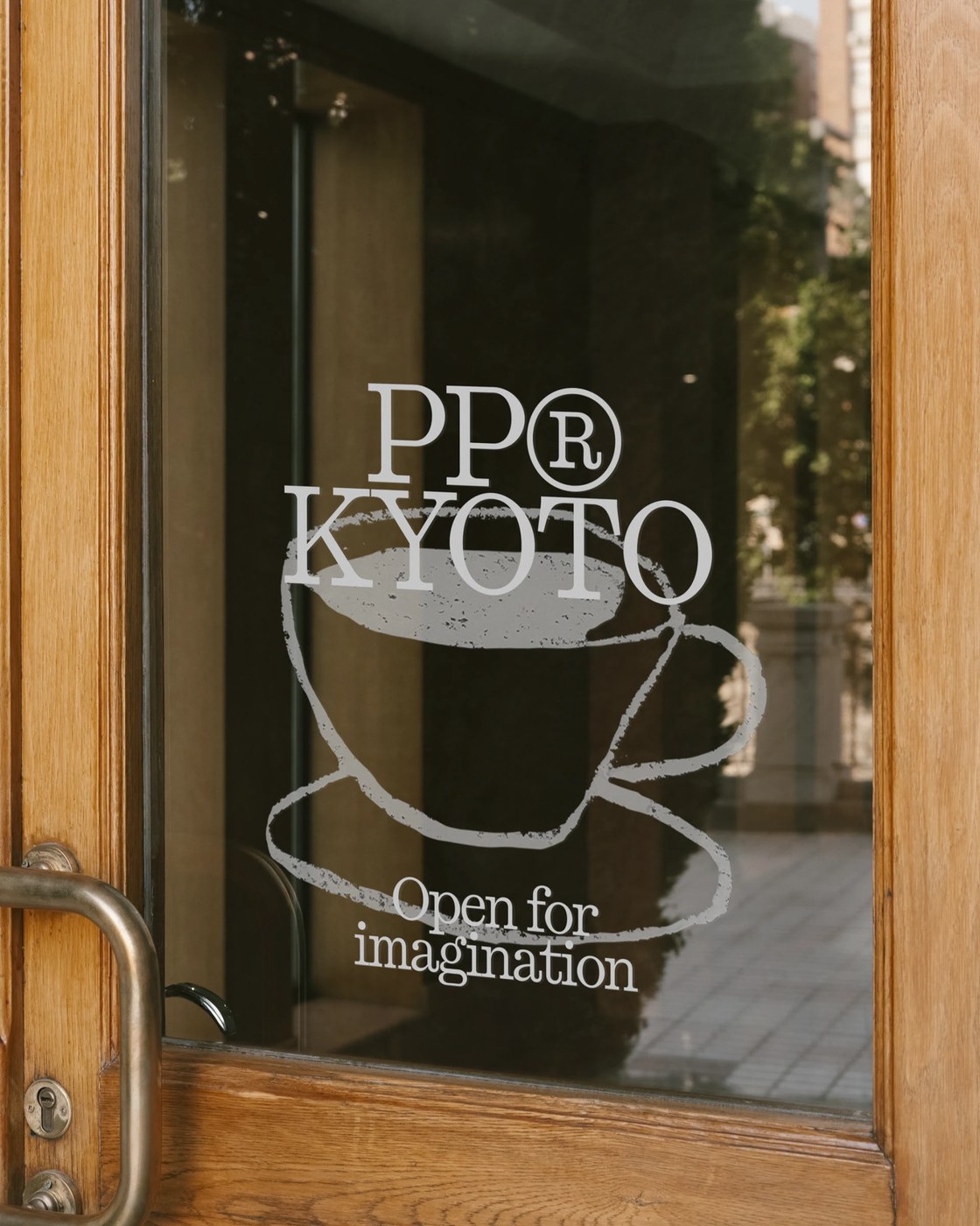
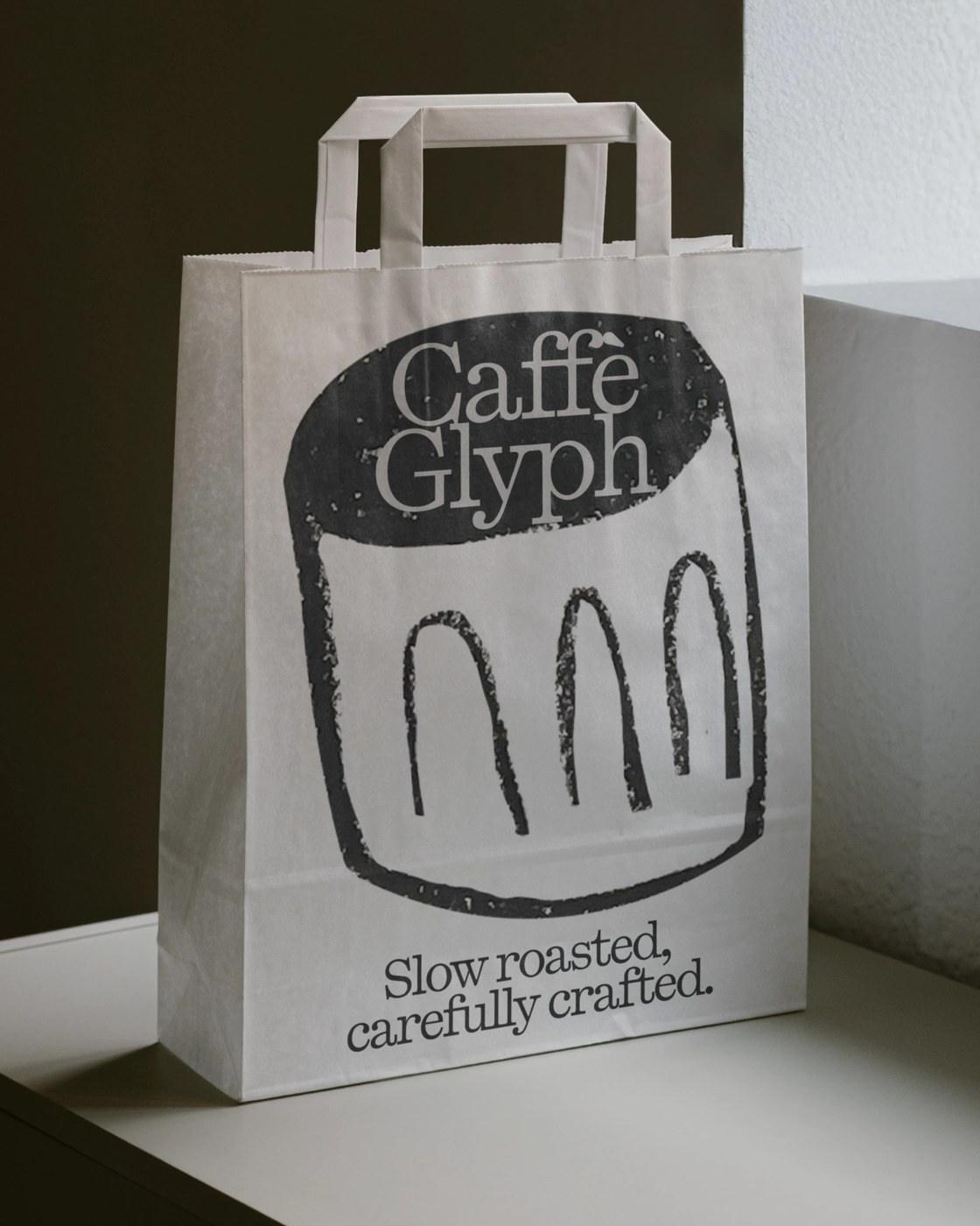
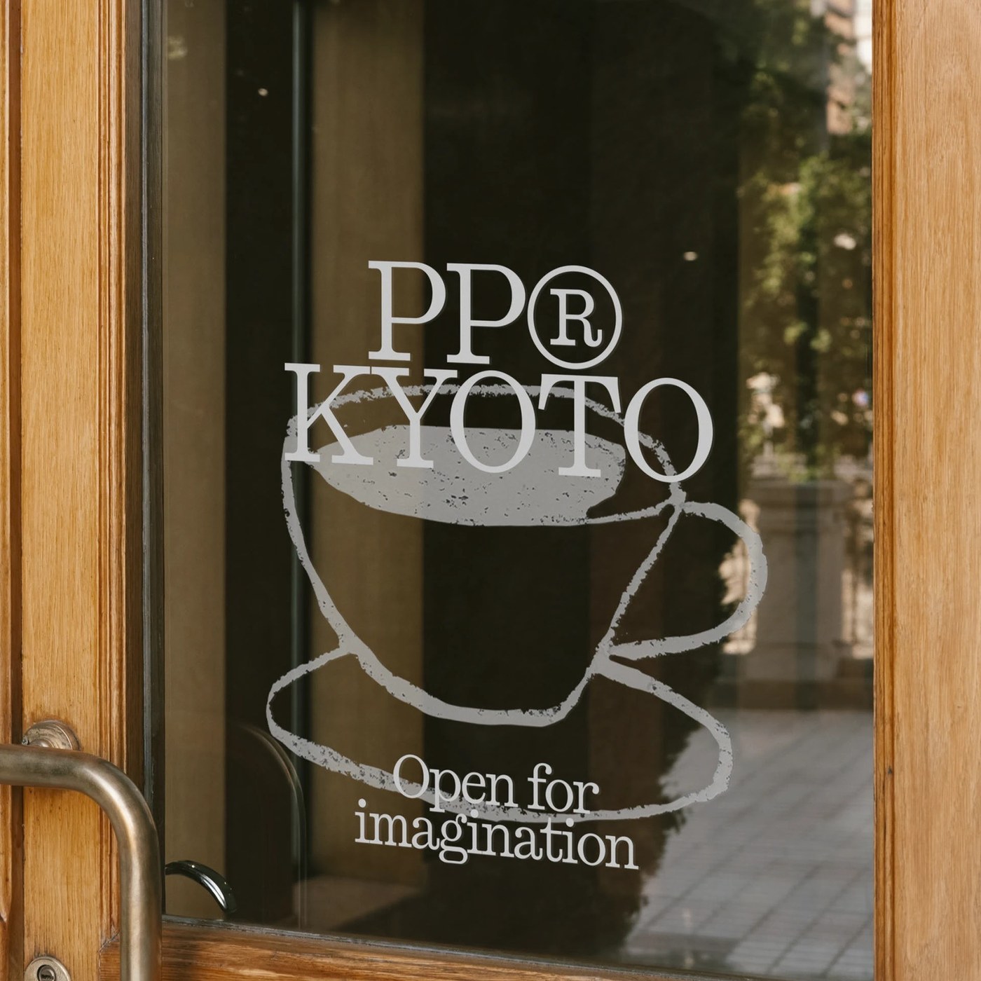
Beyond digital specimens, PP Kyoto demonstrates immediate utility across physical environments and brand touchpoints. The project presents crisp white window graphics applied to a glass entrance door, contrasting against natural oak frames and architectural brass hardware. On tactile packaging, such as white paper takeout bags and crinkled kraft coffee pouches, the typography holds its crisp definition against textured substrates. Deep black linocut arches and dense ink coverage emphasize the typeface design's affinity for specialty retail, hospitality, and editorial publishing systems. This agile transition from monumental display graphics to handheld paper artifacts underscores the foundry's disciplined craftsmanship.
See more from Pangram Pangram® on Behance.