Inside the Craft of Woven Whisky Branding by Freytag Anderson
Freytag Anderson built Woven whisky branding around one idea: blending as weaving, from a frosted apothecary bottle to a graphic for every blend.
Freytag Anderson's clients, Pete and Duncan, came with a clear brief: shake up the blended whisky category and make it more open, more human, and far less prescriptive. The studio's answer starts with the name. Woven speaks to blending as threads coming together to make something richer, and the positioning, Experience Whisky, treats the drink as something to try rather than something to be instructed in. The core range stays pared back and quiet, while each limited edition gets its own graphic, so the shelf reads as one brand with many moods. The case page notes an IWSC win for Hemisphere.
Woven whisky branding: one bottle, a system of blends
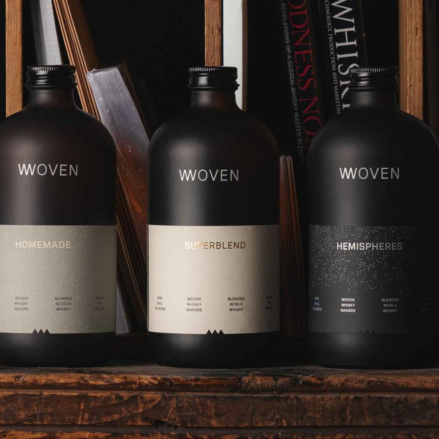
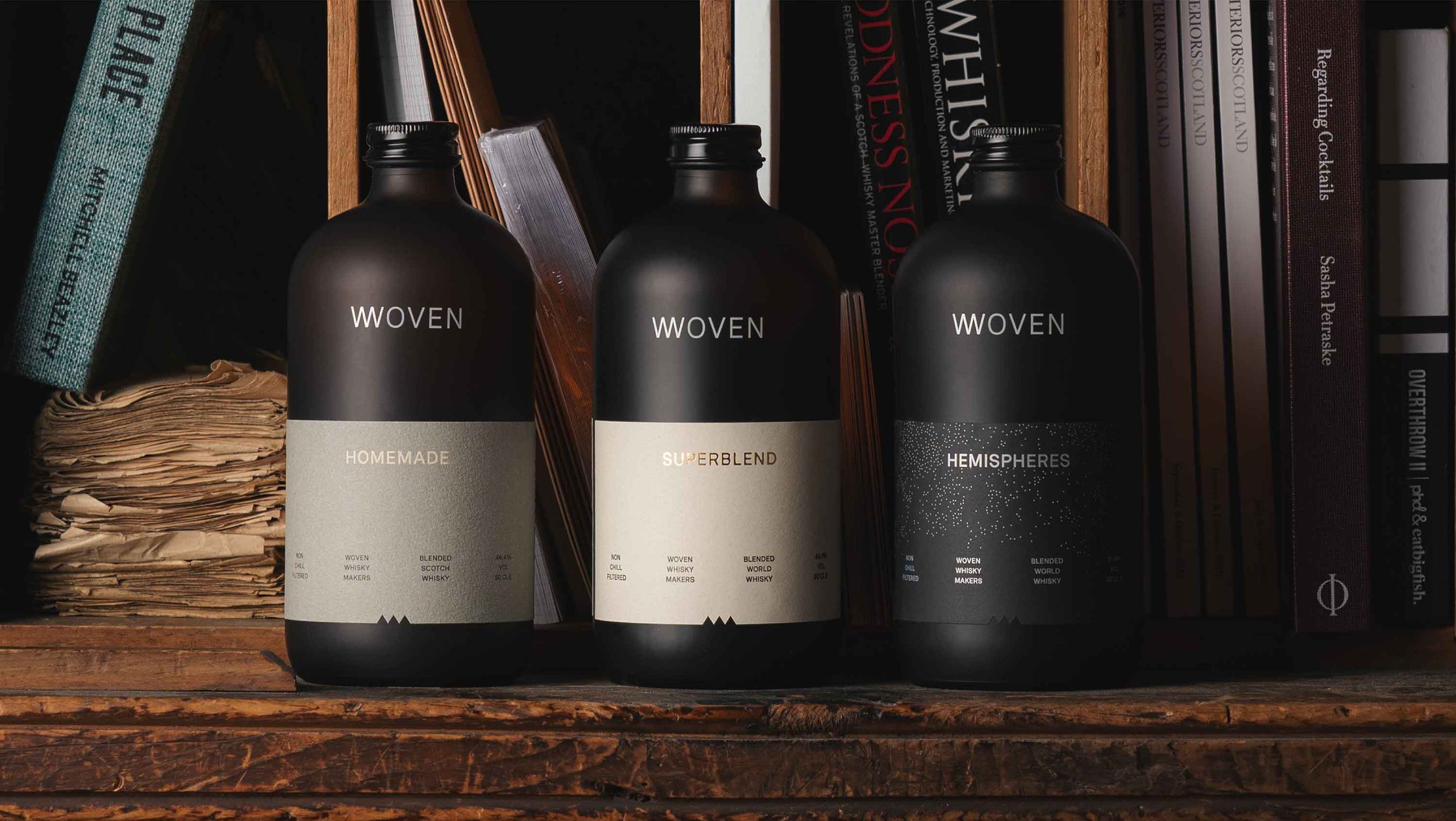
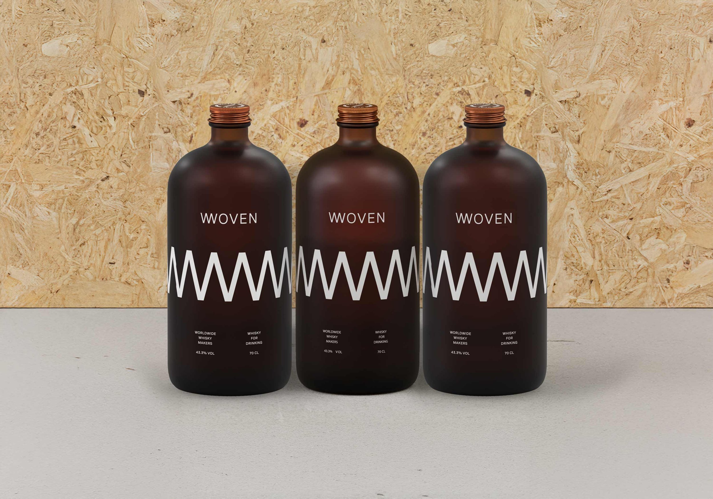
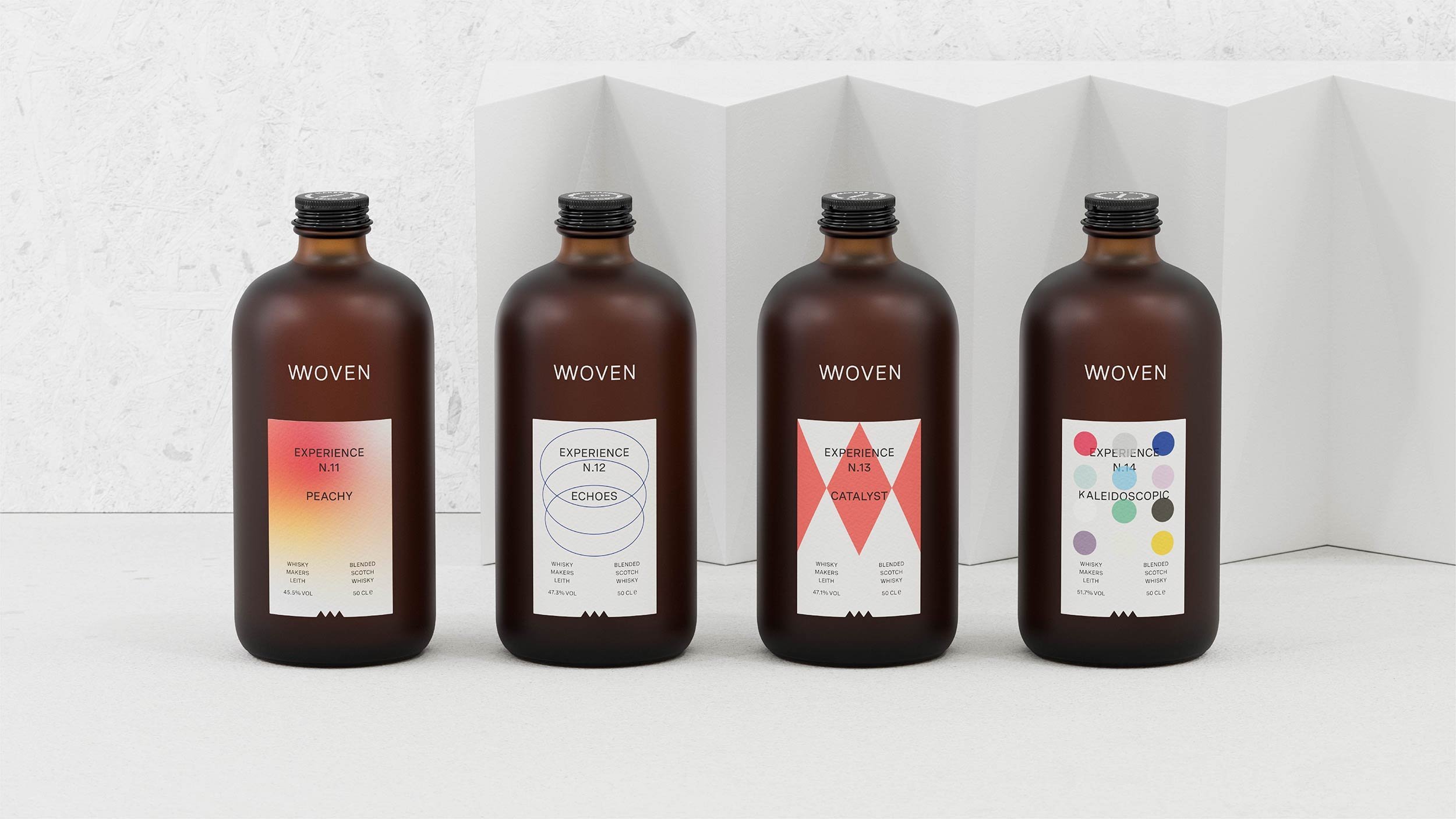
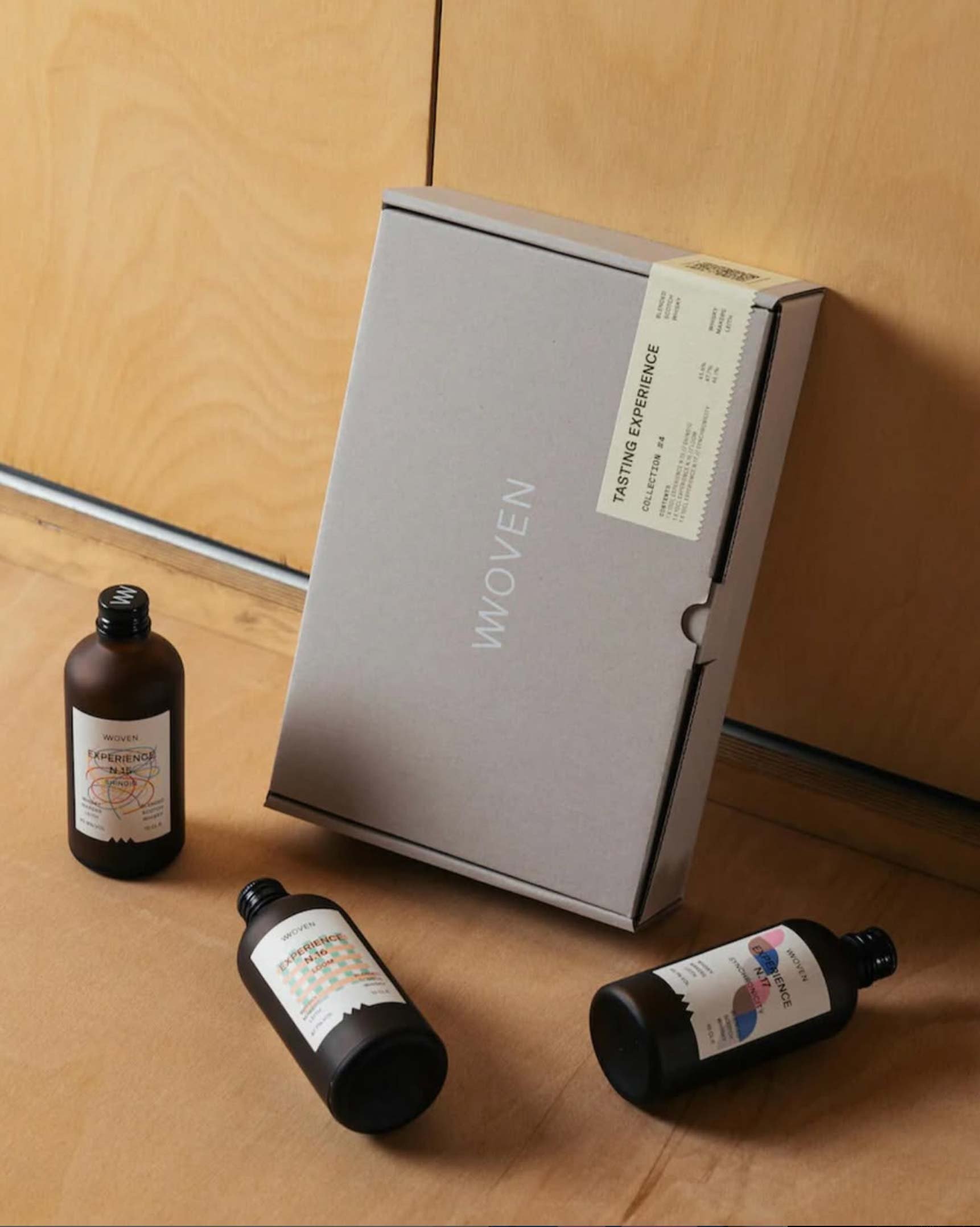
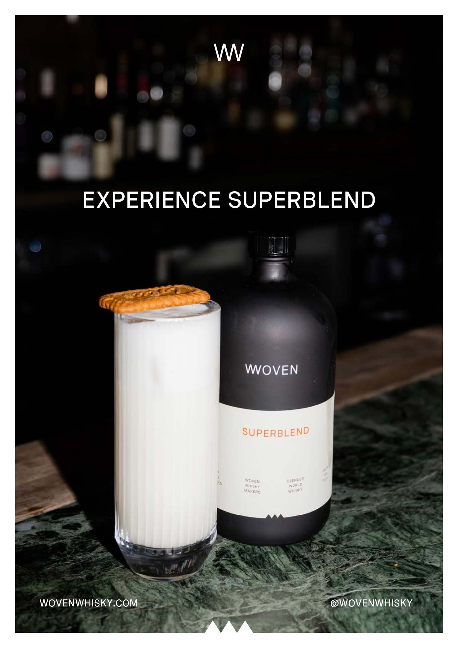
The wordmark does most of the talking. WOVEN sits in widely spaced capitals directly on the frosted brown glass. On the core labels the release name sits centered in the middle of the label, Homemade in muted grey green, Superblend in warm cream, Hemispheres in black scattered with fine dots. Below each name, the same small spec columns run across the foot of the label: non chill filtered, Woven Whisky Makers, the whisky type, and the volume. A small zigzag notch cut into the foot of every label echoes the woven thread idea, and the same mark turns up as a wide white zigzag band wrapped around the house blend bottles. The limited editions break the quiet. Each one is numbered and named, Experience N.11 Peachy, N.12 Echoes, N.13 Catalyst, N.14 Kaleidoscopic, and each gets a graphic that belongs to that blend alone: a soft peach gradient, overlapping blue circles, red diamonds, a grid of colored dots. The labels keep the same centered layout and the same small spec columns, so the wild graphics never break the system, and the grey board boxes follow the same discipline, with the spaced wordmark and a single centered label. The box top repeats the line The Worldwide Whisky Makers in a circle around Woven.
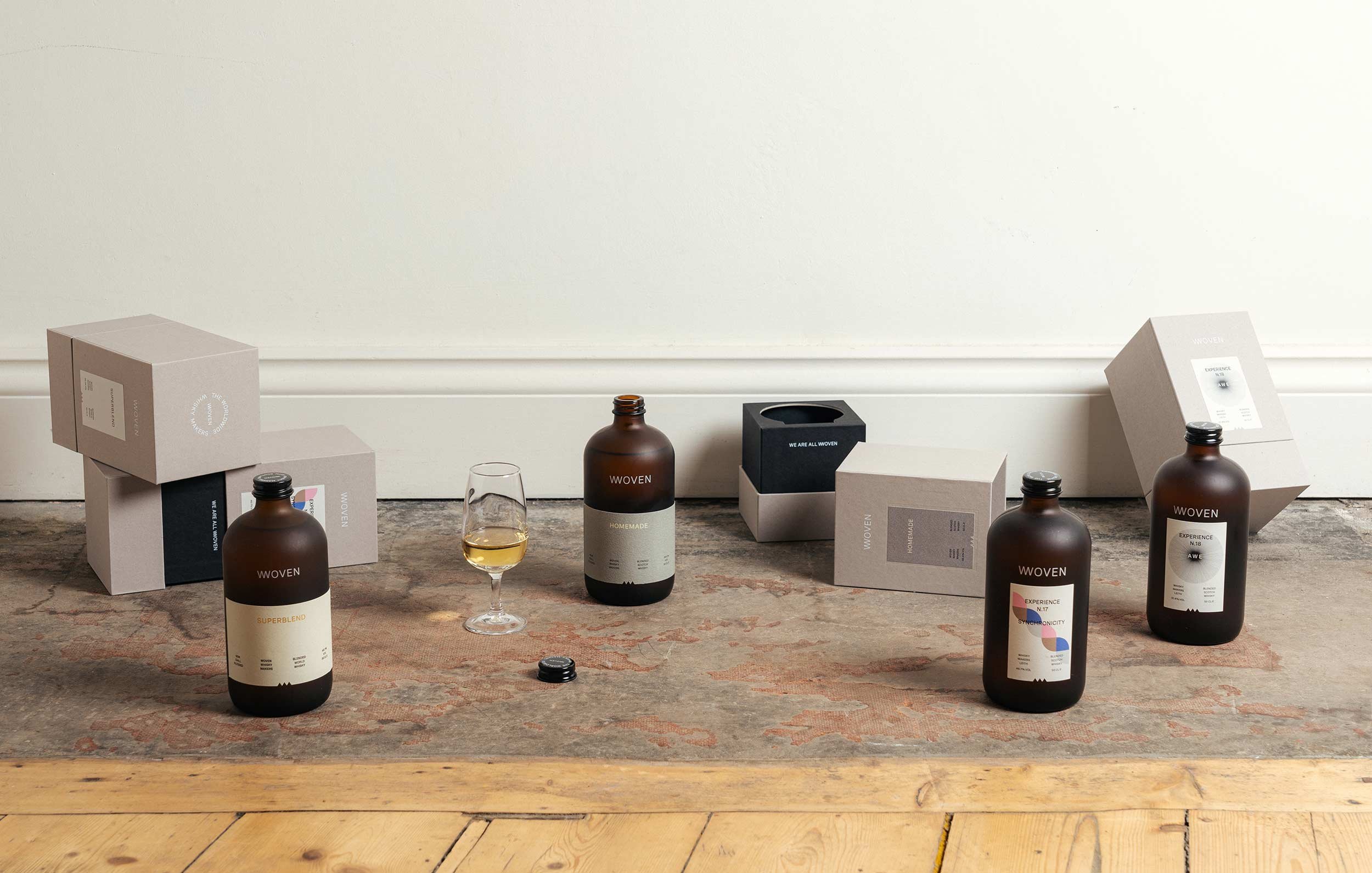
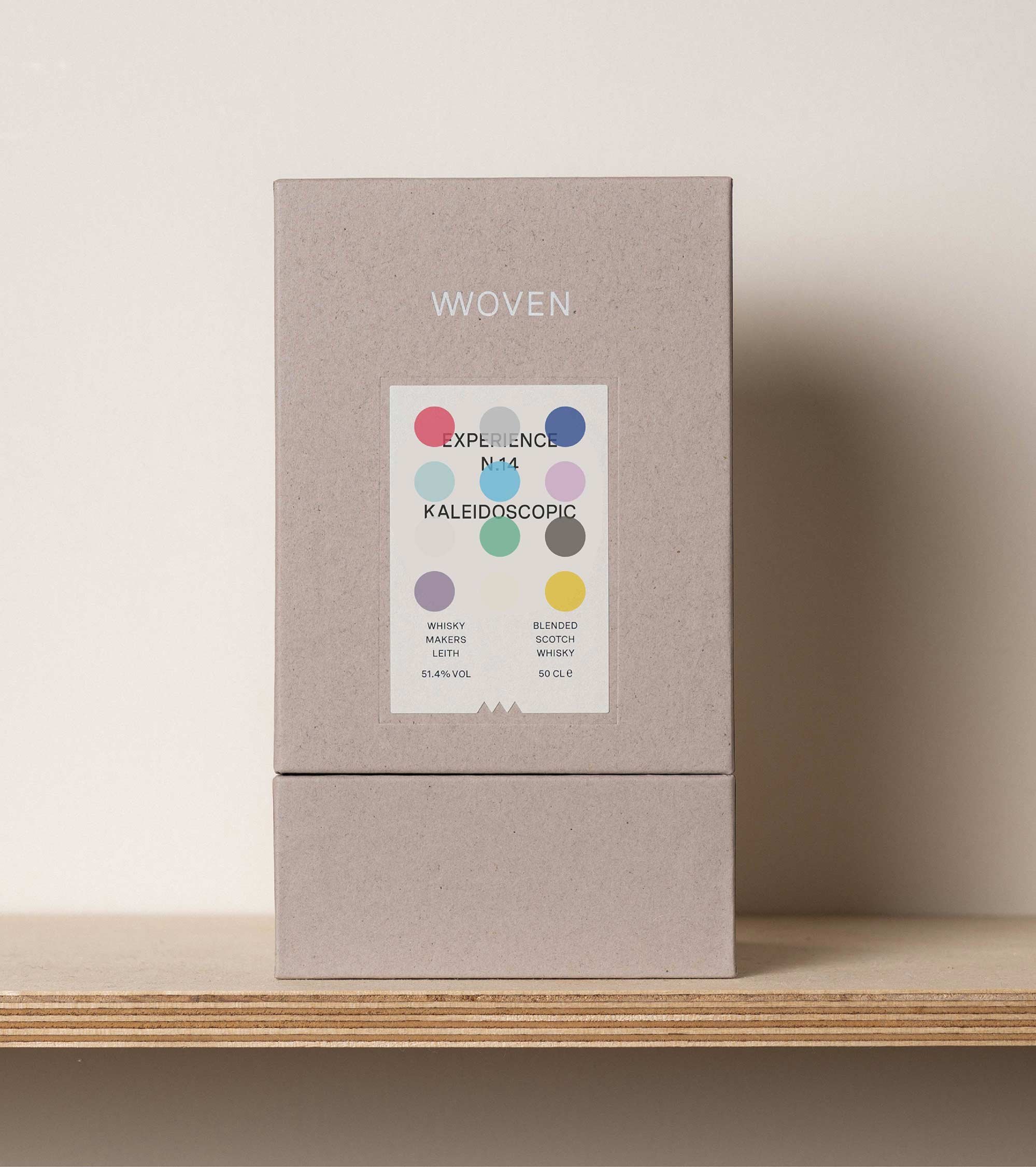
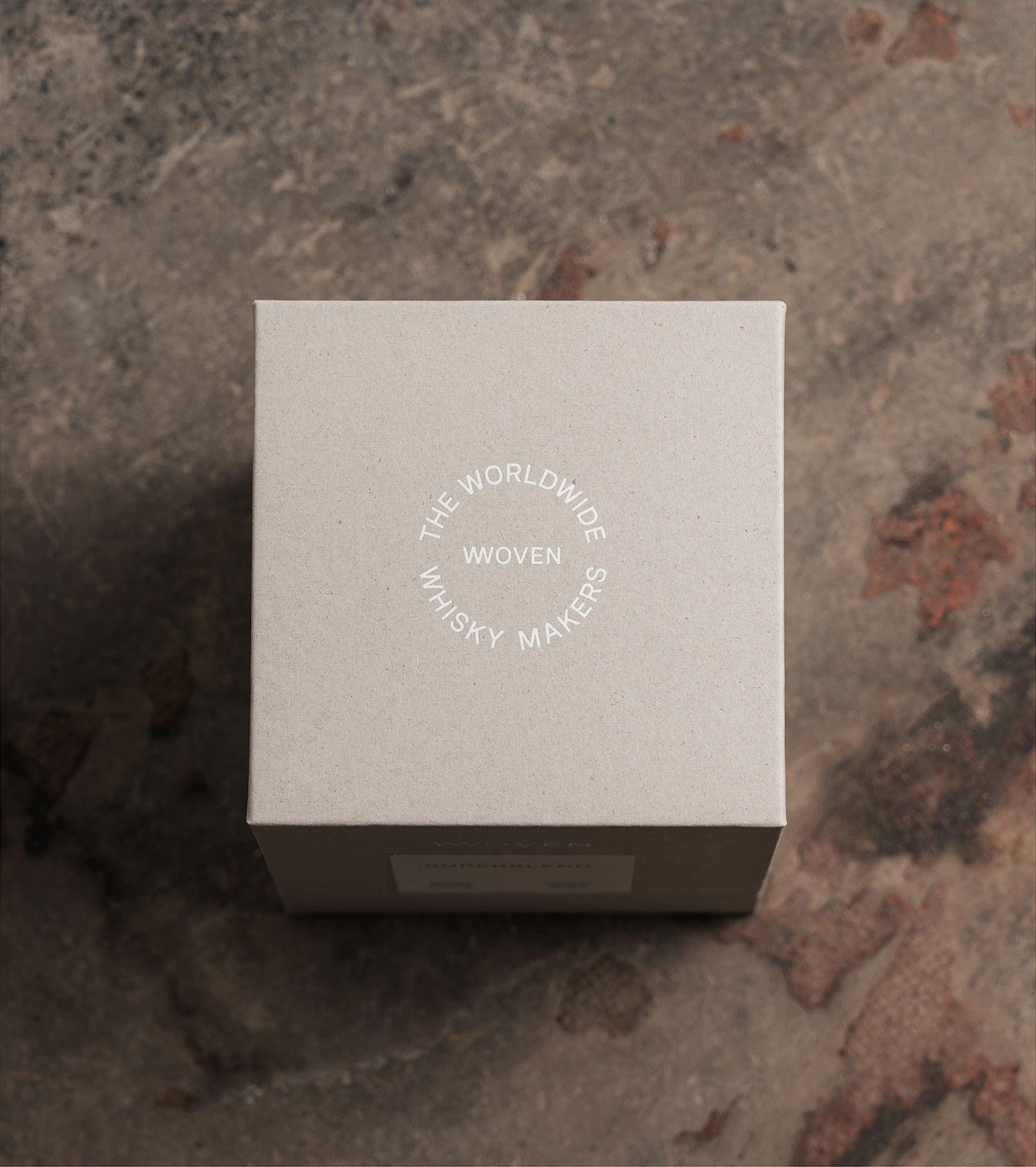
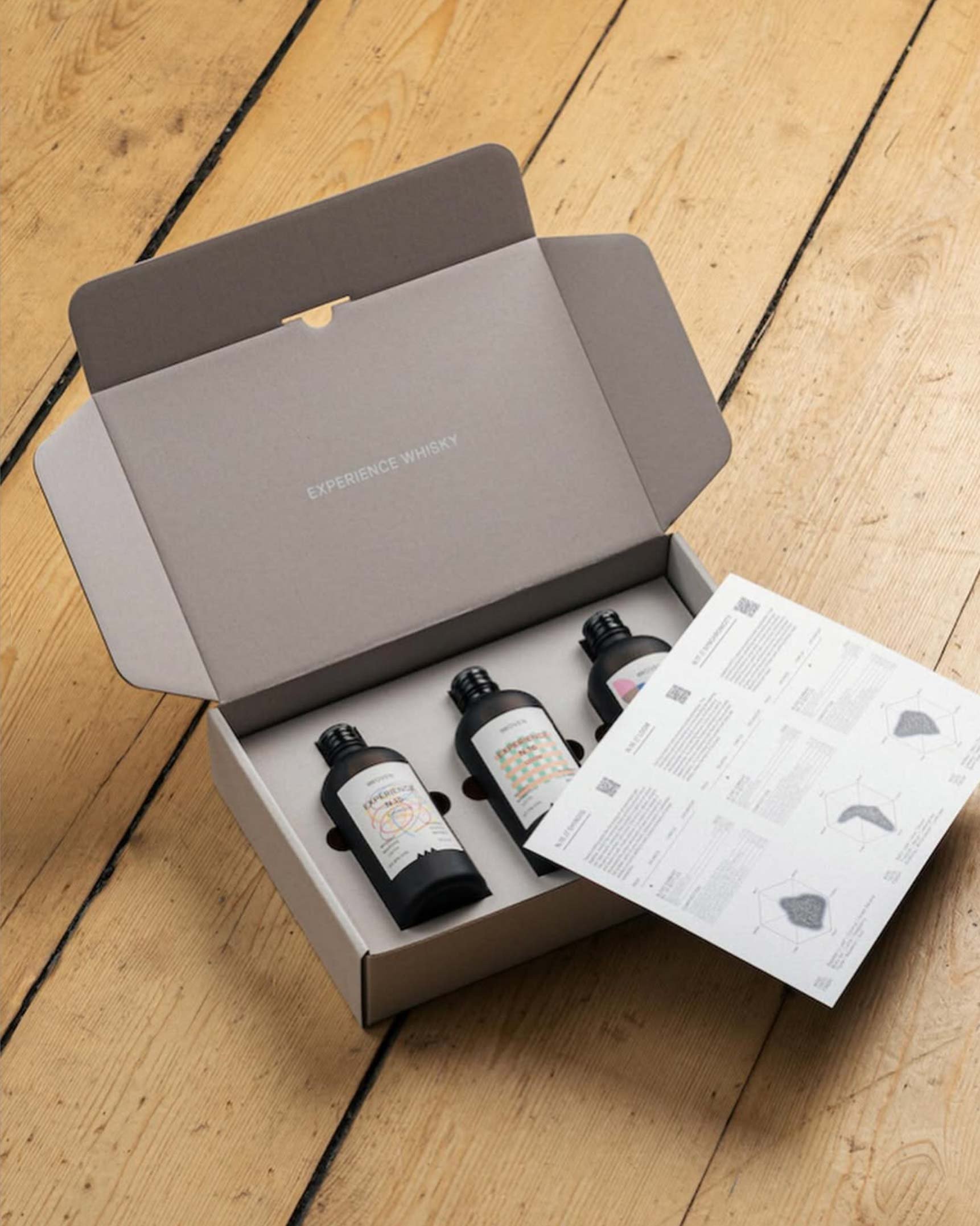
Material is doing as much work as print here. The custom bottle is frosted brown apothecary glass, tactile and unlike a standard whisky bottle, closed with a plain black cap on the core range. The grey board gift boxes hold the bottles with a black Experience Whisky inner box, and the tasting set packs three small bottles with a printed leaflet carrying flavor charts for each blend. Nothing on the shelf shouts. The frosted glass, the quiet board, and the restrained labels let the one loud element, the graphic of each limited edition, do all the talking.
See more from Freytag Anderson.