Production Type Unveils the Ciel Typeface
Léa Bruneau's Ciel typeface for Production Type knots ornamental capitals into dense monospaced squares, to be seen before read.
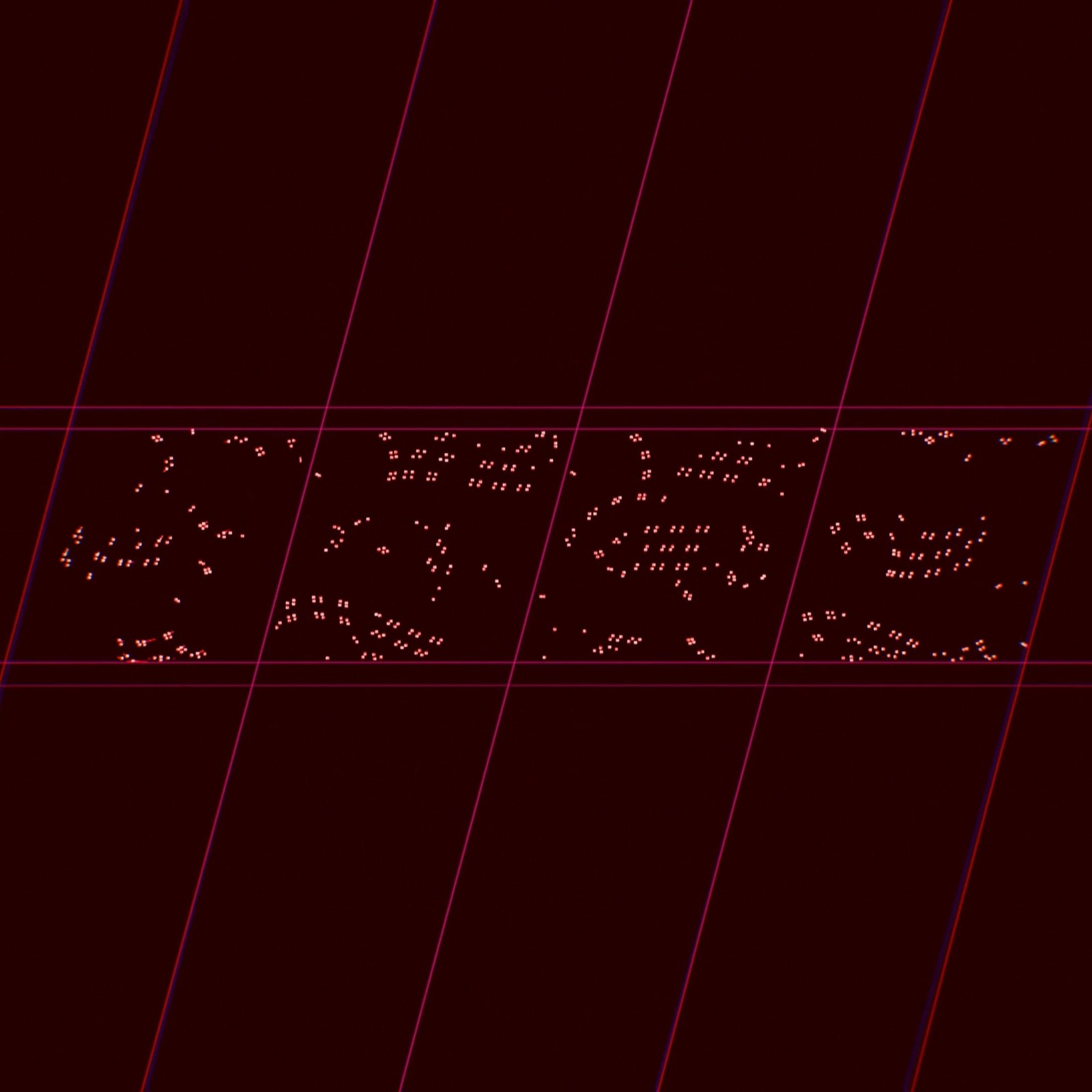
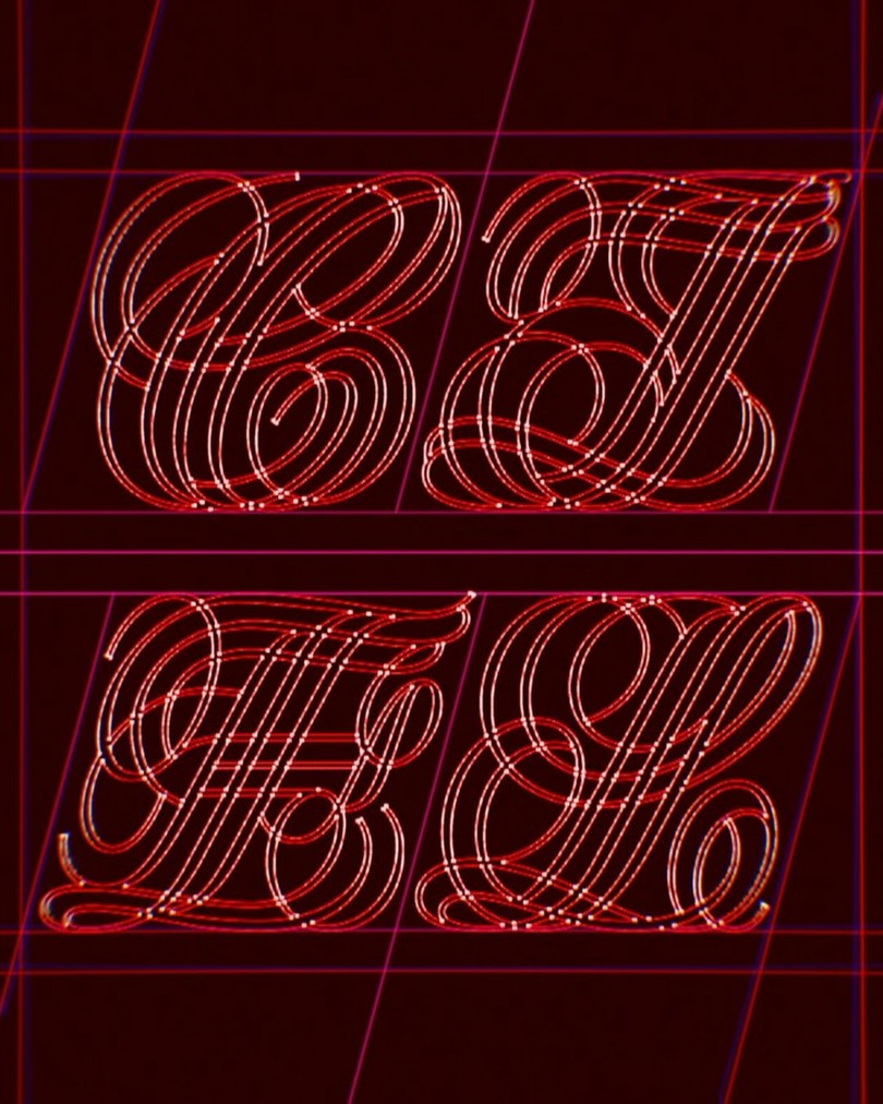
Ciel opens with appearance, and the foundry's own copy says the outlines overspill the linguistic task. Look at the four wireframe capitals that spell it out: C, I, E, L traced in glowing red strokes over a dark maroon field, threaded through with pink construction lines like scaffolding left in place. The strokes never fill in, they lace and double back, so the letterforms read as embroidery and circuitry at the same instant. Every glyph is confined in the same square box, and inside that constraint the complexity proliferates. This is type that insists on being looked at first and read second, the signifier deliberately dominating the signified.
Ciel typeface: ornament as the condition of meaning
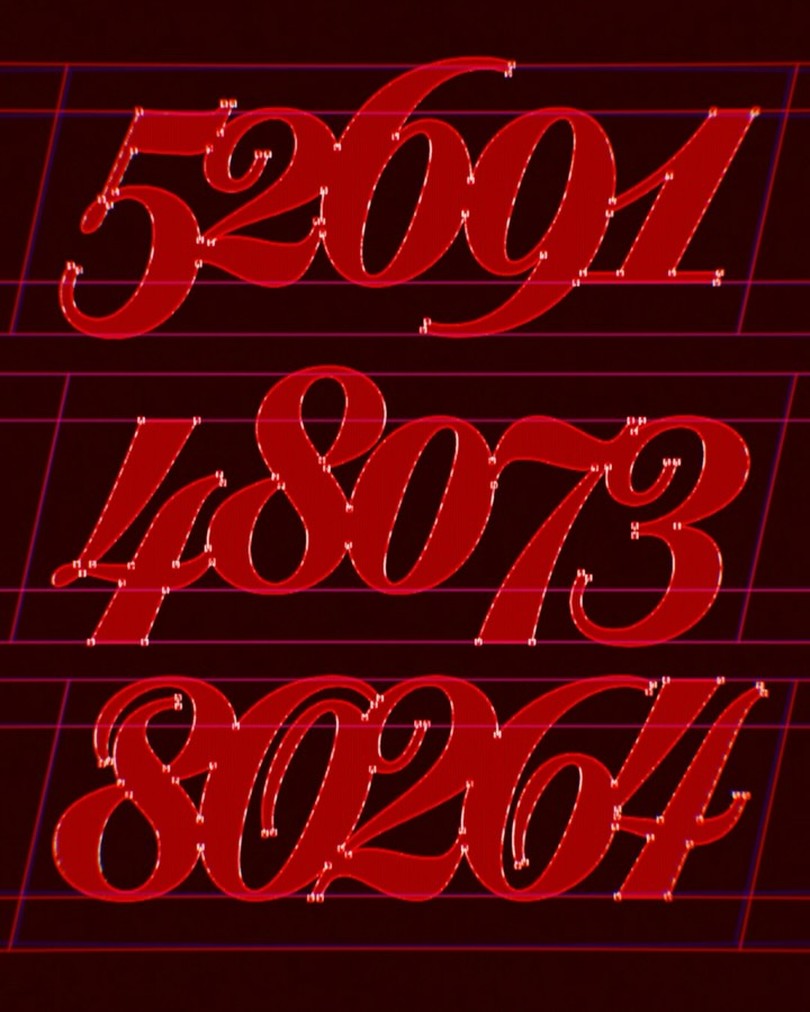
The bones come from British copperplate pointed-nib calligraphy, but the stance is restrained rather than florid: Ciel leans with a tightly controlled slant, carving one sharp toccata word after another. The family ships in five weights, ExtraLight through ExtraBold, and the register shifts dramatically across them. The text-capable faces oscillate between control and exuberance, whispering in weightless hairlines at one end and asserting themselves in saturated initials at the other. The figures carry the same treatment, numerals drawn in saturated red with their construction nodes still visible, ornament rendered as structure rather than decoration.
Ciel's ornamental layer runs thick in three styles of interwoven capitals, each interlace acting as a morpheme in itself, expressive before it is functional. The base styles sustain headlines, short paragraphs, and sober editorial settings, while the initials demand to dominate space: commanding drop caps, titles, posters, book covers, even architectural inscriptions. Art direction for the release came from Bruneau herself with Charly Derouault. The industry noticed: Ciel took Best of Show in Graphic plus Gold at the European Design Awards 2026, an Award of Excellence from Communication Arts 2026, a STA100 2026 win, and a Type Directors Club 2026 finalist spot. "With Ciel, I wanted to discover where the process of complicating initially simple letters would take me," says Bruneau. The family is available now in static OTF, TTF, WOFF, and WOFF2.
See the full family on Production Type.