
how antoni gaudí's architecture found its way into schiaparelli haute couture
from gaudí’s mosaics to sculptural silhouettes, daniel roseberry’s schiaparelli collection reimagines architecture through fashion.
О графическом дизайне
from gaudí’s mosaics to sculptural silhouettes, daniel roseberry’s schiaparelli collection reimagines architecture through fashion.
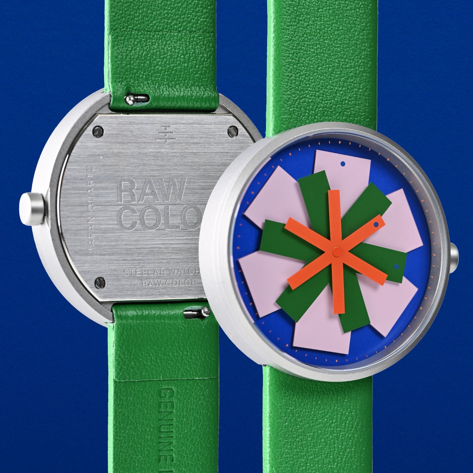
The Stellar watch challenges traditional time interfaces with a dynamic product design built from layered geometric hands. Designed by Eindhoven-based studio Raw Color for watch brand The Trio of Time (TTT), the timepiece turns utility into kinetic design. Co-founders Christoph Brach and Daniera…
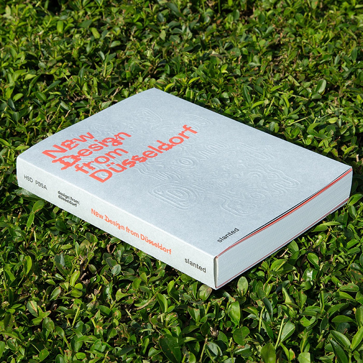
Slanted Publishers' New Design from Düsseldorf 2026 is a 360-page graphic design book of 50 graduate projects from Hochschule Düsseldorf's design school. The cover sets the register immediately: light grey textured stock, coral-red condensed sans at roughly 80pt, three stacked lines. Inside, the…
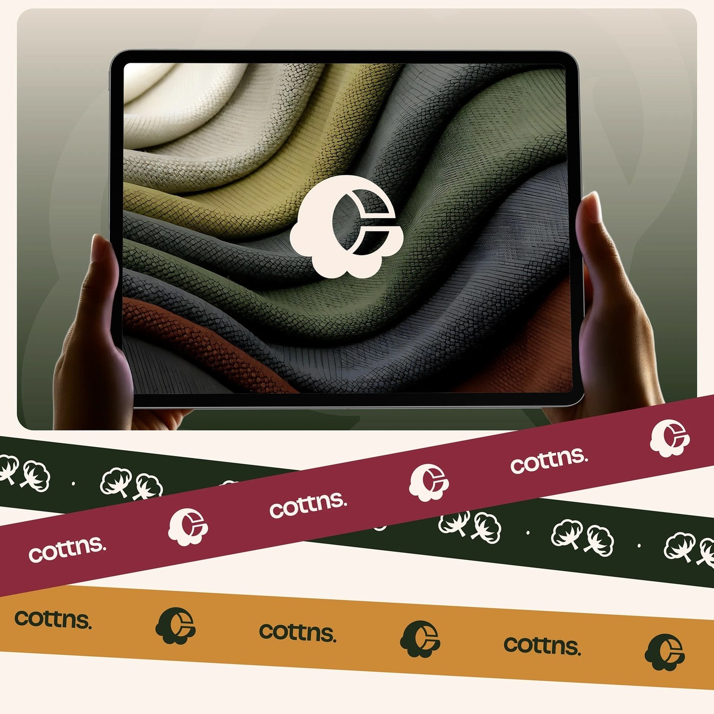
Joshua Oladele's COTTN brand identity design uses natural textures and a soft palette to celebrate the purity of organic cotton. The new visual system for COTTN is built around the sensory experience of 100% pure cotton. Rather than relying on flashy graphics or overwhelming ornamentation, the…
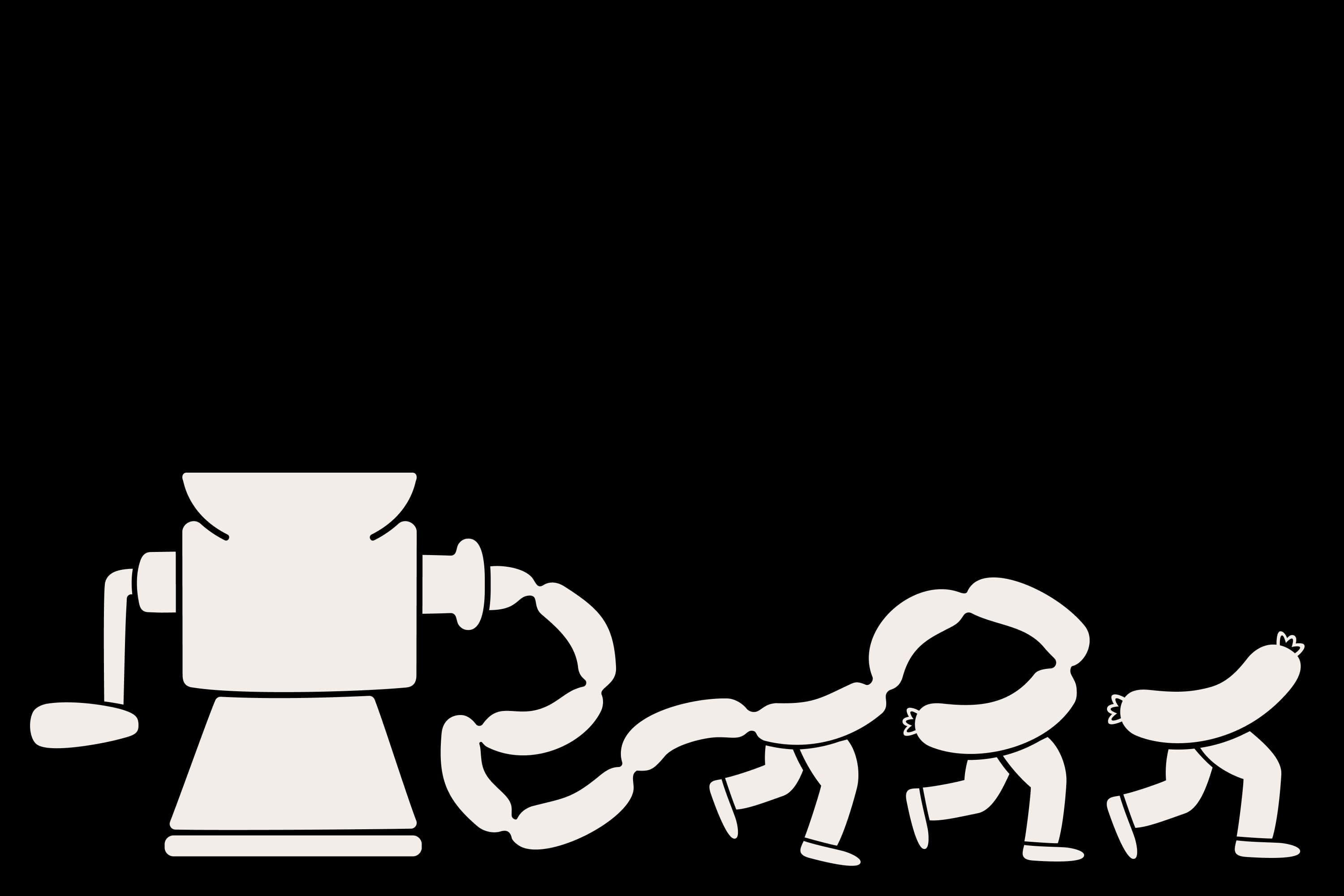
As a vegan of two decades, and a squeamish one at that, the thought alone of a “whole-carcass butcher business” makes me feel rather queasy – so it’s a testament to Studio Blackburn’s incredible skill that despite my personal nonsense, I absolutely adore this branding project. And I love it not in…
As a vegan of two decades, and a squeamish one at that, the thought alone of a “whole-carcass butcher business” makes me feel rather queasy – so it’s a testament to Studio Blackburn’s incredible skill that despite my personal nonsense, I absolutely adore this branding project. And I love it not in…

The newspaper’s head of games, Jonathan Knight, explains why a consistent, human-crafted approach keeps millions of daily players coming back to the likes of Wordle, Crossplay and Pips There are very few products on the internet that have become as deeply embedded in people’s daily routines as the…
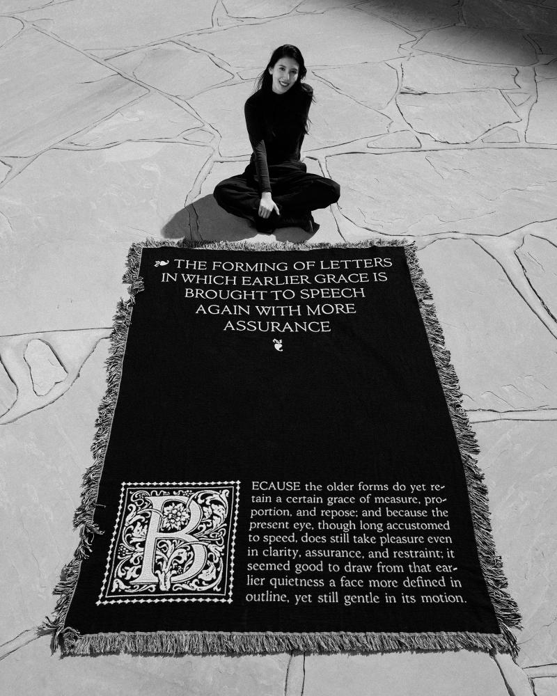
For Aiqi Zhang, her ideas tend to start with a question: "When I see something interesting, I often start asking 'what if,'" she says. "What if this idea lived in a different medium, what if the message changed, or what if the same execution became larger, more physical, or more interactive?" This…
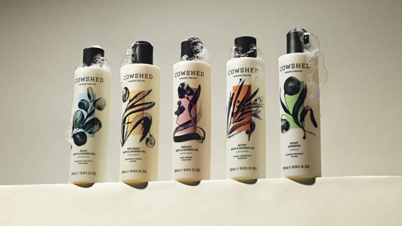
Cowshed has always been one of those brands that feels like an indulgence. It's right up there with Wildsmith and Aesop, but it's always been the more affordable option in the category without losing any luxuriousness. Soho House founder Nick Jones created the original Cowshed spa at Babington…
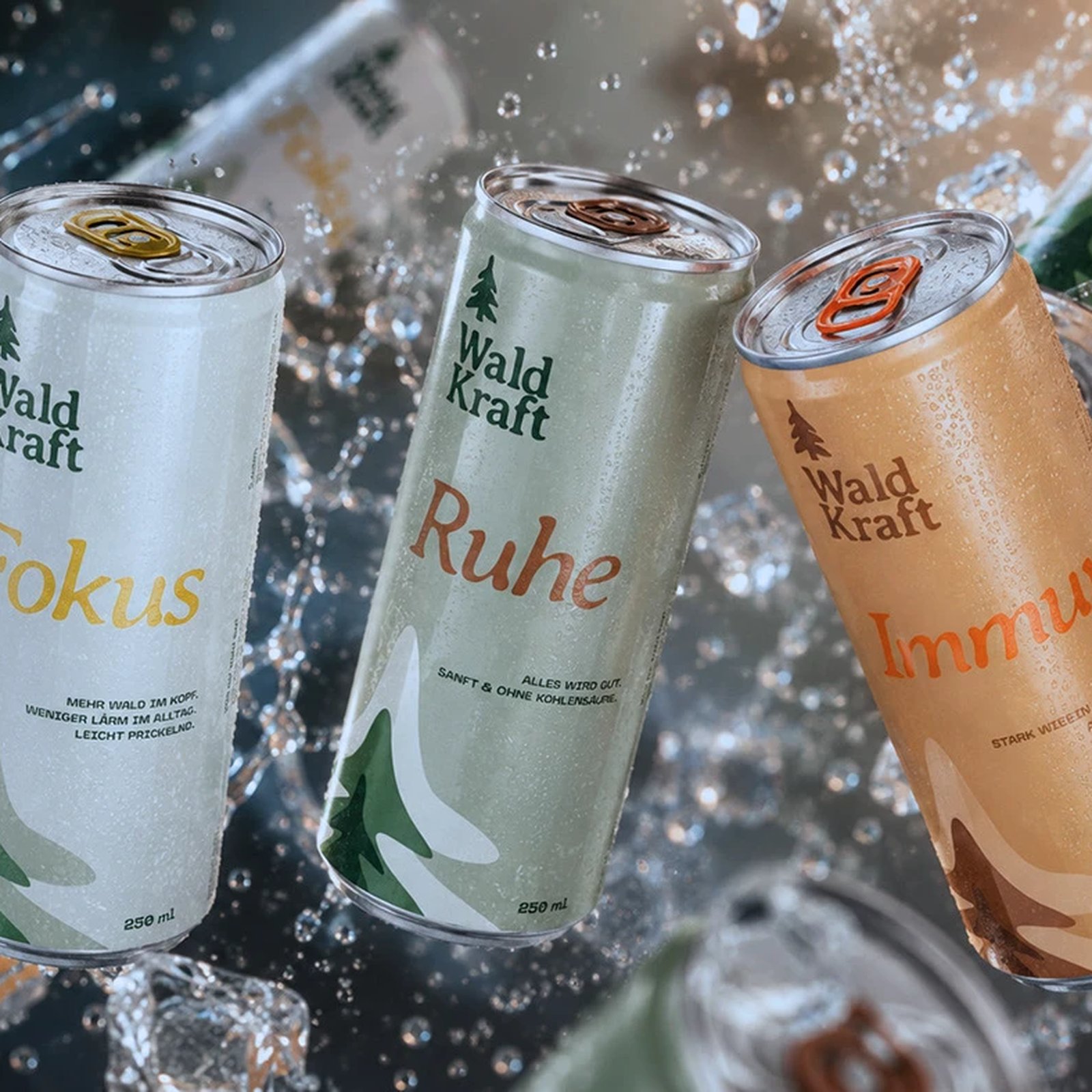
WALDKRAFT shows packaging design inspiration 2026 starts with material: embossed aluminum cans, kraft tones, forest-grade restraint over decoration here. The can itself carries the argument. Hüterin Kreative embossed vertical ridges into the aluminum surface, a texture that reads like bark or…
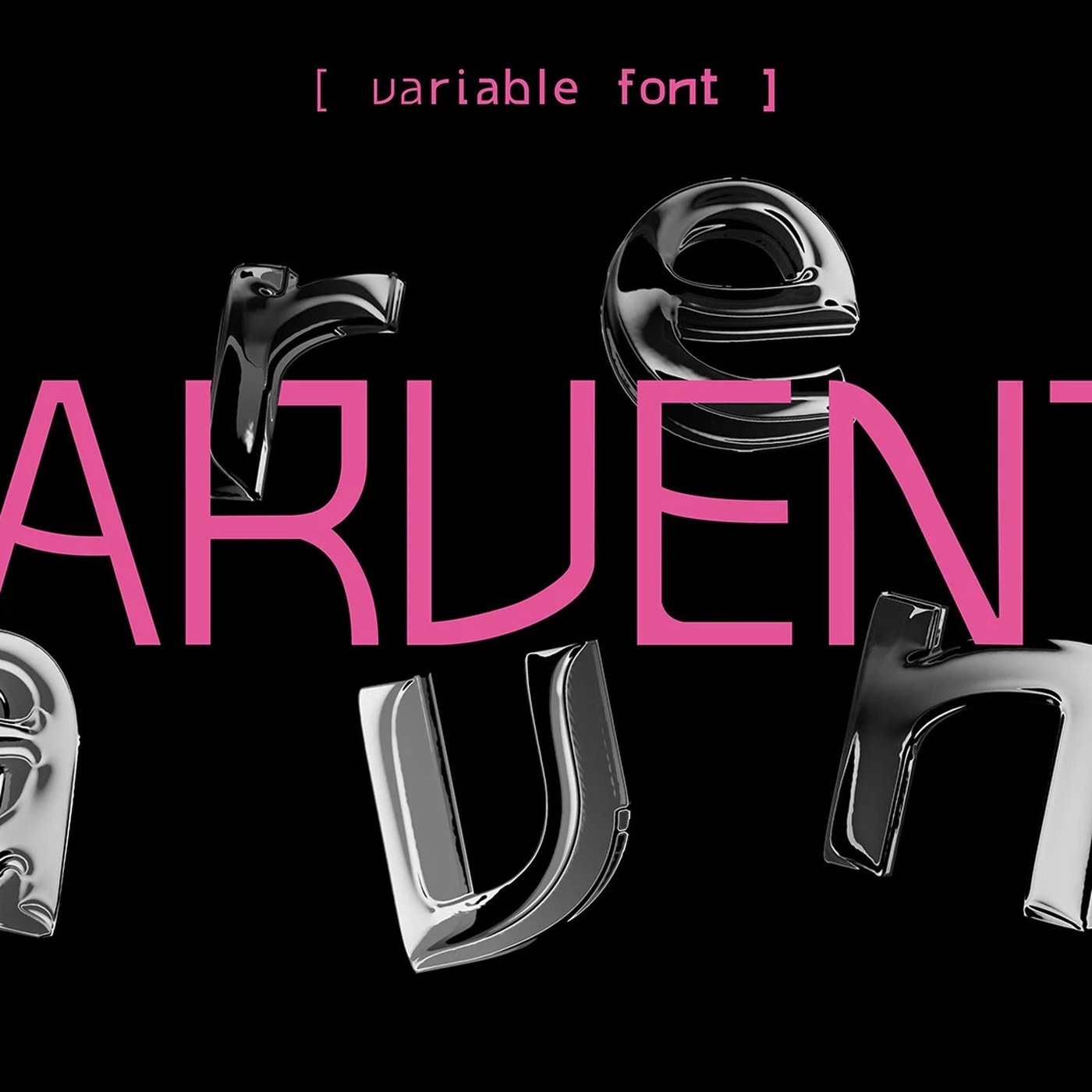
This variable typeface specimen risograph print design booklet showcases the 7-weight Marvento font family designed by Gréti Horváth. The variable typeface specimen risograph print design project by Hungarian designer Gréti Horváth translates digital type anatomy into material weight. Spanning…
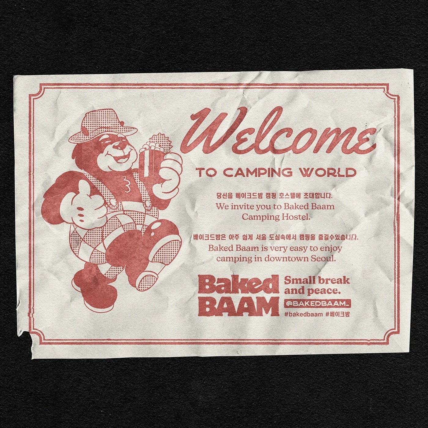
Baked Baam bakery packaging design by Monga Design pairs retro camp illustrations with strict typographic layouts. View the identity details. Monga Design constructed this visual system for Baked Baam, an express camping hostel based in Seoul, South Korea. The concept stems from the quick prep of…
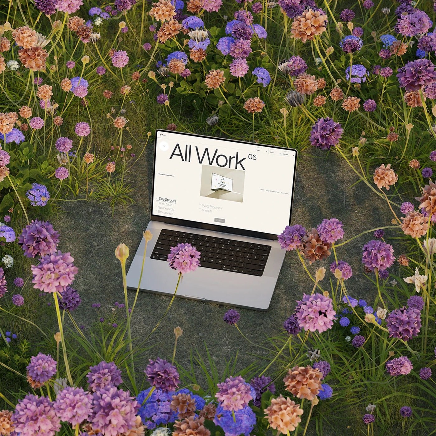
Web design portfolio agency awwwards winners construct sophisticated, high-performance, grid-based, interactive user interfaces. Huy Phan designed this digital portfolio. The grid layout divides the screen space. Bold typography sits in off-center columns. This placement creates strong…
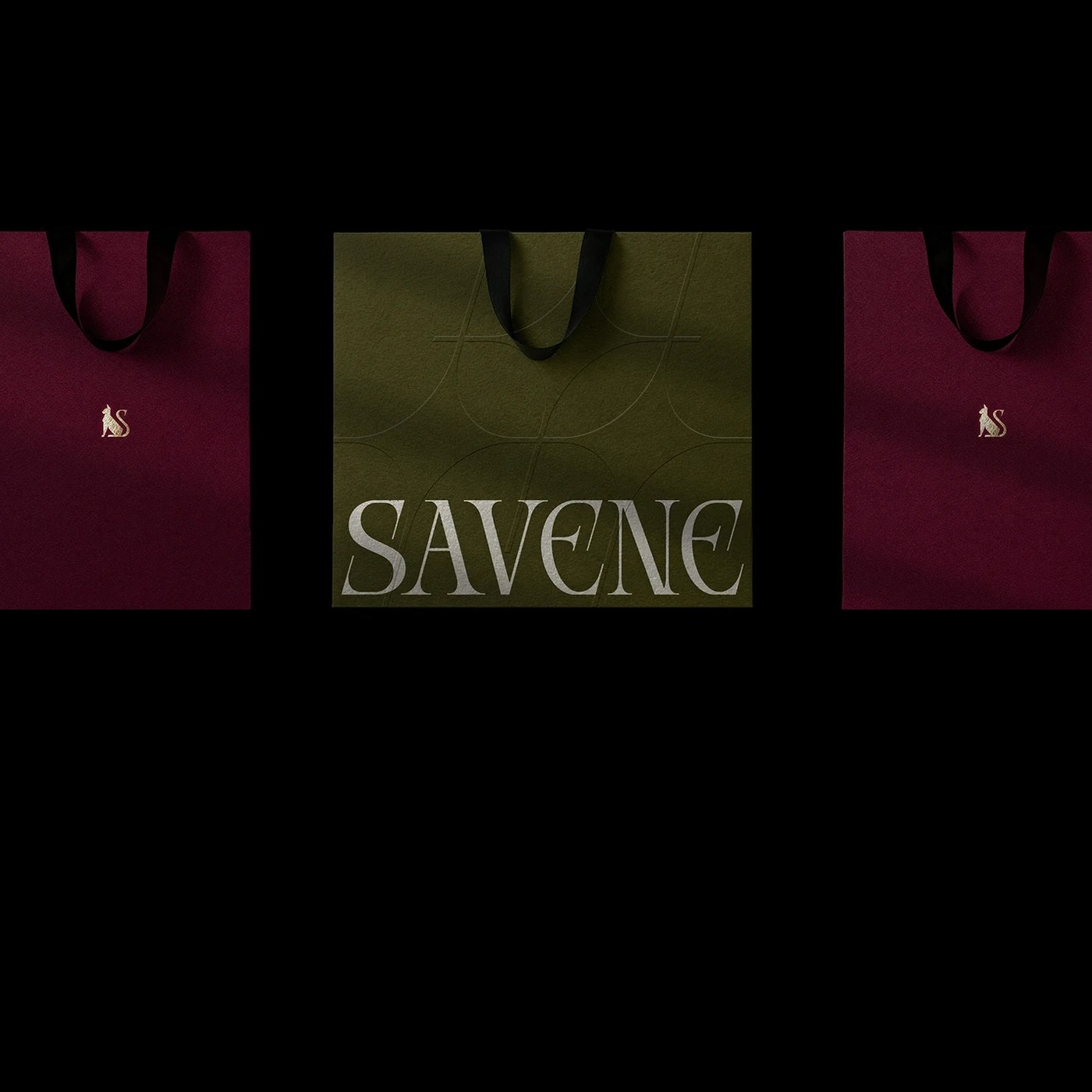
Savene establishes contemporary jewelry brand identity through exceptionally disciplined, structured typographic systems. The visual system relies on a Swiss grid structure. Every graphic element pins tightly to the page margins. This placement creates a compelling sense of compositional tension.…
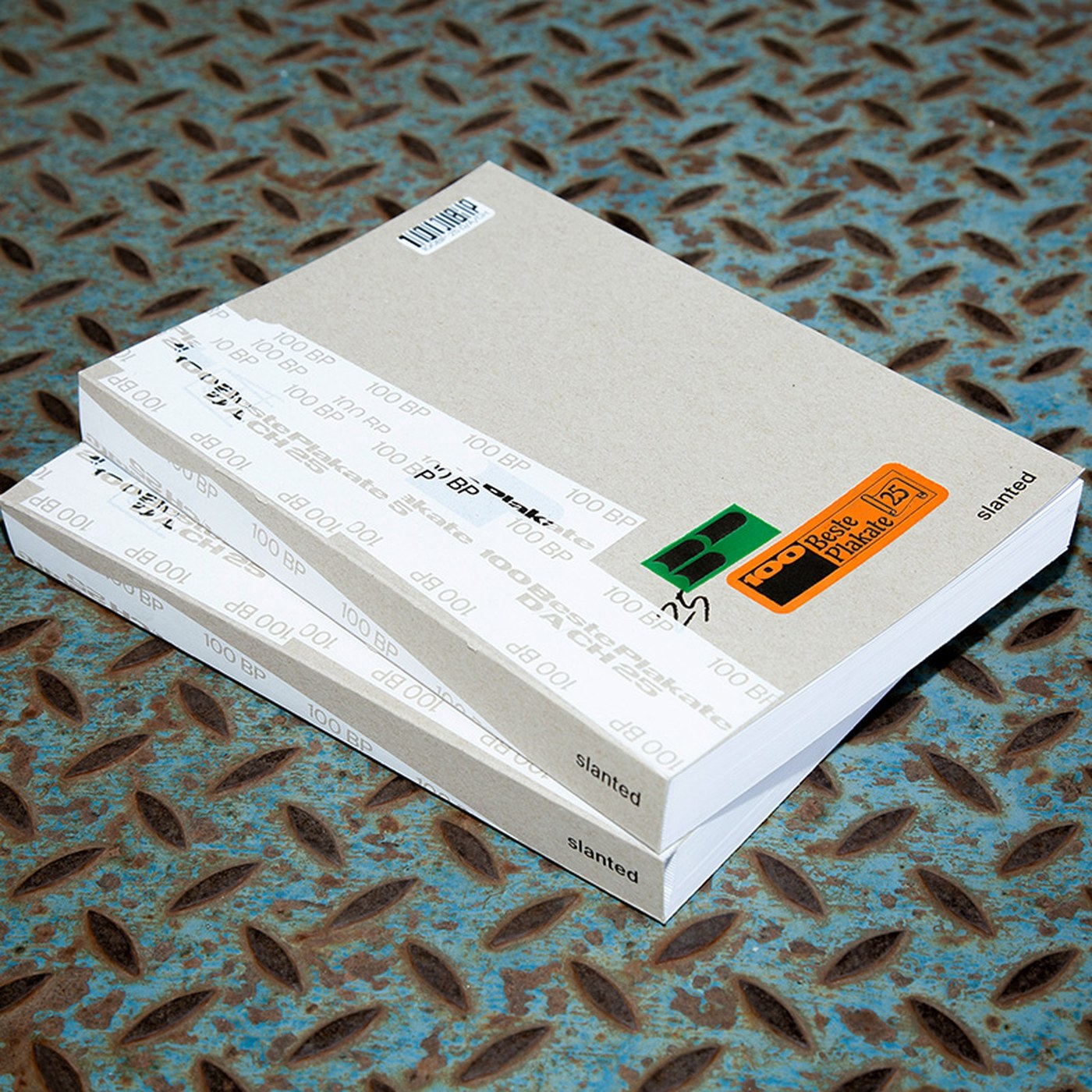
The 100 Beste Plakate yearbook returns with a tactile logistics concept. It frames regional poster designs within a structured, raw packaging design. Designed by Berlin-based designers Ira Ivanova and Lou Hillereau, the book mimics a shipping parcel. The cover consists of unbleached grey cardboard,…
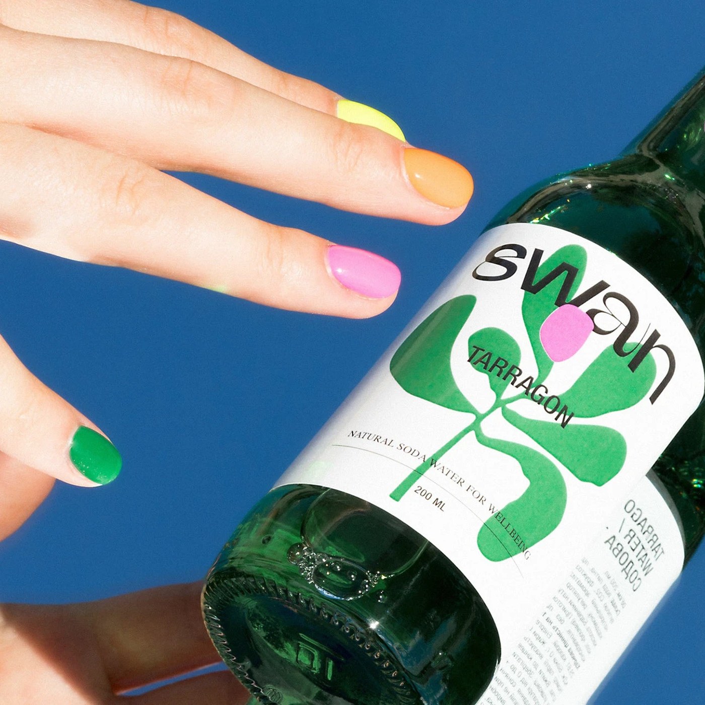
Swan is a natural soda water brand. Orchidea Agency built a soda packaging design system using flat illustration blobs and a bespoke sans-serif wordmark. Eight 200ml clear glass bottles, eight flavours, eight distinct illustration blobs — each one a loose organic shape keyed to its botanical…
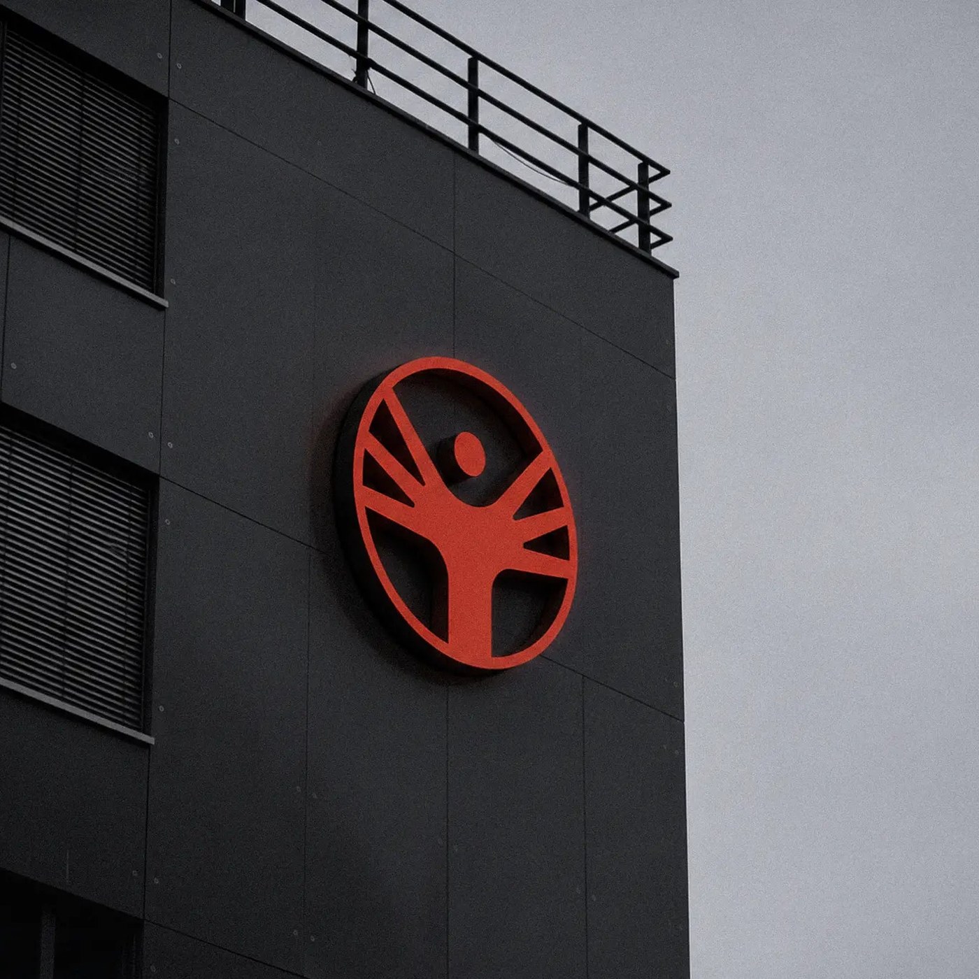
The HydraDAO brand identity showcases a modular design system built for decentralized network scalability. The project sets a new visual standard. Si Maclennan designed a highly systemized visual framework. The layout relies on strict grid alignments. Sharp geometric shapes structure the entire…
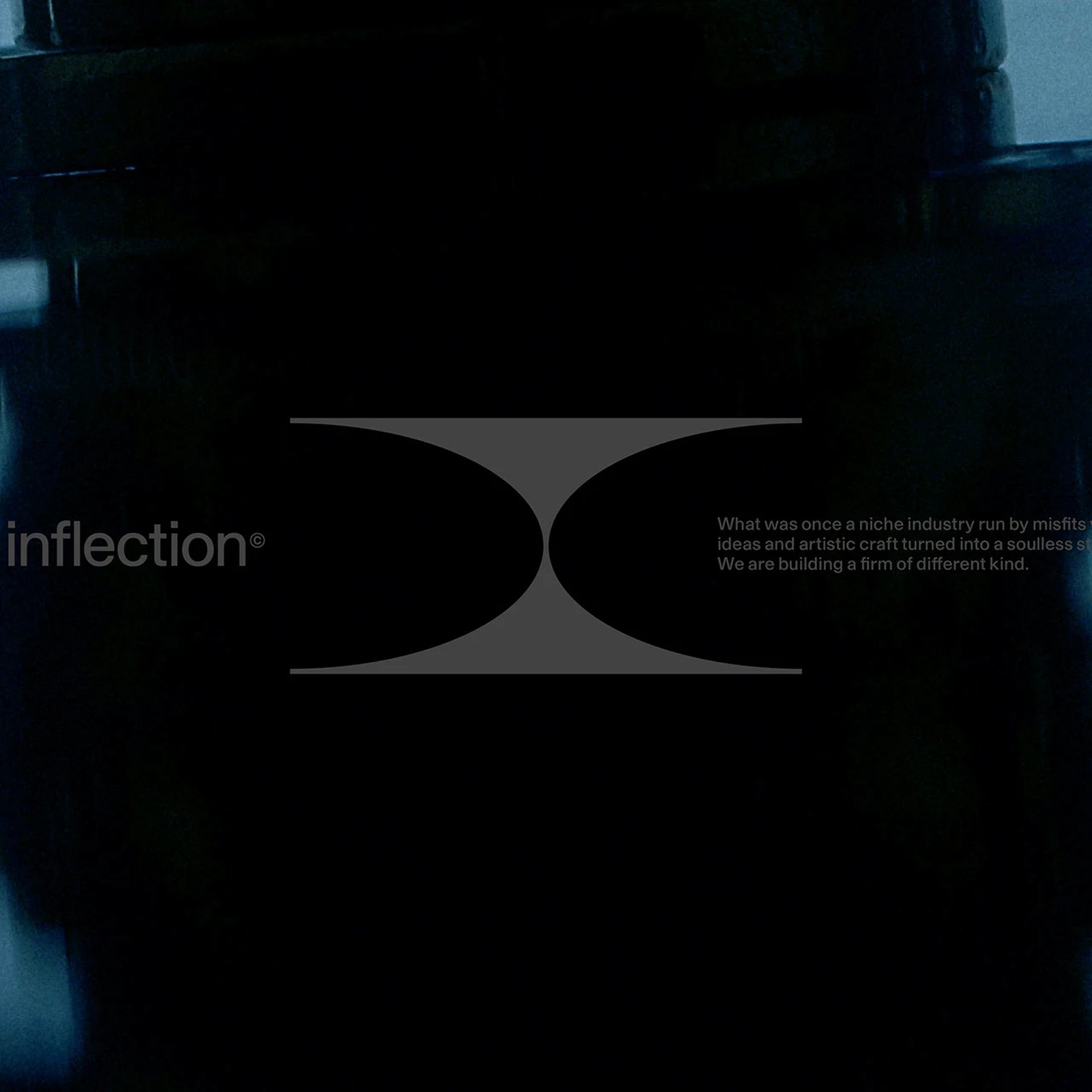
Our roundup of the week's best design projects, featuring systematic visual identities, tactile packaging structures, kinetic typography, and digital-first brand ecosystems. This week's selection highlights a growing industry focus on systematic rigor—using strict grids, code-adjacent monospace…
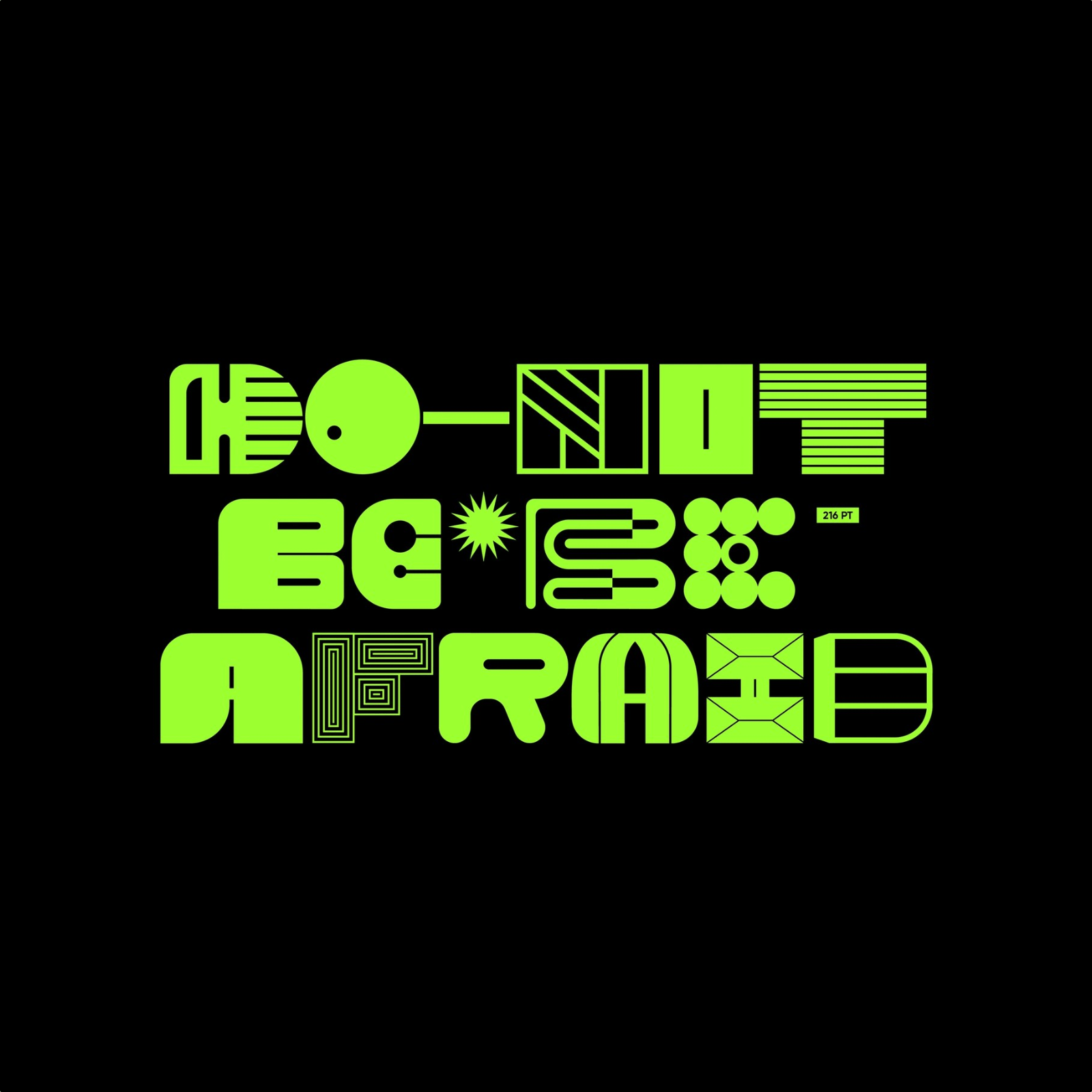
Cleo is a display font retro typography graphic design project by Yai Salinas, mixing retro vaporwave shapes with geometric silhouettes. The Cleo display font retro typography graphic design project relies on a strong sense of typographic eclecticism. Yai Salinas crafts a structured layout grid…
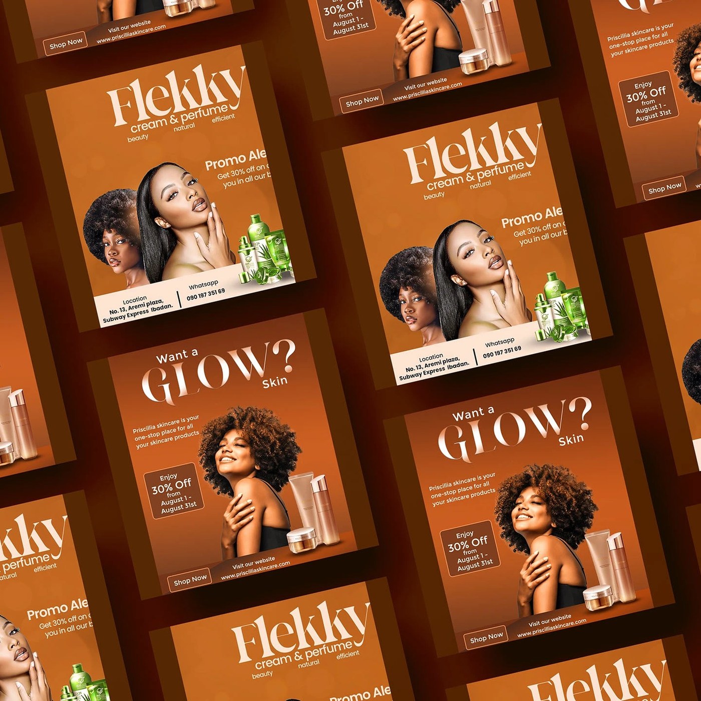
Explore skincare brand design cosmetic packaging by TheDrey Studio, balancing clean grids and rhythmic patterns for a calm shelf presence. Establishing a wellness identity requires balancing functional grids with organic details. TheDrey Studio achieves this by placing abstract, repeating patterns…
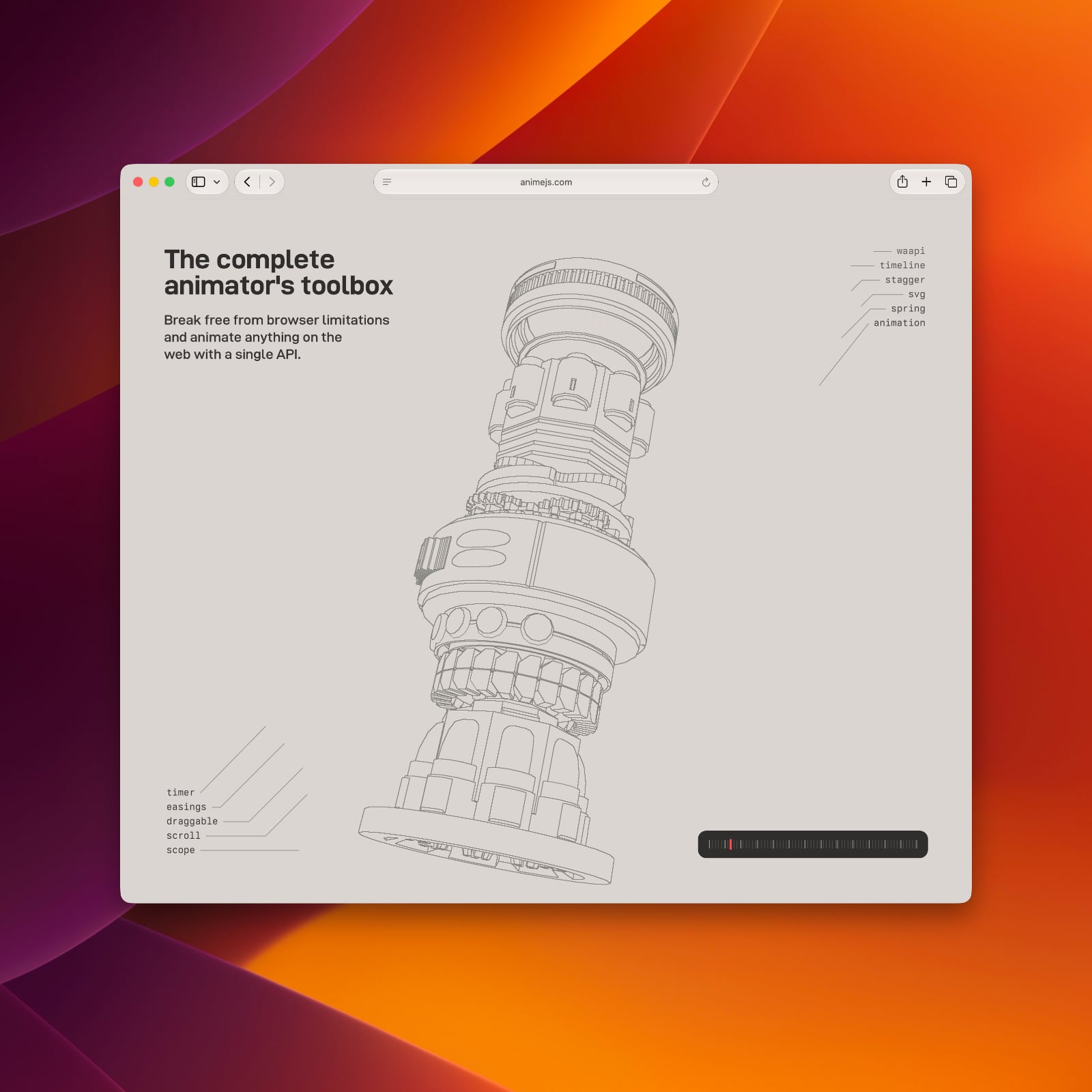
Julian Garnier's Anime.js library celebrates 10 years of redefining web animation with its clean API and modular timeline systems. The library debuted in 2016 as a lightweight tool for developers. Julian Garnier wanted to simplify complex browser movements. Over the decade, this project became a…

Boligkontoret Danmark is one of Denmark’s largest non-profit and member-owned housing administrators. Supporting local housing associations and communities with administrative, financial and technical services, they help create well-functioning homes and thriving neighbourhoods across more than…