Graphics Design

О графическом дизайне

RSS

Nature or Culture? Europeans Can Vote on the New Banknote Design

What best represents European life? The eternal dichotomy of nature vs. culture structures the Central Bank’s quest for a new banknote design, and now, the public can vote and offer feedback on ten proposals. A panel of jurors selected the designs, which follow one of two themes: European places…

Suri Takes on the Toothpaste Tube with its Innovative and Refillable Solution

Oral care start-up Suri has just gone to market with Restore Gel Refillable Toothpaste, with packaging that uses plant-based materials, compostable plastic, and other alternative, eco-friendly materials A lengthy design process pays dividends in the fight against the oral care industry’s packaging…

San Francisco Bay Coffee Gets a Fresh Coat of Fog

Personally, I love it when a coffee bag trades matte earth tones for more drama, and this redesign for San Francisco Bay’s Coffee, courtesy of The Creative Pack, does just that by turning the Golden Gate Bridge into the hero of the pack. The bridge lifts off the top third of every bag in a graphic…

Makitoy turns daily observations into stamp-sized collages of paper and colour

For South Korean illustrator and artist Makitoy, the act of drawing sits closer to “recording time than producing a final result”, she tells us. The artist’s practice consists of persistent observation and repetition through daily collages and illustrations. She charts whole months with micro…

Temporal Festival

Temporal is a festival dedicated to time-based media that brings together different artistic practices, such as moving image, sound, visual arts, device hacking, sound art, and performance—all of which focus on the durational dimension of the aesthetic experience. The first edition of Temporal took…

Xhain gärtnert

Visual identity and printed matter for Xhain gärtnert, a municipal initiative for community gardening in Berlin-Friedrichshain and Kreuzberg. A flexible and simple illustration system highlights the project’s participatory character and can be applied across a range of communication materials,…

The Brooklyn Studio

After many years of operating as CWB, the well-known Brooklyn architectural studio decided on a name and brand change to reflect the expanding scope of their work and business. HvADesign created the vision for the new name: The Brooklyn Studio. Inspired by their residential work, often in historic…

Spring Breeze at D Museum

Spring Breeze (기분 좋은 산책, “A Pleasant Stroll”) was a public art project by the Daelim Cultural Foundation, on view at D Museum’s M2 Media Lounge in Seongsu-dong, near Seoul Forest, in the spring of 2023. The exhibition gathered two media art groups – SILO Lab, whose immersive installation A Breezy…

Krakage Karaoke

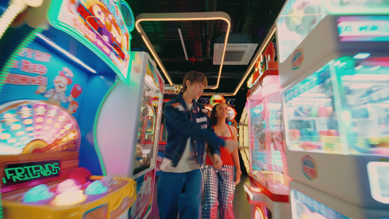
Krakage is karaoke with a ‘glow-up’ twist. For this project, our art direction reimagines the conventions of karaoke with a neo-retro brand identity featuring contemporary kitsch, embodying a spirit of glitz and total letting go. Extending from the décor to social media, this pop universe draws on…

Jazz Station

Round is used for the identity of Jazz Station. From designer Stéphanie Desjeunes: The Jazz Station is a jazz club nestled in a former train station and perched above the tracks in Brussels. It hosts concerts, exhibitions, residencies, open mic nights, workshops… and is dedicated to making jazz a…

Arrêt 59

Arrêt 59 is cultural center in Péruwelz, Belgium. The typeface system is based on three b•v-h families: Anto Rounded (Regular, Bold) for all technical information like performance schedules; these typically dense blocks were given rhythm, making them legible and visually appealing; Anto Rounded…

Inspiro magazine (2020–)

Inspiro is a Bulgarian magazine on lung and respiratory health, distributed locally to doctors. Krassen Krestev has been designing its covers since the magazine’s launch in 2008. In 2020, TheSans was introduced as the cover typeface, first appearing on issue 55, dedicated to COVID-19. Since then,…

Ot Avtora

От автора (Ot Avtora, “From the Author”) is a series of readings launched by Roman Liberov and Vladimir Rayevsky in Moscow back in 2016. At each of these events, an invited poet would read and comment on their selected work. All 64 readings that the project’s creators eventually were able to host –…

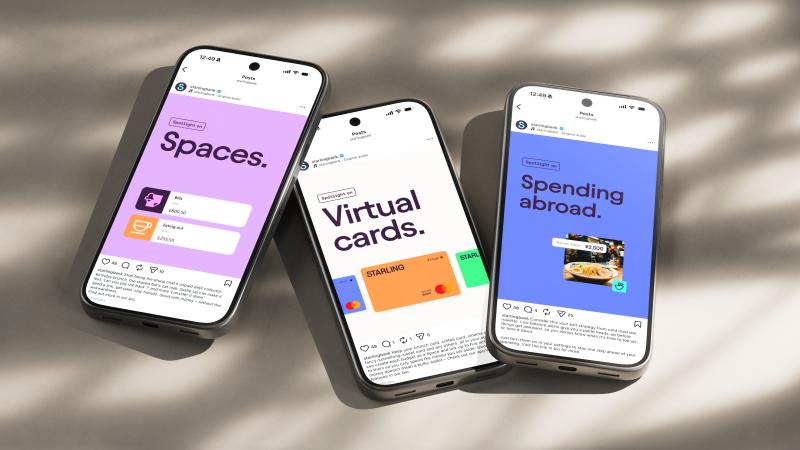
Buff Motion's motion identity for Starling is built around confidence, not cash

Be honest: when did a bank's social feed last stop you mid-scroll? Me, personally? I'd rather bury my head in the sand than look at my account balance, not to mention all the beige and boring financial content I'd rather ignore. So it's rather refreshing to come across a project that treats the way…

Ueshima rebrand champions the Japanese art of coffee

As Ueshima sets its sights on Lavazza and Starbucks, The Clearing refreshes its UK identity to bring the brand’s heritage to the fore In 2021, London-based agency The Clearing worked with prominent Japanese coffee house Ueshima to create a brand for its UK presence. Over the next few years, Ueshima…

Founders Makers redesigns Hi*Ball for UK launch

London creative studio Founders Makers has overhauled the brand identity, packaging, and strategic positioning for cult US sparkling energy water brand Hi*Ball as it makes its UK debut. Design News 28 July, 2026 American beverage owner Tilray Brands has introduced sparkling energy water Hi*Ball to…