Graphics Design

О графическом дизайне

RSS

Studio x01 identity and website

Founded in Milan, Studio x01 is a creative studio and production company working across documentary filmmaking, cinema, publishing, and visual communication. Its projects range from independent documentaries to branded content, communication campaigns, and occasional editorial work. For their…
Saboteur

Branding studio Saboteur uses F37 Analog throughout its own brand identity, bringing a distinctive, characterful voice to the studio’s visual language. Paired with a bold graphic system and playful art direction, the typeface helps create an identity that feels confident and expressive. Formats…

PIXILAB

PIXILAB is a Swedish technology company, developing software for media-rich experiences in museums, exhibitions, corporate showrooms and other public spaces. The company grew out of decades of work with large-scale presentation and media control systems for the audiovisual industry. Its tools are…

The Book of Names

The new permanent exhibition in Block 27 at the Auschwitz-Birkenau State Museum deals with the Shoah – the murder of the Jewish people – in its entirety. The exhibition imparts, as concisely as possible, the fundamental aspects of the Holocaust in order for visitors to comprehend how…

OFF-Biennale Budapest 2025

“Poems of Unrest” was the title of the identity for OFF-Biennále Budapest’s anniversary edition in 2025, responding to a moment shaped by political, social, and environmental unease. From city lights to UI, web and participant materials, the visual language carried through with bold colour, sharp…

Abartig by Atalja Tapis

Abartig is a graphic novel by Swiss illustrator and designer Atalja Tapis, created as her diploma project. The book is defined by Tapis’s distinctive illustration style, with expressive drawings and rich, vivid colours that give the story its own unmistakable visual world. The graphic novel is set…

Tune In to the Midnight Heart acrylic character stands

On this acrylic character stand collection, female character names (Iko Kirino, Nene Himekawa, Rikka Inohana, Shinobu Uzuki) from the Japanese anime series Tune In to the Midnight Heart are set in the Japanese square geometric typeface VDL LineG by Visual Design Laboratory. The typeface is…

Quest is a highly designed sci-fi and fantasy magazine built for web fiction

One of the best things about alternative literature is that it really originated online, and with it, ushered in a new world of blog writing, GeoCities prose and intertextual genre writing that would’ve previously been rare finds in niche magazines. Those magazines are now largely online, just take…

Shelf Life 129: Former DTC Brands Are Making Grocery Displays Good Again

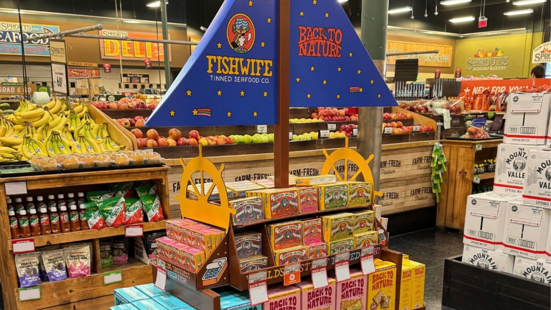
Pierre Jamet spent the week between Christmas and New Year’s the way most of us spend that strange, formless stretch of the calendar. And by that I mean not working. Of course, if you like your job, you’re loosely thinking about work and fusing that with some whimsical thoughts. Unlike what I was…

Best of the Week: Structural Packaging and Swiss Grids

We gather the best of the week across packaging, branding, editorial design, and typography from ISO week 2026-W39, highlighting architectural forms and print craft. This week’s editorial throughline investigates the tension between severe structural geometry and organic, tactile materiality.…

Good Housekeeping magazine ad

From a 1954 press and journalism annual issued by the National Magazine Co. Ltd., an advert singing the praises of Good Housekeeping. The magazine was the 1922 British offshoot of the American parent that had first been published in 1885 and has been owned by the Hearst Group for over a century.…

studio panter&tourron on redefining the codes of luxury design

Panter&Tourron’s studio in Lausanne In Switzerland, Panter&Tourron are designing subtle, quiet objects that people can’t help but take notice of. It would be unfair to say that their work is ‘eye-catching,’ as that may conjure an image of something gaudy, gold, or strobing. But there is a certain…

Editorial Design: Adam Pendleton Monograph by SAVVY STUDIO

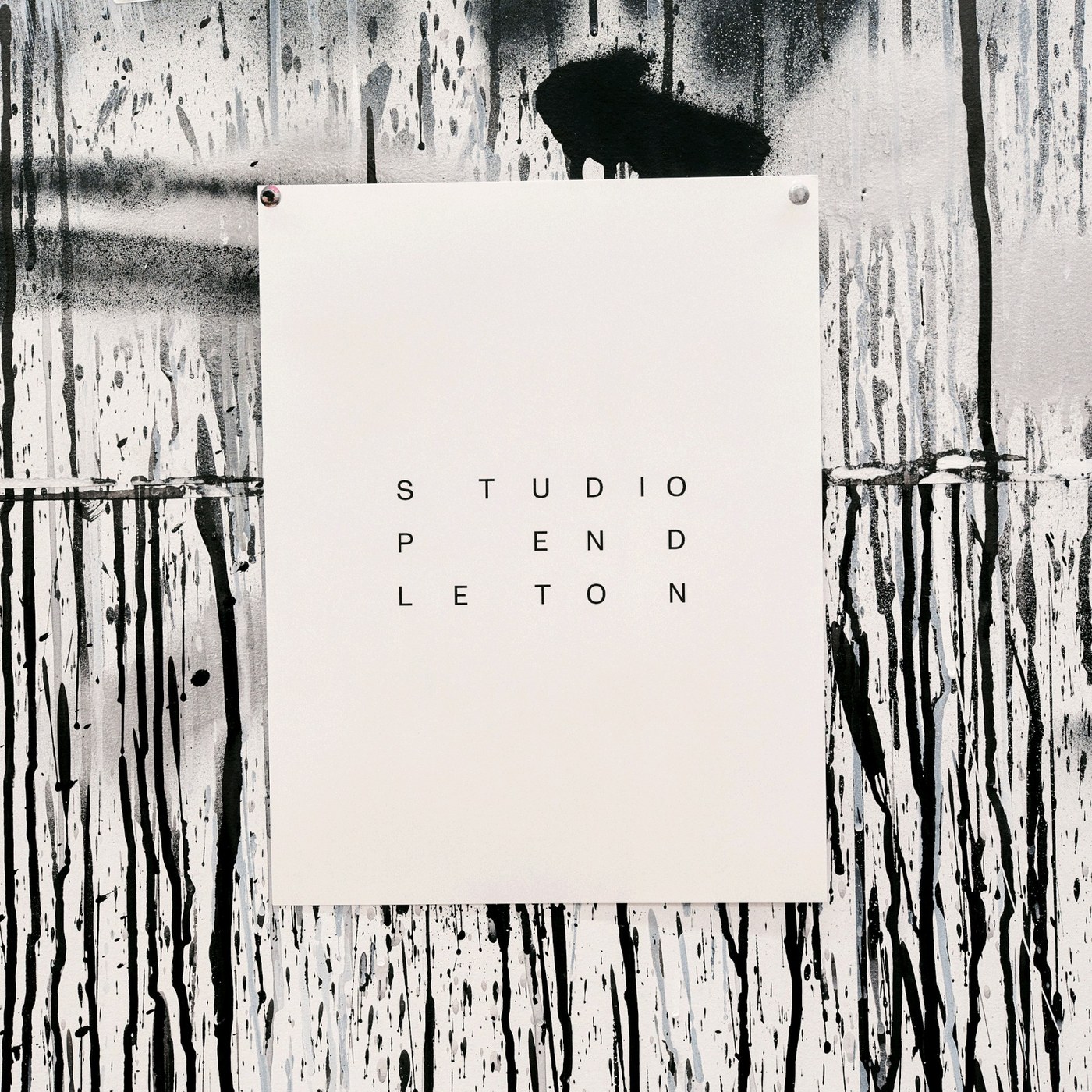
SAVVY STUDIO structured the Adam Pendleton monograph around 1960s computational punch cards and concrete poetry for rigorous editorial design. Adam Pendleton operates within a strict visual universe defined entirely by black and white. For his studio identity and print collateral, Mexican agency…

Inside Cuberto’s Mobile App Design for Sleepiest

Cuberto crafted Sleepiest with atmospheric dark-mode palettes and fluid haptic audio controls for peaceful night mobile app design. Cuberto approached Sleepiest with an uncompromising commitment to sensory calming and nocturnal ergonomics. Designed specifically to guide users effortlessly into…

Spatial Design: NVM Association Clubhouse by Silo

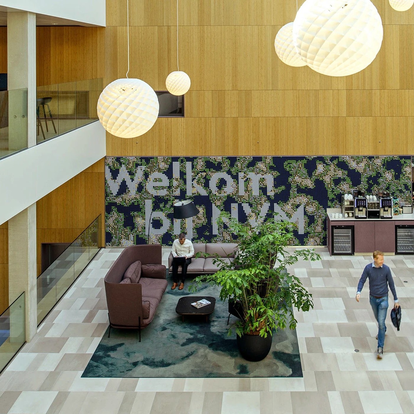
Silo delivered disciplined environmental spatial design interventions throughout the Dutch real-estate association headquarters. NVM represents brokers and real estate agents across the Netherlands. Most Dutch home sales pass through its large network of members. Their head office serves as a…

the runway tells you where to look: 10 fashion shows that rewrote the catwalk

the path of the runway rewritten Fashion shows typically begin with a straightforward diagram. Models move along a prescribed path, its edges lined with spectators, and everyone knows where to look. In general this basic layout has remained consistent across time. Yet some of the strongest runway…

Spatial Design: Eurojust Privacy Manifestations by Silo

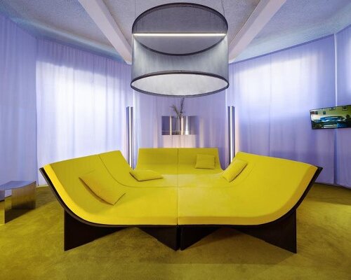
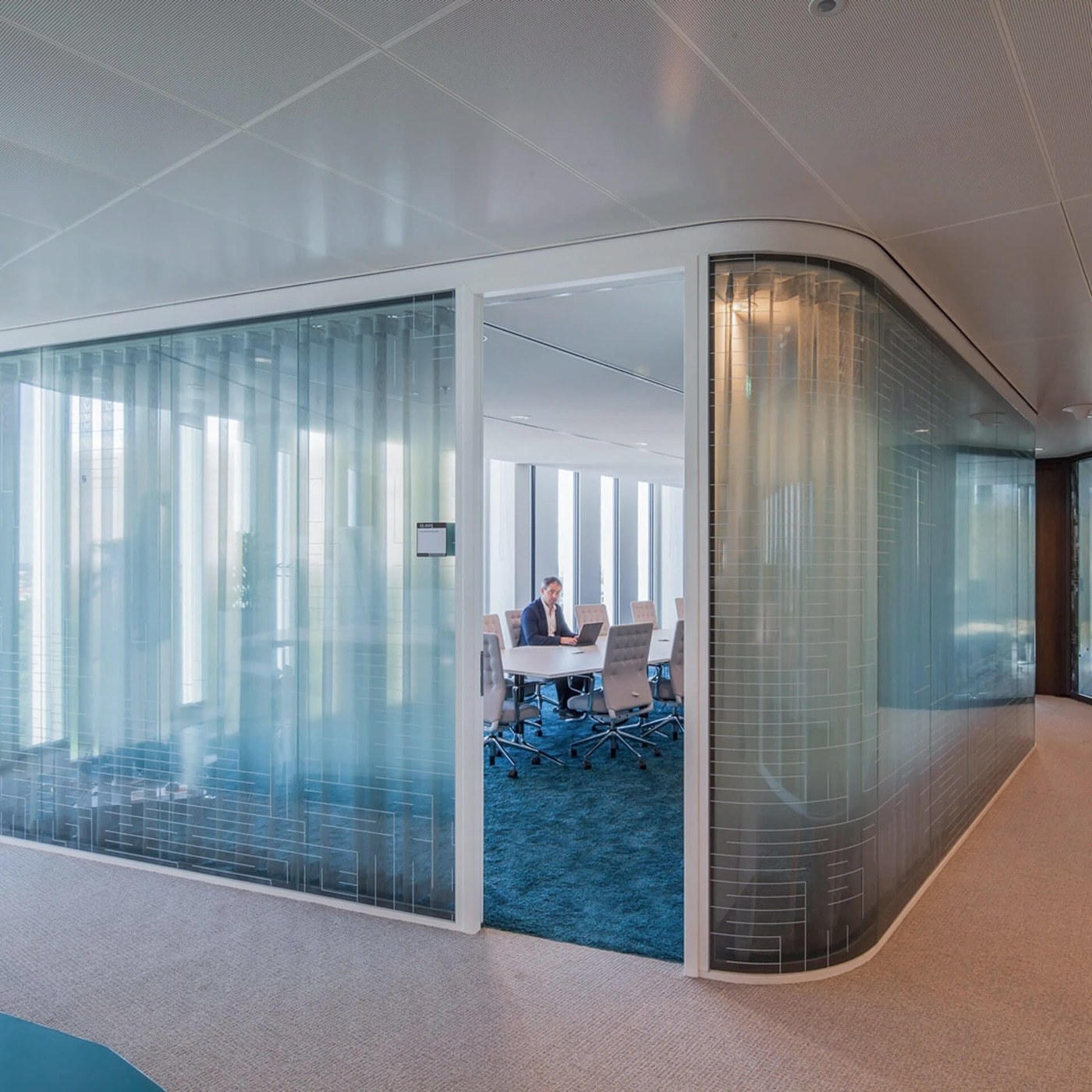
Silo engineered disciplined spatial design manifestations across Eurojust partitions, balancing internal privacy effectively. Eurojust fights cross-border crime across Europe from their base in The Hague. Their headquarters hosts four hundred desks for legal delegates from many nations. Mecanoo…

Julia ribbon wordmark | Mindsparkle

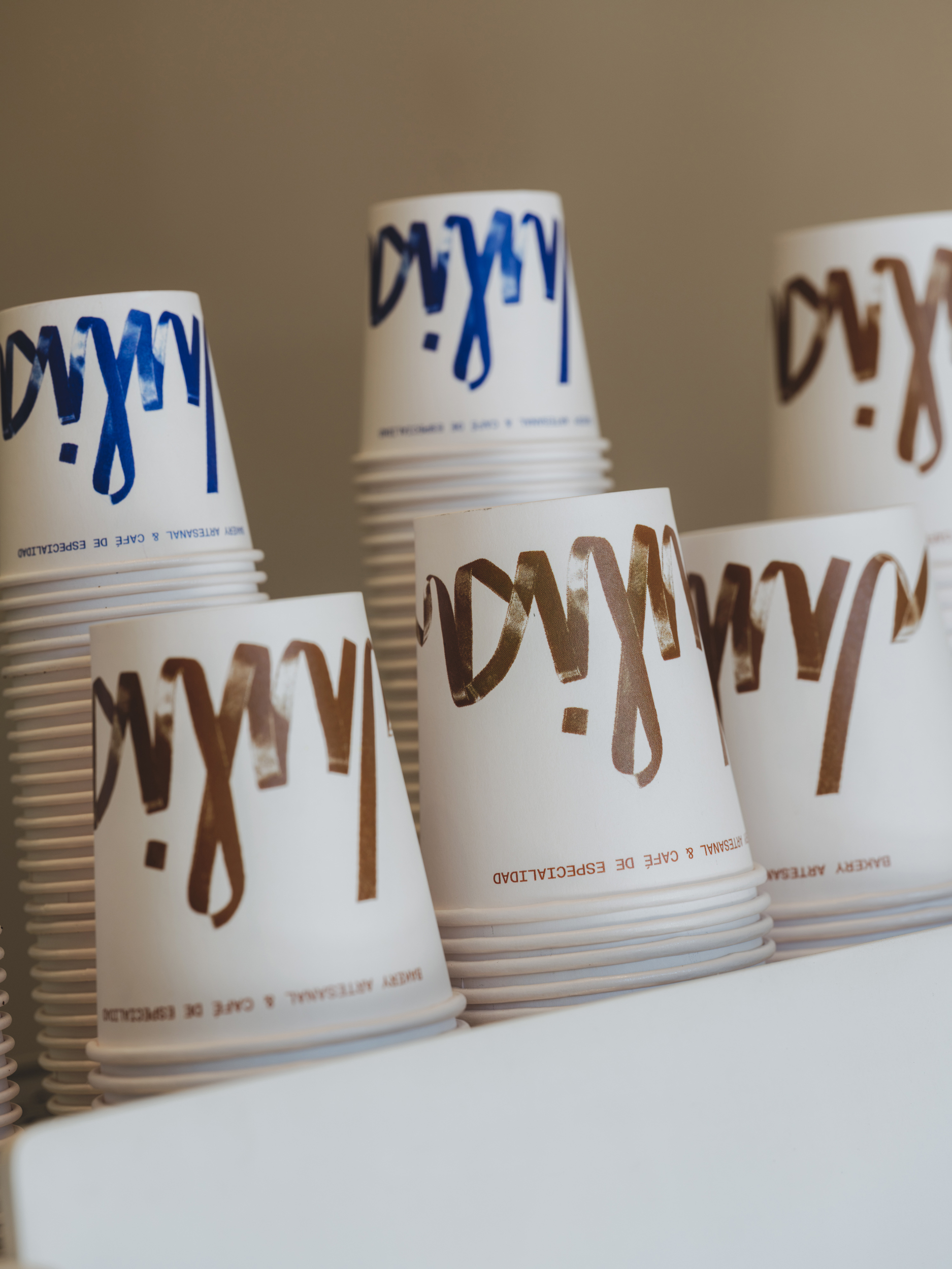
Hey Studio Mindsparkle Mag Julia's Barcelona coffee shop wordmark is tied from a real ribbon Julia is a small specialty coffee shop in Poblenou, Barcelona, where the food is homemade and the attention to detail is part of the daily routine rather than a claim on a wall. The brief was to make an…