Graphics Design

О графическом дизайне

RSS

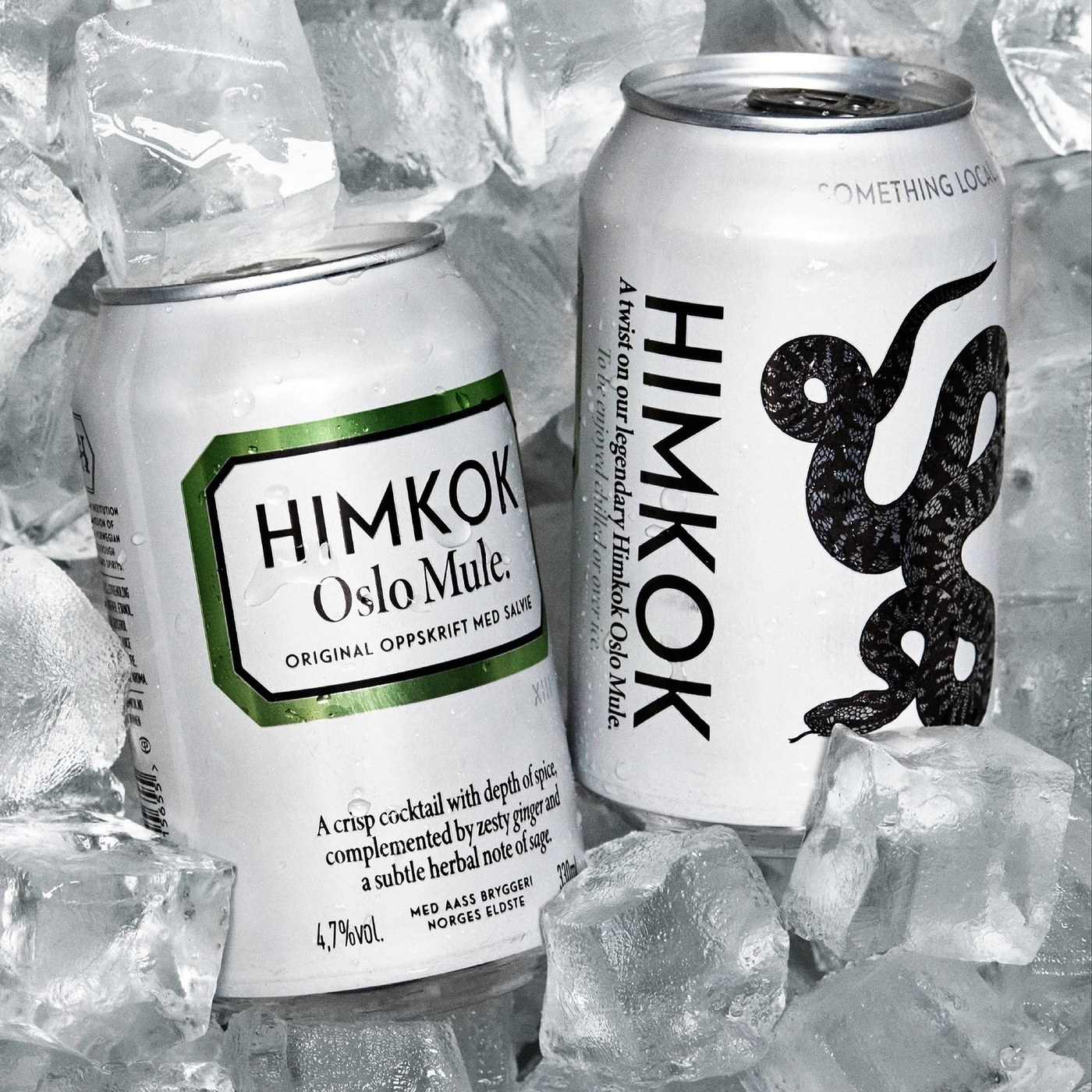
Himkok RTD: Inside OlssønBarbieri's New Packaging Design

OlssønBarbieri crafted tactile packaging design for Himkok RTD, pairing matte aluminium cans with Nordic apothecary distillation cues. Himkok ranks among the top cocktail bars in Oslo. When city bars closed, the bar team entered food stores. OlssønBarbieri brought craft drink culture to simple…
October 2026 Opportunities: Open Calls, Residencies, and Grants for Artists

Every month, we share opportunities for artists and designers, including open calls, grants, fellowships, and residencies. Make sure you never miss out by joining our monthly Opportunities Newsletter. Arch Enemy Arts Call for ArtistsFeatured Arch Enemy Arts is seeking submissions for an annual…

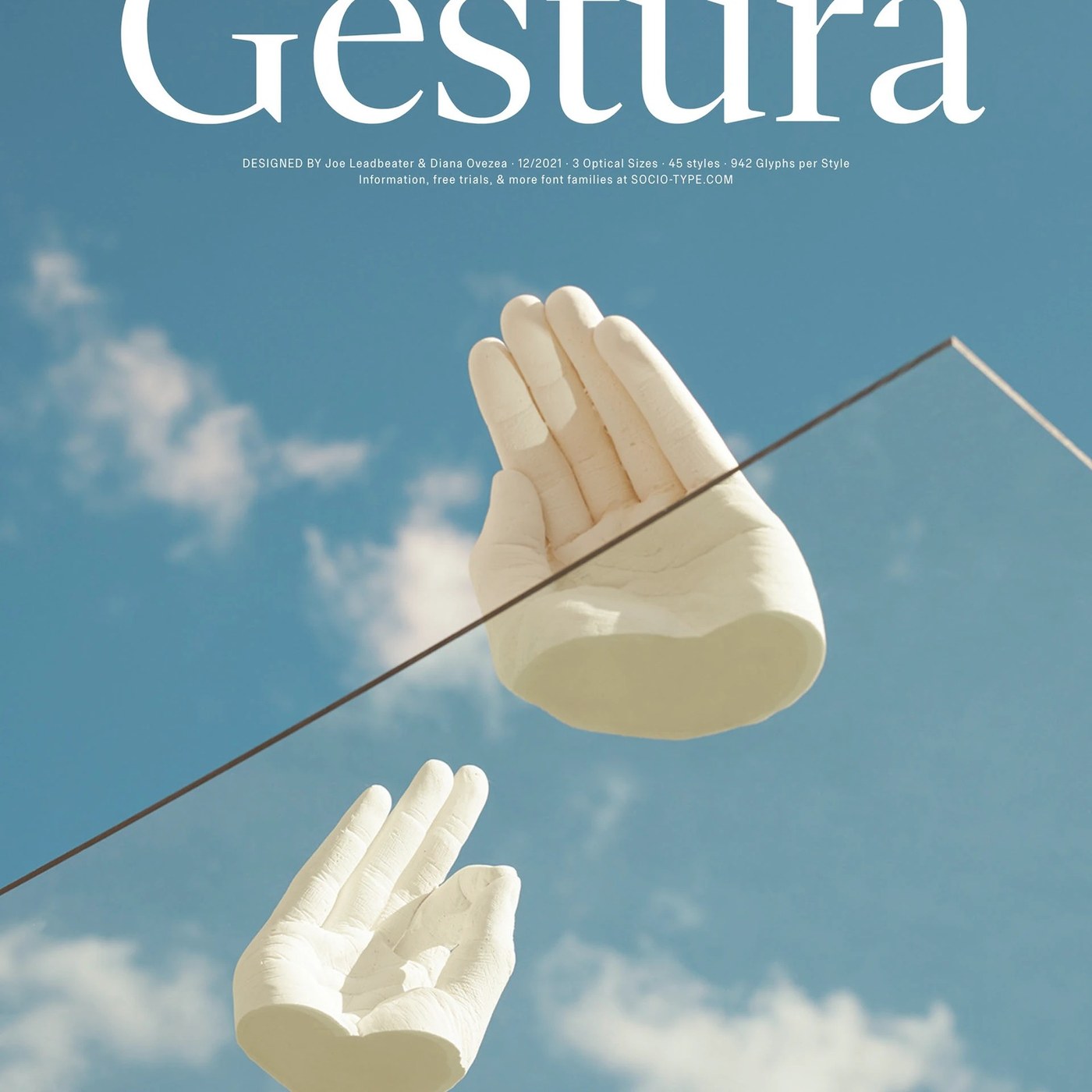
Sociotype Foundry Unveils Gestura Typography Design

Sociotype Foundry unveils Gestura, a modern serif superfamily exploring typography design through old-style roots and calligraphic warmth. Sociotype Foundry approaches typography design with a deliberate tension between historical scholarship and fresh graphic expression. Designed by Joe Leadbeater…

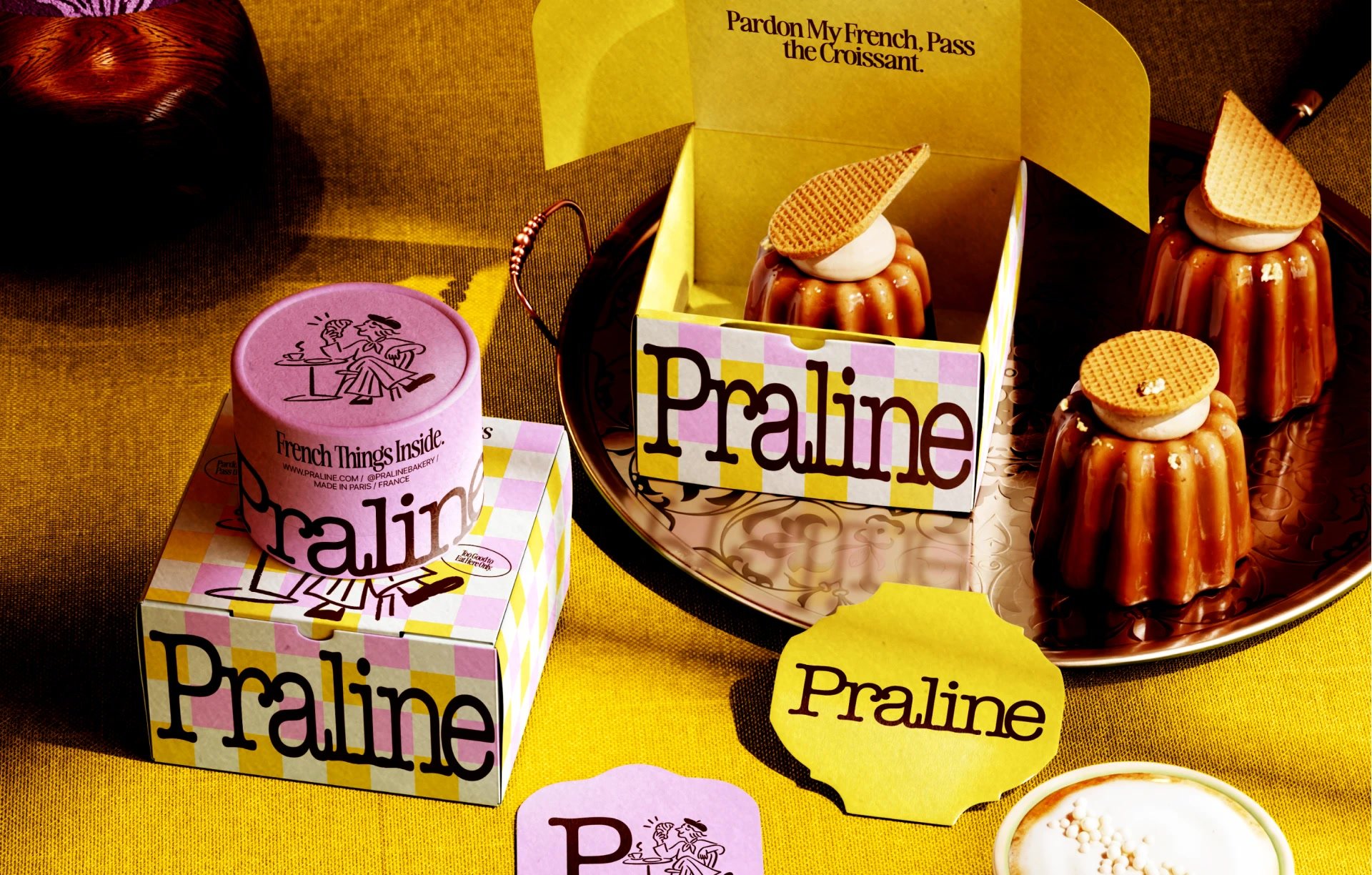
Pardon my French: a gingham bakery identity | Mindsparkle

Yuliia Hrabynska Mindsparkle Mag Pardon my French: a bakery identity built on gingham and wry one-liners Praline is a bakery that does not exist, and the identity built for it treats that freedom as licence to be loud. The system runs on a butter-yellow and bubblegum-pink check that behaves less…

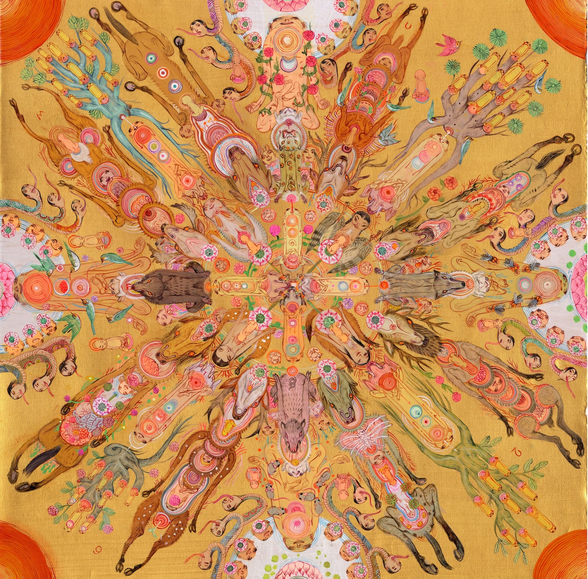
At a ‘Molecular Level,’ Mu Pan Composes Meticulous Mandalas in Acrylic

In the Buddhist tradition, mandalas are devotional images that represent the universe, their precise geometry and motifs depicting holy realms and a sense of order through symbolic references to the elements and astrology. Tibetan Buddhist monks painstakingly create colorful sand renditions as part…

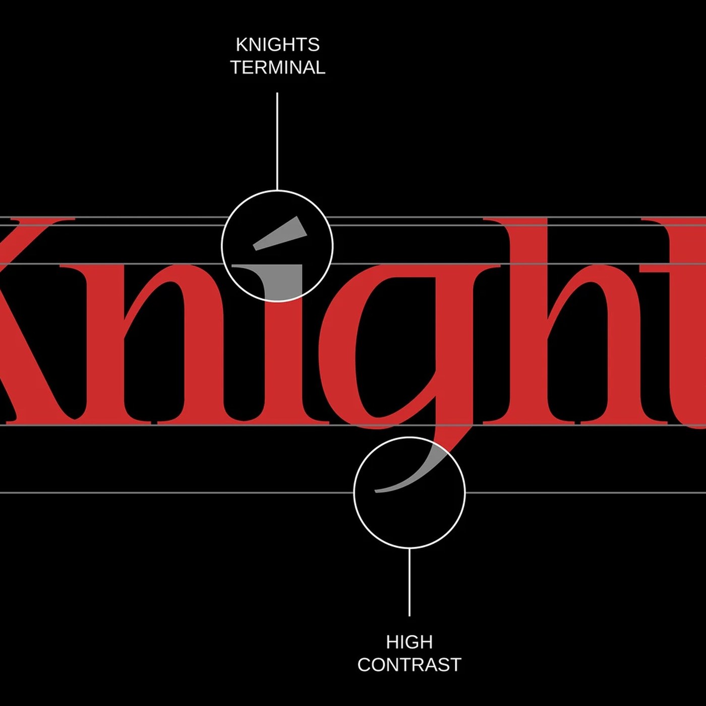
Typography: Knights & Fighters Typeface by Noodle Wang

Explore Knights & Fighters typography by Noodle Wang, blending classical Roman proportions with sharp high-contrast serifs and Gothic details. Created under his artist imprint Noodlemaker, type designer Noodle Wang developed this typography release to examine how enduring historical forms converse…

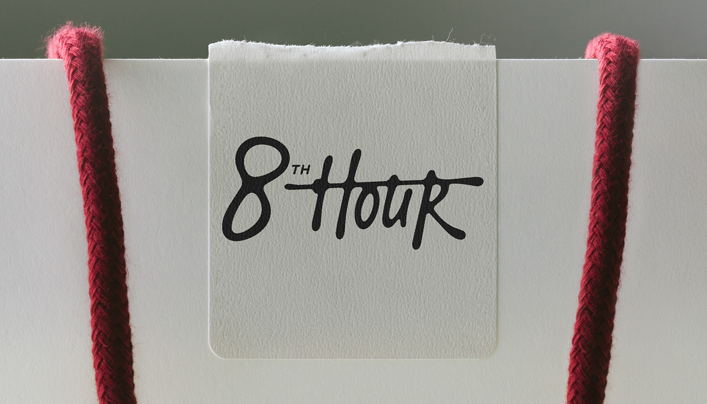
8th Hour Branding and Visual Identity for Modern Workwear

8th Hour is an identity system and branding project by Anastasiia S. that links office uniforms with practical workwear items. The visual system balances raw work clothes with clear office structure. At the core of the branding sits a bold script mark. The mark features a long stroke that runs…

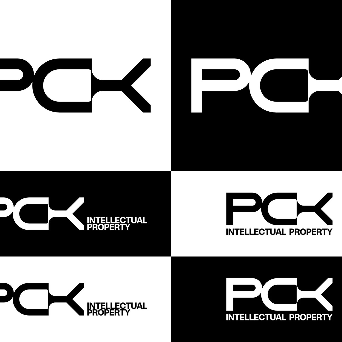
Brand Identity: PCK by Brand Brothers

Explore the new PCK brand identity by Brand Brothers. A bold monochrome monogram, geometric ligature, and structured symbol for legal IP. Brand Brothers took a clear path to build the brand identity for PCK Intellectual Property. Law firms often rely on safe blue tones and dull crests. The studio…

Three Days Left for DIELINE Awards Fall Entry Rate!

DIELINE Awards Fall Entry officially closes on Wednesday, September 30, at 23:59 GMT. That means you’ve got THREE DAYS to act now before the Pre-Holiday window opens, and awards entry rates move up. What changes on October 1 Professional goes from $385 to $415. Independent goes from $275 to $300.…

Lush Flexes its DEI Program Co-Create for Día de los Muertos Collection

Lush has released a collection of products for Día de los Muertos designed by employees through their Co-Create DEI program To authentically celebrate Día de los Muertos, this seven-piece collection was created by Lush employees with direct cultural ties to the holiday Every year, Día de los…

Corsario: a serif redrawn for every size | Mindsparkle

Felix Braden / Floodfonts Mindsparkle Mag Corsario, the editorial serif that redraws itself for every point size Editorial design asks a lot of a typeface: it has to carry expressive headlines, long reading texts, captions and footnotes while keeping one consistent visual language. Corsario…

Comptoir Krem & Kanel

Krem & Kanel is a shop located in Sainte-Thérèse, Canada, that sells cinnamon rolls, coffee, and soft-serve ice cream. Their visual identity was created by Mill3 and uses Kaio Krilin (from Lift Type) as the wordmark and primary typeface. For the logo, the corners of the font were slightly rounded,…

Faz Colher e Borda o Cabo

The book Faz Colher e Borda o Cabo (“Carve the spoon, then embroider the handle”) is published by a collective at Centro Cultural Vale Maranhão (CCVM), with graphic design by ps.2 arquitetura + design. The publication gathers research, narratives, and processes showing there is no border between…

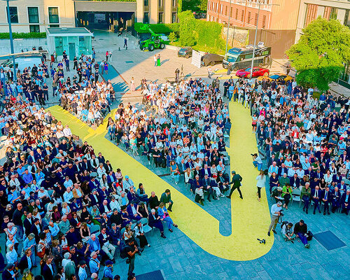
Studio x01 identity and website

Founded in Milan, Studio x01 is a creative studio and production company working across documentary filmmaking, cinema, publishing, and visual communication. Its projects range from independent documentaries to branded content, communication campaigns, and occasional editorial work. For their…

Saboteur

Branding studio Saboteur uses F37 Analog throughout its own brand identity, bringing a distinctive, characterful voice to the studio’s visual language. Paired with a bold graphic system and playful art direction, the typeface helps create an identity that feels confident and expressive. Formats…

PIXILAB

PIXILAB is a Swedish technology company, developing software for media-rich experiences in museums, exhibitions, corporate showrooms and other public spaces. The company grew out of decades of work with large-scale presentation and media control systems for the audiovisual industry. Its tools are…

The Book of Names

The new permanent exhibition in Block 27 at the Auschwitz-Birkenau State Museum deals with the Shoah – the murder of the Jewish people – in its entirety. The exhibition imparts, as concisely as possible, the fundamental aspects of the Holocaust in order for visitors to comprehend how…

OFF-Biennale Budapest 2025

“Poems of Unrest” was the title of the identity for OFF-Biennále Budapest’s anniversary edition in 2025, responding to a moment shaped by political, social, and environmental unease. From city lights to UI, web and participant materials, the visual language carried through with bold colour, sharp…